Monday, September 27, 2010

September 27, 2010 - Beverly Hills Adult School Fraktur Class #3

Beverly Hills Adult School Fraktur Class #3:  DeAnn put pretty music on while the students warmed up or lined paper. The warm-up was writing the Fraktur letters and words. Students came up to have DeAnn critique their writing and demonstrate on their sheet with a Zig calligraphy marker. DeAnn also reviewed proper posture and set-up to prevent body aches and pains.


DeAnn reviewed common mistakes she saw in the homework:


o :  should be symmetrical around the vertical axis. If you look at it upside down, it should look the same.


u :  don’t end the initial vertical stroke too low,  so you can start the rectangle stroke higher.


b, f, h, l :  start the vertical stroke with a tiny bit of curve at the ascender, to smooth the transition of the hairline.


alternate f :  instead of rectangle stroke ending with a curve, bring it down in a hairline into the cross-stroke.


w : after the initial curve, start the rectangle stroke high enough, then the direction change stroke low enough to reach the waist.


x :  soften the fractures just enough so that they’re smooth transitions, but not too curvy. Start stroke 2 high within the stem stroke so that it smoothly branches outward.


m :  start with a softened version of the square-stroke-serif vertical stroke. If the last stroke curves out, put that vertical stroke closer because the curving out adds white space to that last inner space. An alternate ending to “m” or “n” is to bring the stroke down toward the descender.


d :  don’t overlap the vertical strokes, so start at the waistline and be sure that the final stroke doesn’t overlap the first stroke.


a :  don’t curve the first stroke too wide. Look closely at the Exemplar, the first curve stroke is fairly straight. Stop the rectangle stroke when it’s even with the end of the first curve stroke.


Letter Spacing:  all the inner white spaces should be similar. If the letter form’s strokes are all straight (e.g. “minimum”), then the spaces between the strokes should be the same. The difficulty comes in judging the correct spacing between curved and straight strokes. If two curves are next to each other (e.g. “oo”), they can be very close together, even overlapping. A particularly difficult letter combination is “ev” – DeAnn is thinking of creating an alternate “v” that will fit in better next to the “e”.


For letters that have a “hangover” like “c”, “e”, “r”, “t”, “f”, “x”, leave the square serif off of the next letter and overlap or tuck underneath to start the down-stroke. E.g. er, ru, ei, ci, ce.


General rule of thumb on spacing:  write out “minimum” with the correct spacing. The overall “color” of the text should match that of “minimum” – by “color”, DeAnn means how the text looks at a distance while squinting your eyes.

TIP:  after writing out text, hang it on the wall and take a break. Then come back and stand some distance from it and squint your eyes. Do any white spots stand out? Do you see any dark spots? Those are the areas that are spaced too far apart or too close together.


REMEMBER:  It’s more important to get the spacing correct than each individual letterform being perfect. Even if some of your letters don’t look very good, your piece will still look good with the correct spacing. But even if you have beautiful individual letters, your piece will not look good if your spacing is not correct.


Illuminated Manuscript Project: start thinking about what text you may want to use. Any text that you like is OK. You’ll need about 40 words, but even if your text is too long, you can edit an excerpt from it.

Example from Gothic Textura semester

Next week DeAnn will go over the capital letters using the 5mm Brause nib.

HOMEWORK:  Beginners, continue writing words, then go on to write alphabet sentences .

Intermediates can go down to the 2 ½ mm Brause nib. The x-height is ½-inch (4 boxes); use an ascender/descender of 2 boxes (1/4 inch). Practice alphabet sentences and text, if you find something you like for the project.

Tuesday, September 21, 2010

September 20, 2010 - Beverly Hills Adult School Fraktur Class #2

NOTE:  More Photos are coming! Click on a photo to see a bigger image of it.
Beverly Hills Adult School Class #2:  Today DeAnn demonstrated the lower case Fraktur letters. She collected homework at the beginning of class. She highly recommends turning in homework so that she can correct and return it to you. If you haven’t done any at home, you can turn in the practice sheet you did in class.

The Bienfang paper (with the light blue lines) may bleed when you write, especially at the 5mm size. Use pounce (DeAnn has it available for the class) to fix bleeding. Pounce can also erase fingerprints. It’s often used on envelopes that are difficult to write on.


DeAnn reviewed the basics of pen angle and lining the paper.

Pen Angle:  A pen angle of 0-degrees creates the thickest down-stroke the Brause chisel point nib can make. It also makes the thinnest cross-stroke (horizontal stroke). A pen angle of 90-degrees creates the thinnest down-stroke and thickest cross-stroke. The pen angle for Fraktur is 45-degree, which makes the down-stroke the same width as the cross-stroke. To keep the vertical strokes the same width, don’t turn your wrist at all during the down-strokes. Move your whole arm. Using your left hand (non-writing hand) as a weight will enable you to freely move your right hand/arm (writing hand).

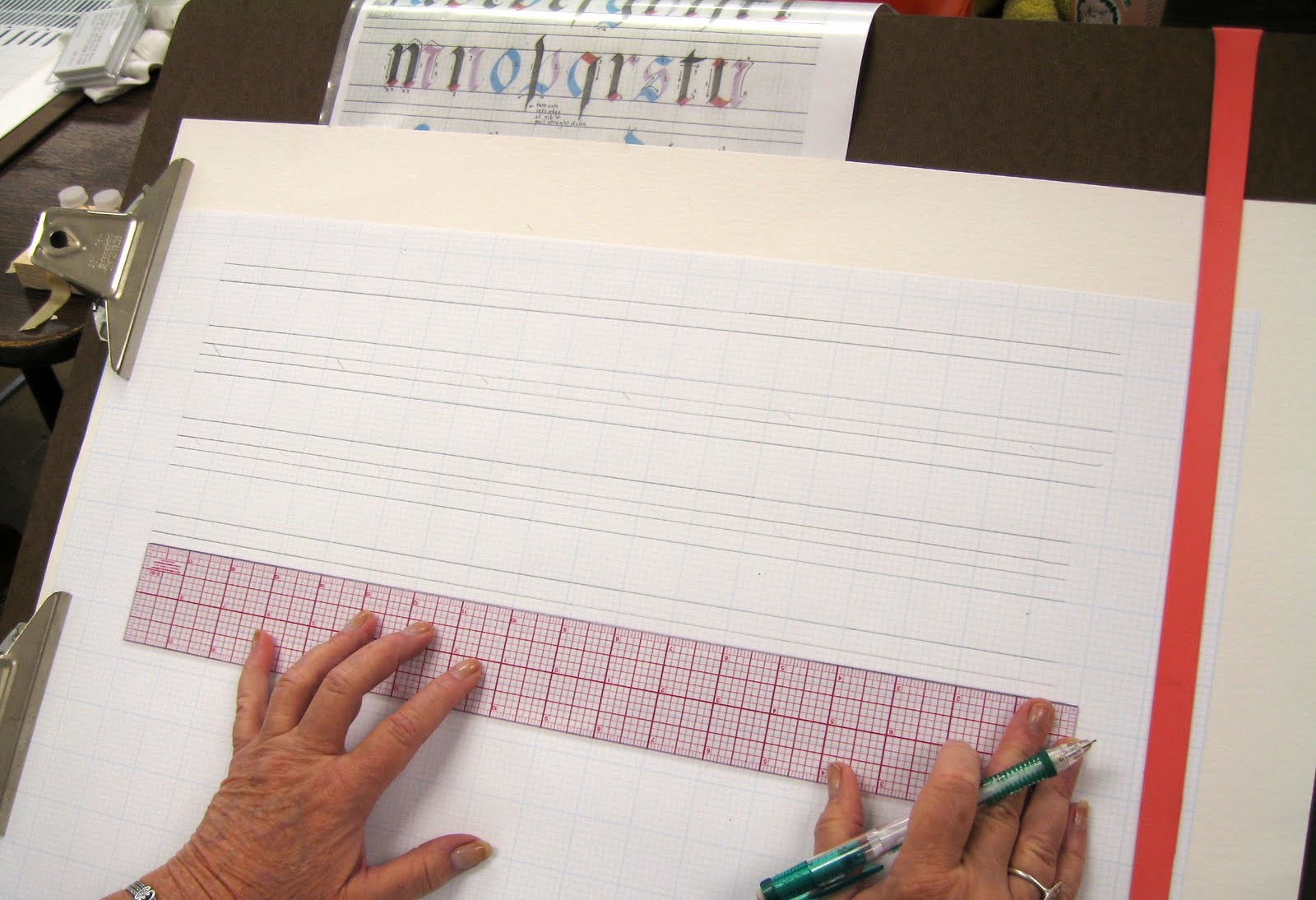
Lining the grid paper:  Using the 18” C-thru ruler easily creates a 2-inch margin on each side of the 17x22 sheet. By placing it in the middle, you don’t have to move it back & forth, just downward as you draw the lines with a sharp pencil.


For the 5mm Brause , the x-height (width between waist to base) for Fraktur is 5 pen widths (not to be confused with boxes on the grid paper), which is 1-inch or 8 boxes on the grid paper. The space from the waist to the ascender is 2 pen widths, which is 3 boxes; the space from the base to the descender is also 2 pen-widths, or 3 boxes. The ascender is also called an extender. Line the sheet so that the darker-blue (or thicker black for the Bee Paper) lines will form the x-height every other inch. Then divide the 8 boxes in-between in 3-2-3 boxes; the first 3 are the descender, then 2 boxes for inter-linear space (space between lines of writing), then 3 boxes for the ascender of the next line. DeAnn suggests lining the paper once, then cutting that strip to create a template that you can just place against a clean sheet so you don’t have to measure each time.


DeAnn says: Practice is rehearsal! Set up your tools and yourself correctly so you can write in an organized fashion and learn good writing habits.


Only practice on 1-side of the Bienfang paper. Once written on, the sheet will pucker and the writing will be visible from the other side too. However, the Bee Paper with the black lines is thick enough that you can try writing on the back too. Note: One side of the Bee Paper has 8 boxes per inch and the other side has 10 boxes per inch.


Parallel pens:  DeAnn prefers that beginning students practice exclusively with the chisel point nib, not markers or fountain pens. Markers can be made to write however you hold them, but DeAnn’s goal is to teach the correct way of writing the letterforms and she doesn’t want beginners to develop bad habits. Once you can write with the chisel point nib, you can write with anything. That being said, the parallel pen is a fountain pen with a good chisel point. So if intermediate students want to practice with the parallel pen, DeAnn has a few sizes available for sale.


Hints for Fraktur strokes:
Square:  starting with the 45-degree pen angle, stroke in the direction opposite of pen angle, until the length is same as the width. This is the thickest your pen will write. Practice this without the serif to get an idea of what the square shape looks like.

Rectangle:  start with the same 45-degree pen angle as the square, but stroke in a flatter direction.

Caution:  don’t let the serifs get too curvy. You don’t want to obscure the vertical strokes.


Curve:  start down at 1 whole pen width

Direction change:  entrance serif, then a slight s-curve in the downstroke

Dot:  like a comma; tiny bit of serif to start

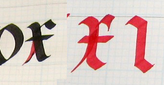
To create the lowercase Fraktur letters, use these strokes to form the letters. Pay close attention to the Exemplar and compare it to your own letters. Pay particular attention to the white space (or inner space) of the letters like a, o, etc.

Notes on individual letters:


i :  The vertical stroke doesn’t quite reach the waist-line. Until this period, “i”s weren’t dotted. The dot is also called a jot or tittle.

j :  like the “i”, but pull the vertical stroke all the way to the descender, letting it end at the regular pen angle so that it tapers

l :  start at ascender for the vertical stroke. You can put the square stroke decoration next (#2 stroke), then pull the top serif as #3. To make the thin line, use the left edge of your nib and draw the line using ink that’s pooled at the top of the vertical stroke. If there isn’t any pooled ink, squeeze some out of your nib by setting it at the beginning of the vertical stroke and pressing. Then draw out the line with the edge of your nib.

t :  place the left side of the nib on the waistline to start the vertical stroke. For the crossbar, put the right side of the nib on the waistline, then pull the cross-stroke. Becase of the 45-degree pen angle, both angles should match.


o :  should be about 5 boxes wide. Look at the white space (the inner space) carefully when comparing your letter to the Exemplar.

c :  First, let’s do the alternate “c” at the bottom of the Exemplar, which is more similar to the “o”. For the ending serif, twist your pen so that you can draw a line downward with the left edge of the nib. Beginners, if that’s too difficult to do right now, don’t worry about it – leave it as a rectangular stroke. If you’re using the Brause wooden pen-holder, then you have to twist your hand; but if you’re using a pen-holder with a round ferrule, then you can roll it between your fingers.

d :  for the alternate “d” at the bottom of the Exemplar – see where the left edge of the curve stroke is and move your eye upward so that you can start stroke #2 at the ascender with the same left edge but crossing it slightly.

q :  for the rectangle stroke, match the left side of stroke to the vertical stroke. For the end, roll onto left edge of nib but you don’t have to do it for now if you can’t.

a :  curve – rectangle – vertical stroke comes down toward the baseline, but just before it, take curve up just barely.

g :  like the “q”, match the left side of rectangle stroke to the vertical stroke, which curves out at the baseline (similar to the “a”) but then stops. Rectangle stroke meets it for the lower stroke.

c and d from top of Exemplar:  start a whole pen width (at 45-degrees) from the waistline to leave room for the rectangle stroke. Start with a slight serif and some curve. Then for the “c”, a rectangle stroke with decorative serif which goes down, NOT in. You don’t want to create a dark spot that will make it look like an “e”. For the “d”, start the last stroke at the ascender with the same left edge as the first stroke.


b :  start the vertical stroke at the ascender (this is also called the stem stroke). For the direction change stroke, start the serif at the stem stroke about ¼ away from the waistline. If you start too low, the white space maybe too narrow. The last stroke is a “thorn” – this type of decoration will also be used in the capitals.


e :  like the “c”, start one whole pen width (at 45-degrees) below the waistline. Then the rectangle stroke goes all the way in. You can also write an alternate “e” similar to the “c” at the bottom of the Exemplar.


f :  start one pen width (at 45-degrees) below the ascender. You can stop the vertical stroke as it approaches the descender or twist onto the left side of your nib to make the serif. Be careful not to make the rectangle stroke look like a flag blowing in the wind. The cross-stroke at the waistline should end at the same right edge as the rectangle stroke.


h :  the square stroke is a decoration, so don’t overdo it. The direction change stroke goes down to the descender.

k :  Alternate stroke sequence – you can do the square stroke second, then the serif for the vertical stroke.


m :  start at the waistline with a small serif, then make vertical stroke – square – then hairline that goes up and then over – square – then hairline into a rectangle stroke that ends into a vertical stroke with an exit serif.

n:  like the second half of the “m”; white space inside should be similar to that of the m.

p :  start at the ascender, like a flame at the top, then into a vertical stroke that you can stop or roll onto the left edge of the nib to taper off. The final rectangle stroke has a curvy entrance.


s :  think of the “s” within an “o” to achieve the correct width. Practice the first two strokes on top of an “o”.


v :  the first stroke is like the second stroke of the “o”. When writing the direction change stroke, look at the point where you want it to meet the rectangle stroke.

w :  start with a hairline at the waistline, then curve slightly above it before pulling the stroke toward the baseline. Then the rest is the “v” twice.

x :  start at the waistline with a hairline, then over and down and over again, ending with an exit serif. Stroke 3 is like a square beginning with a hairline from the stem stroke. The cross-stroke should end at about the same right margin as the bottom corner of the square stroke.

y :  live the “v” except swing the direction stroke beyond the rectangle stroke, then down to the ascender. Start stroke 4 with the same left edge as the rectangle stroke of stroke 2.

You can use the alternate letter forms within the same text. Depending on the letter-order or spacing, one form may be a better fit.  Experiment!


Be aware: are all the white spaces the same? For example, the inner space of the “a” should be the same as that of the “o” and “n”. Don’t overdo the serifs on the square and rectangle strokes. It may be better to leave off the serifs for now to concentrate on the letter forms themselves.

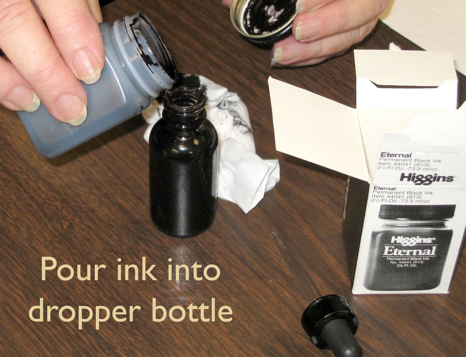
Cleaning the Brause chisel point nib:  Usually, wiping off the nib is enough between practice sessions. But if it has become crusty with dried ink, then it should be rinsed in water. To remove the nib from the holder, hold the nib in a rag – the sharp metal of the nib can cut your finger – and pull it out of the holder. Still holding the nib in the rag, then pull the reservoir off of the nib. Don’t let the reservoir wash down the drain! Put it aside. Wash the nib under running water and dry it off – because Higgins Eternal ink is not waterproof, it should eventually dissolve off the nib when it’s washed. Use an old soft toothbrush if you need to scrub it some more.

Putting the nib back together:  Make sure the nib and reservoir are dry; then put the reservoir on your finger (flat side down). Place the nib into it and hold onto the reservoir with your thumb and first finger as you push the nib back in .

HOMEWORK:  Practice the letters this week. If you feel comfortable with them, beginners can start writing words. Go to DeAnn’s website to get the list of “Words to Use for Spacing” which are words that emphasize spacing issues between letters. DeAnn's website is http://www.designingletters.com/  Go to "About", then "About Calligraphy" and you'll see a list of Homework items.

Intermediates can go ahead and write alphabet sentences  after writing the letters and then the words.

TIP:  Try to practice 15 minutes a day, rather than an hour Sunday night before class. A little more often is better practice than a longer session just once a week.

Sunday, September 19, 2010

Beverly Hills Journaling Class


Journaling Lesson Sequence and Thoughts

Illustration
So you’re not an artist. You don’t draw, paint, sketch, or even doodle well enough for a Post-It note. Have no fear. Your journals are an expression of your personal vision, private places to create as you see fit. Sometimes, it’s hard not to feel intimidated when you see other artist’s journals. Remember that your personal books are not finished artwork. They’re not about the results as much as they are about process. Your journals are along for the journey whether you’re the Da Vinci or, like the rest of us, your’re not.
Making Memory Books and Journals by Hand

Content

If you’re creating a journal specifically to document your personal history, you may find these types of books inspirational. Many contain s prompts to get the creative juices flowing . Try creating your own personal prompts such as the ones listed below. Keep your list somewhere in your journal to get you motivated when you find yourself staring at the blank page.
Once again, I don’t know what to write..
The last time this happened I….

This is who I am today…
This is what I did today….
This is what I like best/least about this (journal, pen, day, place, house, life, body)….
I keep journals because…
I wish I was…/ I’m glad I’m not…
If I could write in my journal to anyone it would be…
The next artistic technique I’m going to attempt in my journal is…..
The best thing about my journal is…

  1. Transfer Technique:
Materials needed: regular acetone, Chart-Pak burnisher, removable scotch tape, paper to use as a cushion, a glass container to put the acetone into. You must use a color or black and white Xerox or laser copy. It needs to be toner not from an inkjet printer. If the copy has lettering or needs to be printed in a particular direction then make the copy in the “mirror” image so when it prints it will be in the correct direction.
  1. Making a handmade journal. (closed: 5x7 or 8.5x11”)
Bring papers of different colors and textures also maps add a nice touch. We will combine them into a simple multi-signature binding. We will sew them with a 3-hole pamphlet stitch. I’ll bring some Tyvek to make the covers. If you have acrylic paint or ink, bring that with you along with large brushes and old credit cards or similar type tool to spread the paint. If you want thread that is colored bring that or embroidery thread. I have some colors and plain.
Pop-Ups

Thursday, September 16, 2010

Beverly Hills Journaling Class


This is the lesson sequence from last semester for the new students.

Journaling Lesson Sequence 


 There is no “must” in art, because art is free. Wassily Kandinsky

Material from Keeping a Watercolor Sketchbook by Brenda Swenson

Materials and Techniques to Try

  1. Water soluble pens.
Using Water-Soluble Pens. For these sketches, water-soluble pens are very useful. Once I’ve drawn the general shapes with this tool. I can wet the edge of my lines with a damp brush and easily create form and shadow. I can even go back and add more color with my pen if I want,
  1. Pencils, ink, watercolors, erasers; white plastic, kneaded eraser.
  2. Permanent pens keep your drawing from being affected by water.
  3. Colors; what paints are you using? Do you understand these paints?
  4. Sponges,
Color Study
What is value? It’s the way the eye reads light or dark. Most people are familiar with a gray scale of values, but colors also have a scale of tonal values. Yellows have the lightest hues, greens and reds have mid-range hues, and purples have the darkest hues. It’s easier to see values when squinting.

Saving and Retrieving Whites

Lifting color with masking.  Protect the surrounding color with artist’s tape, then lightly scrub with a damp sponge to remove color.
Lifting color without masking. Using a stiff brush loaded with clean water, gently scrub the paper to remove color.
Masking fluid. this rubbery substance can mask whites. Apply the mask, paint over it and then rub off the mask when the paint is dry.
Scraping with a razor. For small areas you can apply a razor to already-dried paint to gently scrape off lines of surface color.
Scraping with a knife. When damp paper has just lost its shine, you can use a palette knife to scrape off color.
Testing Transparency. Although watercolor is a translucent medium, not all paint colors are equally transparent. Knowing the strength of your colors’ transparency will help you predict how the colors will interact. Test each watercolor’s opacity by painting it over a dry band of water proof black ink. If the hue is visible on top of the line when the paint is dry, the color is opaque. You can also try overlapping different colors from you palette to avoid surprises when you combine the paints in your sketches.
            Overlapping Colors to Test Transparency. Colors that are more opaque than the yellow shown here (new gamboges) will seem to float above the yellow line, whereas colors that are more transparent will seem to sink below it. Even semi-opaque colors will appear transparent if diluted with enough water.
Glazing Colors. Because of their transparent nature, watercolors can be glazed on top of one another. The under-color will affect the top color, but the effect  varies depending on the transparency of the colors used. Paints with the same quality of transparency will produce more equal visual blends.
Granulating Colors. Certain pigment (such as manganese blue, raw sienna, and cobalt blue) granulate- meaning their pigments separate from the binder and settle into the grooves of textured paper. These colors can produce exciting effects, especially when depicting rusted metal, rocks, or wood. Experiment by mixing them with other colors or try them alone.
Mixing Greens. You may have already noticed that I don’t keep any green paints on my palette. I find that the ranges of greens I can mix with my existing colors are richer,m more varied, and more natural than those that come straight from the tube. Try mixing the blues and yellows from your palette to sample some of the many possible combinations.

Drawing what you see

There is a big difference between sketching what you actually see and sketching what you think you see. Because we have expectations about what we will see, in truth, we spend very little time looking. Take a few minutes to explore with your eyes. Don’t just register the objects around you , but look at their shape-or the many shapes that comprise one object. Notice how light affects the edges of objects,, and pay attention to whether the shadows are long or short. Then note if the colors are bright or muted.  If you take the time to slow down enough to really look at the world around you, you may find that you begin to see things in a different way-and you may even see some things for the very first time!

Simplifying Objects into Shapes and Forms

Every object is a three-dimensional form based on some combination of four basic geometric shapes the circle, oval. rectangle and triangle. Learning to see and recognize the shapes and forms in the objects surrounding you in essential if you want to create realistic sketches. It’s much easier to depict an object once we are able to break it down into simple shapes and forms!

Shapes-Forms

Circle-Sphere
Oval-cylinder
Rectangle-Cube
Triangle-Cone

Try turning everything into these elements. Combine these elements to become your subject.
Contour Drawing
Contour drawing is an excellent way to exercise your observation skills because it forces you to slow down and concentrate on the subject at hand. To create a contour drawing, first acknowledge the overall shape of your subject; then concentrate on one edge-or contour-at a time, To make a contour drawing carefully draw each edge as you follow it with your eyes, Focus on one edge at a time and draw exactly what you see. There’s beauty in a well-done line drawing.
If you would like to challenge yourself, you can also try making a continual-line contour drawing. With this approach, you draw the entire subject entirely without ever lifting your pen. Find a starting point. place your pen on the page and begin drawing the outline of your subject. Don’t pick up the pen until you have finished. The subject usually becomes a little distorted when working this way, but I think of the distortion as part of the charm.
Contour drawings are direct and honest representations of what you see-and they allow you to say so much with so little!

Recording Details
Break a scene down from a large to a small detail. Instead of drawing the whole valley of wildflowers, pick a few single blossoms to render.
Working in Monochrome
I typically draw with a colored water-soluble pen, pulling color from the line to lightly tint the paper. In the darker passages, I use the pen alone, without diluting the ink with water. You can also approach a monochromatic study by drawing the scene in pencil or pen and then tinting the paper with any one watercolor hue.
Monochromatic sketches done in sepia or burnt sienna have an old-world feel, similar to that of a tinted photo from long ago.
Simplifying with Vignettes
 The vignette is an open format that keeps information out of the corners and touches the border in only two or three spots. The uncomplicated design give the sketch a somewhat unfinished appearance, allowing a more spontaneous approach, I typically limit myself to four colors when working in a vignette format-applying a simplified palette to a simplified format. Try putting an outline around the drawing. (framing)

Finding the Best Format

Square, Vertical, Horizontal (both rectangles). Panarama rectangles(high contrast ratio); vertical and horizontal

Choosing a Viewpoint

Eye level, Bird’s eye view (above eye level), Worm’s eye view (below). These distinct viewpoints can add a more dramatic feel to even the most ordinary subjects. To experiment with points of view place your horizon either lower or higher on your page; then alter the angle-or perspective-accordingly, as shown in the examples here. You’ll often find that artists use more exaggerated points of view when painting landscapes and city scenes but still lifes and interiors can benefit from a slightly different perspective as well.

Rearranging Elements

Be willing to edit what you’re drawing and combine things that don’t necessarily really exist. Take a little of this and a little of that and combine them into one drawing or painting. Or make a Visual Collage of multiple images onto one page.


Color Awareness

It’s a good idea to make your own color wheel, so you can experiment with the color and how to mix different hues.

Warm and Cool Colors

Choosing colors isn’t just a matter of replicating what you see; colors possess an emotional quality that should also be taken into account. For example, warm colors (yellows, oranges and reds) emit life, energy and strength; whereas cool colors (greens, blues and purples) evoke quietude, tranquility, and serenity. You can use the inherent emotional aspects of colors to your benefit by exercising “temperature dominance.” Before you begin painting, first determine whether the mood you want to express is warm or cool; then let that choice guide your color selection.


Placement and Style of the Writing

You need to find a style of writing that is easy to write but is “easy” on the eye. When there lettering that is evenly spaced and enough light throughout it is more pleasing to look at on the page. Consider where you do the illustration and where you arrange the writing. I have an “italic” style and a “copperplate” style to choose from. It needs to be very evenly spaced so it compliments the drawing. You don’t want it to create dark spots on the page, it makes it too chaotic.
You need to learn to combine the illustration and writing in a harmonious way. Some of the ways to do this is to draw with the pen that you do the writing. At least include some strokes with the same tool that you will be writing,. Another technique is to put some of the color from the drawing into the writing. I like to put a brush stroke of one of the colors under the initial capital letter of the writing. Somewhat like an illuminated manuscript would start with the decorated capitals.
Composition of illustration and writing
  1. Picture with captions
  2. Picture with wrap-around text.
  3. Writing with picture drawn or painted on top.
  4. Picture with writing on top.
  5. Columns of writing with picture.


Painting is just another way to write in a diary. Pablo Picasso


Tuesday, September 14, 2010

September 13, 2010 - Beverly Hills Adult School Fraktur Class #1

Fraktur example by Satomi Wada
Beverly Hills Adult School Class #1:  Gothic Fraktur will be the hand taught this semester. It originated in the Middle Ages after Gothic Textura developed. Gothic Fraktur was used mostly in Northern Italy, France, England,  and Germany. “Fraktur” means “fracture”, as in fractured letters made up of both straight and curved lines, unlike Textura which only has straight strokes. Fraktur is very decorative and DeAnn will also be teaching flourishing of Fraktur this semester.

DeAnn distributed basic supplies. For this week, students will need black ink (Higgins Eternal), Brause wooden pen-holder, Brause 5mm nib, grid paper, inkwell, and a board. We’re starting with the 5mm Brause nib. DeAnn has nibs, ink, inkwells, and dropper bottles for purchase. See the suppliers list.

Today’s handouts were: Materials list, Gothic Fraktur exemplar, Gothic Fraktur sentences.

Preparing the ink:  once you open the Higgins Eternal ink, the bottle may leak if it falls over. So transfer the ink to a dropper bottle and leave the remaining Higgins Eternal ink at home. The dropper bottle shouldn’t leak even if it’s on its side. Fill one of the ink wells in your inky-dip almost to the rim. You’ll be taping down the whole inky-dip at the table’s edge; if you’re right-handed, it should be on the right side, if you’re left-handed, then it’s on the left side.


Pictures and information provided by Judy Shibata
Set up your tools and workspace correctly so that it will be easier to write without any back or wrist pain. Remember to tape down your dinky dip on the right (or left, if you’re a left-hander) to avoid spills and for ease of dipping your pen. Sit so that the angle of the board in your lap isn’t too high. The ideal writing area of the board is slightly above table level where it’s the most stable. So adjust your chair accordingly. If you’re right-handed, the clips of the board should be on the left so they don’t interfere with the movement of your arm as you write. Remember to use your left-hand as an anchor. Clip several sheets of paper to the board or use a blotter sheet for some padding. The sheet you’re writing on should NOT be taped down; instead, you should move it as needed so that you’re always writing in the same area of the board and not stretching or hunched over.

Use a document holder  (like a PageUp) so that it’s easy to see your exemplar or whatever sheet you’re looking at. Place it so that you don’t have to move your board to see it.

Be sure to line your paper before starting. Even if lining the paper seems like a chore, guidelines are necessary for good writing. Think of it as meditation.

Preparing (lining) the grid paper:  8 boxes on the grid paper equal an inch, with the darker blue lines indicating the inch-marks. Leave a 1 1/2-inch margin on top & bottom, 2-inch margin at the left & right. Label the top line “A” for ascender, the next line “W” for waist, then “B” for base, and the 4th line is “D” for descender.

To start, we’ll be using the Brause 5mm nib (largest one). Insert it toward the right side (when holding it) of the wooden nib holder. If you’re looking at the holder head-on, the nib will be toward the left edge.

Pen angle:  The Brause is a chisel-point pen, able to create thicks & thins within one stroke, based on the angle of the pen. Using a protractor as the reference, a pen angle of 0-degrees equates to holding the pen so that the nib is parallel to the horizontal lines of the grid paper.  A vertical stroke at this pen angle is the thickest; a horizontal stroke is the thinnest. If the pen angle is 90-degrees, then a vertical stroke is the thinnest and a horizontal stroke is the thickest. For a 45-degree pen angle, use a box as a reference and place the pen so that you’re placing it on the diagonal of the box. At this angle, both a vertical stroke and a horizontal stroke should be the same thickness.

x-height: is the height between the waist and base. Each hand has a specific x-height measured in pen-widths. At a pen angle of 90-degrees, draw short horizontal strokes to measure by pen widths.

Gothic Textura has a pen angle of 45-degrees and an x-height of 5 pen widths (equal to an inch or 8 boxes on the grid paper). The ascender and descender are 2-pen widths (about 3 boxes). A 45-degree pen angle goes from corner-to-corner (see exemplar for a diagram).

In class we practiced writing downstrokes & cross-strokes at 0, 90, and 45 degrees, at an inch in height. Dip the pen so the reservoir is 3/4 full. Wipe the nib on the edge of the ink well to take off any excess. We need to get fully familiar with this chisel point nib. Practice making straight lines with the nib. You need even pressure on both sides of the nib. Not a lot of pressure, just even pressure. The ink will flow better to begin with if you give a little side-to-side "rub" (like an ice-skate) with the nib. Or touch the tip to some wet ink on a previous stroke. As you draw the stroke down the page, EXHALE. This helps give a more controlled stroke. Also, set your opposite hand near the work so you can give slight pressure as you start down. These tips will help you have success quicker. At this large size, ink will puddle at the end of the downstrokes; don’t worry about it now, it’s natural & expected.

At this time it’s OK to wipe off your nib to clean it. DeAnn will show you how to remove the reservoir next time so don’t worry about washing it with water yet. When practicing, wipe your nib every 20 minutes or so to remove any paper residue, etc.

DeAnn went over the different strokes of Gothic Fraktur that make up the letter-forms. The pen angle is 45-degrees. The square stroke is short, the rectangle stroke is slightly flatter.

DeAnn’s TIP: Once you start writing (practicing), go to the end – don’t cross-out, crumple-up, stop & start elsewhere. Even if you feel like you’ve made a bad mistake, continue writing and don’t dwell on it. Don’t waste paper and don’t throw out your practice sheets. You’ll see improvement when you compare your older practice sheets to your newer ones.

HOMEWORK:  Practice the strokes. Don’t worry about the individual letters yet. Try tracing the individual strokes within the letters if you want to deconstruct the letters. Start at the top left of the paper and fill the sheet. Write your name and date in the lower right hand corner. Turn in a sheet or two at the next class for DeAnn to review and correct.

Classes have begun again!

Yay, classes have begun!!! I'm so happy to have art conversation again. I love teaching calligraphy and art so much! And even more, I love to see my students and catch up with how they are doing.
We started with a "THUD" on Monday at Beverly Hills. They changed the classroom to the High School, so anyone who hadn't registered early didn't know. There were registration issues because the office was closed the 2 days before class started. I really feel sorry for the office who had to get that all straightened out in time for classes to begin. Then the room that we were switched to wasn't ready and all the tables were stacked on top of each other. And all I could do is sit there while Judy and my husband carried everything from the car. I really felt helpless and was so sorry for all the students wandering around the streets and campus to find this illusive classroom #121. I extend my apologies to all who made the effort to be there and if anyone tried and gave up, please come back!!! I'm going to try to make a map so you'll know where to park and find the class. When I do, I'll post it here. For those that weren't there Judy will be posting the notes from class. And, while I'm talking about Judy Shibata, I want to say, right up front that she's an angel for helping me the way she has. You are a doll, and I appreciate you so much. Also, I want to thank Satomi Wada, Debra Moini and the other people in the class that were so helpful and put the class together. It really was a group effort. A thousand thanks to you all. I hope the office staff will be able to catch their breath and carry on. I'm still trying to figure out the best way of teaching from my wheel chair. I hope it won't be much longer before I can at least stand up.
The classes at Westchester have begun as well and I need a few more students for the morning class. If you have been thinking about learning a new letter style and you would like individual attention, this is the right class for you. Consider coming to the 9:30-11:30am class. It's very small so you can learn quickly. Let me know if you're interested in coming and what style you want to learn and I'll prepare for you. See you all soon!

Saturday, September 4, 2010

I got my cast off!! School starts soon

NO CAST!
 Rooney keeping watch over me. (With his eyes closed)
Yay....I got my cast off on Monday! I now can scratch my ankle as much as  I want. Aaahhhhhhh!!! That feels sooo good! I washed it and got a lot of the dead skin off and it looks pretty good. I do miss the stylish purple and pink of my cast though the "boot" is black, which goes with my usual black attire but isn't showy like the cast. But, I find the boot much easier to get around. I still can't put weight on my leg for 1 month, but I balance much better with the boot when I'm using crutches. So it is getting easier with each new development. I don't know how long before I can drive. But, honestly, I'm going crazy being stuck at home all the time so I may have to drive with my left foot.
School starts in about another week. I went to Beverly Hills to see the new classroom that they've assigned to me. This is truly a new thing since I've been in the Scout House for years and I'm quite fond of it. Some don't appreciate it's charm much, but I like it. Yet, of all the times to change rooms, when I can't move any of my things from one to the other. And the new classroom is #121at the High School where it's really uphill from the parking. I don't know how I'm going to wheel myself in the wheelchair to get there. I will go with the flow, and make the best of it. In the end I think it will be great!