

DeAnn reviewed common mistakes she saw in the homework:

o : should be symmetrical around the vertical axis. If you look at it upside down, it should look the same.

u : don’t end the initial vertical stroke too low, so you can start the rectangle stroke higher.

b, f, h, l : start the vertical stroke with a tiny bit of curve at the ascender, to smooth the transition of the hairline.


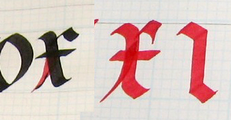
alternate f : instead of rectangle stroke ending with a curve, bring it down in a hairline into the cross-stroke.

w : after the initial curve, start the rectangle stroke high enough, then the direction change stroke low enough to reach the waist.

x : soften the fractures just enough so that they’re smooth transitions, but not too curvy. Start stroke 2 high within the stem stroke so that it smoothly branches outward.
m : start with a softened version of the square-stroke-serif vertical stroke. If the last stroke curves out, put that vertical stroke closer because the curving out adds white space to that last inner space. An alternate ending to “m” or “n” is to bring the stroke down toward the descender.


d : don’t overlap the vertical strokes, so start at the waistline and be sure that the final stroke doesn’t overlap the first stroke.

a : don’t curve the first stroke too wide. Look closely at the Exemplar, the first curve stroke is fairly straight. Stop the rectangle stroke when it’s even with the end of the first curve stroke.

Letter Spacing: all the inner white spaces should be similar. If the letter form’s strokes are all straight (e.g. “minimum”), then the spaces between the strokes should be the same. The difficulty comes in judging the correct spacing between curved and straight strokes. If two curves are next to each other (e.g. “oo”), they can be very close together, even overlapping. A particularly difficult letter combination is “ev” – DeAnn is thinking of creating an alternate “v” that will fit in better next to the “e”.

For letters that have a “hangover” like “c”, “e”, “r”, “t”, “f”, “x”, leave the square serif off of the next letter and overlap or tuck underneath to start the down-stroke. E.g. er, ru, ei, ci, ce.

General rule of thumb on spacing: write out “minimum” with the correct spacing. The overall “color” of the text should match that of “minimum” – by “color”, DeAnn means how the text looks at a distance while squinting your eyes.
TIP: after writing out text, hang it on the wall and take a break. Then come back and stand some distance from it and squint your eyes. Do any white spots stand out? Do you see any dark spots? Those are the areas that are spaced too far apart or too close together.

REMEMBER: It’s more important to get the spacing correct than each individual letterform being perfect. Even if some of your letters don’t look very good, your piece will still look good with the correct spacing. But even if you have beautiful individual letters, your piece will not look good if your spacing is not correct.

Illuminated Manuscript Project: start thinking about what text you may want to use. Any text that you like is OK. You’ll need about 40 words, but even if your text is too long, you can edit an excerpt from it.
 |
| Example from Gothic Textura semester |
Next week DeAnn will go over the capital letters using the 5mm Brause nib.
HOMEWORK: Beginners, continue writing words, then go on to write alphabet sentences .
Intermediates can go down to the 2 ½ mm Brause nib. The x-height is ½-inch (4 boxes); use an ascender/descender of 2 boxes (1/4 inch). Practice alphabet sentences and text, if you find something you like for the project.
No comments:
Post a Comment