
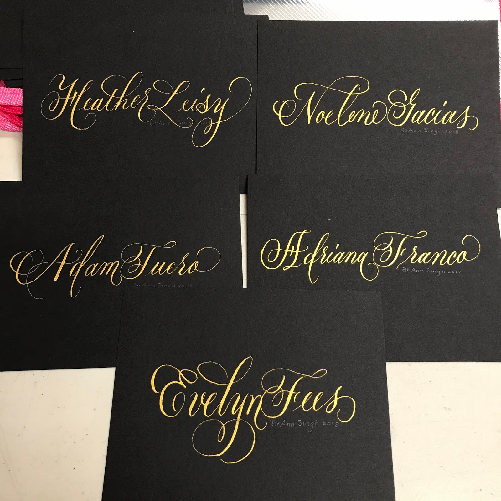
Tues. Night Classes
Starting January 22, 7-9 pm 6 weeks $180.00 cash, check, Venmo
Modern Pointed Pen
4032 Marcasel Avenue. Los Angeles CA 90066
deannsingh@me.com email for registration
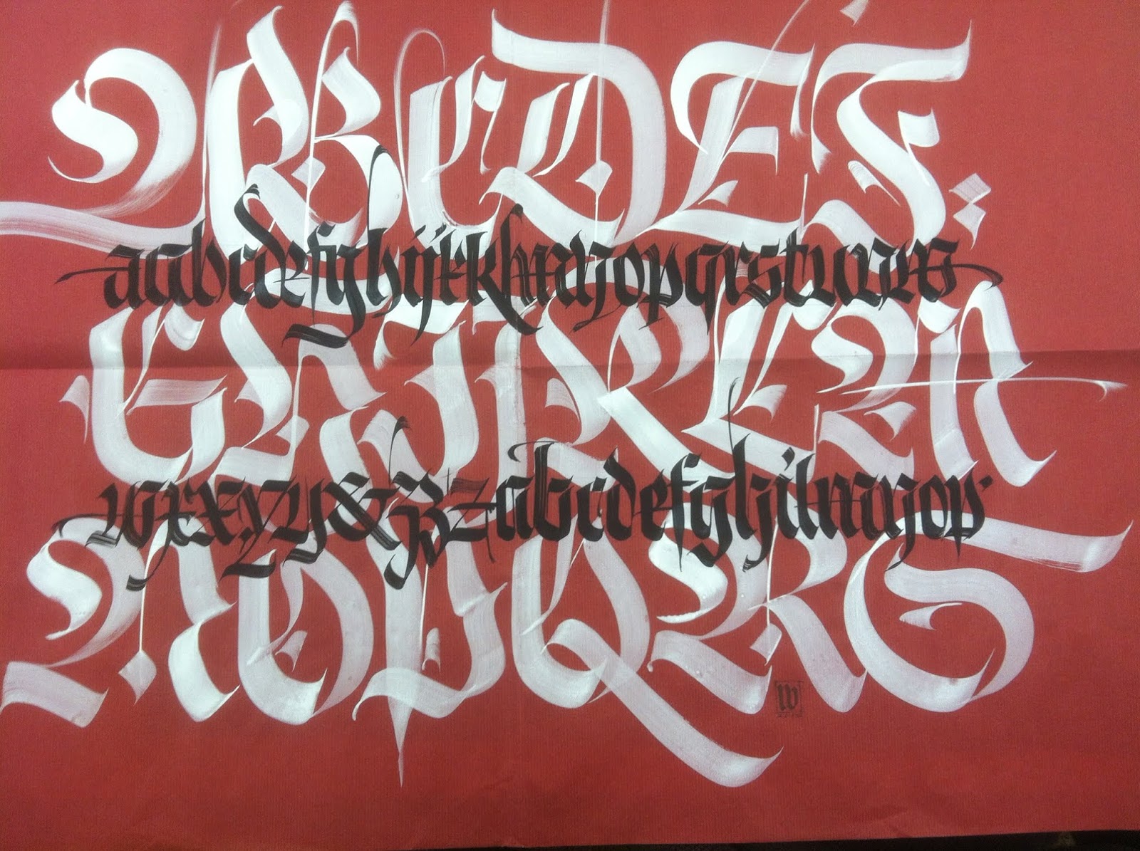
Wednesday Night Classes
Start Jan. 23, 7-9 10 weeks pay for 9 weeks get 10th week free $270.ºº
Fraktur and Textura Large To Small: Ancient to Modern, In Book Form!
 |
| Luca Barcelona |

 |
| Molly Gaylor |


