
 |
| Fraktur example by Satomi Wada |
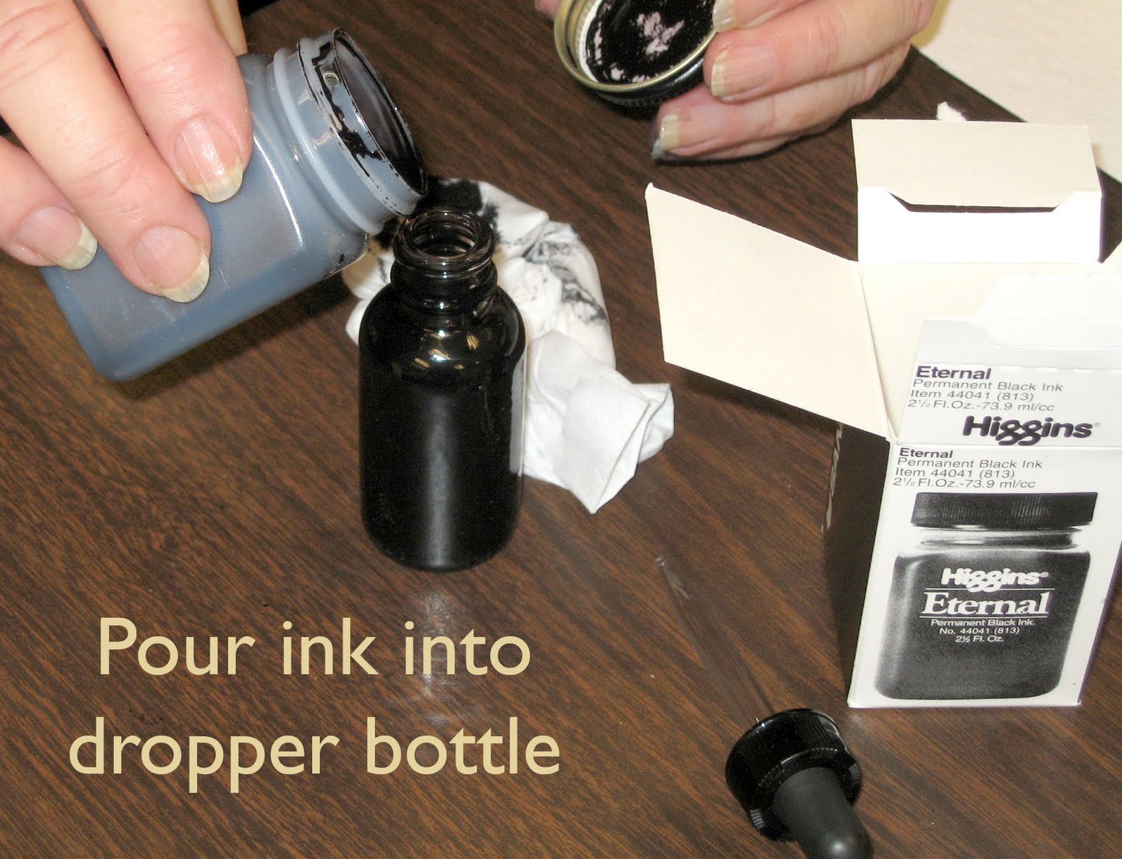
DeAnn distributed basic supplies. For this week, students will need black ink (Higgins Eternal), Brause wooden pen-holder, Brause 5mm nib, grid paper, inkwell, and a board. We’re starting with the 5mm Brause nib. DeAnn has nibs, ink, inkwells, and dropper bottles for purchase. See the suppliers list.
Today’s handouts were: Materials list, Gothic Fraktur exemplar, Gothic Fraktur sentences.
Preparing the ink: once you open the Higgins Eternal ink, the bottle may leak if it falls over. So transfer the ink to a dropper bottle and leave the remaining Higgins Eternal ink at home. The dropper bottle shouldn’t leak even if it’s on its side. Fill one of the ink wells in your inky-dip almost to the rim. You’ll be taping down the whole inky-dip at the table’s edge; if you’re right-handed, it should be on the right side, if you’re left-handed, then it’s on the left side.

 | |
| Pictures and information provided by Judy Shibata |
Use a document holder (like a PageUp) so that it’s easy to see your exemplar or whatever sheet you’re looking at. Place it so that you don’t have to move your board to see it.
Be sure to line your paper before starting. Even if lining the paper seems like a chore, guidelines are necessary for good writing. Think of it as meditation.
Preparing (lining) the grid paper: 8 boxes on the grid paper equal an inch, with the darker blue lines indicating the inch-marks. Leave a 1 1/2-inch margin on top & bottom, 2-inch margin at the left & right. Label the top line “A” for ascender, the next line “W” for waist, then “B” for base, and the 4th line is “D” for descender.
To start, we’ll be using the Brause 5mm nib (largest one). Insert it toward the right side (when holding it) of the wooden nib holder. If you’re looking at the holder head-on, the nib will be toward the left edge.
Pen angle: The Brause is a chisel-point pen, able to create thicks & thins within one stroke, based on the angle of the pen. Using a protractor as the reference, a pen angle of 0-degrees equates to holding the pen so that the nib is parallel to the horizontal lines of the grid paper. A vertical stroke at this pen angle is the thickest; a horizontal stroke is the thinnest. If the pen angle is 90-degrees, then a vertical stroke is the thinnest and a horizontal stroke is the thickest. For a 45-degree pen angle, use a box as a reference and place the pen so that you’re placing it on the diagonal of the box. At this angle, both a vertical stroke and a horizontal stroke should be the same thickness.
x-height: is the height between the waist and base. Each hand has a specific x-height measured in pen-widths. At a pen angle of 90-degrees, draw short horizontal strokes to measure by pen widths.
Gothic Textura has a pen angle of 45-degrees and an x-height of 5 pen widths (equal to an inch or 8 boxes on the grid paper). The ascender and descender are 2-pen widths (about 3 boxes). A 45-degree pen angle goes from corner-to-corner (see exemplar for a diagram).

In class we practiced writing downstrokes & cross-strokes at 0, 90, and 45 degrees, at an inch in height. Dip the pen so the reservoir is 3/4 full. Wipe the nib on the edge of the ink well to take off any excess. We need to get fully familiar with this chisel point nib. Practice making straight lines with the nib. You need even pressure on both sides of the nib. Not a lot of pressure, just even pressure. The ink will flow better to begin with if you give a little side-to-side "rub" (like an ice-skate) with the nib. Or touch the tip to some wet ink on a previous stroke. As you draw the stroke down the page, EXHALE. This helps give a more controlled stroke. Also, set your opposite hand near the work so you can give slight pressure as you start down. These tips will help you have success quicker. At this large size, ink will puddle at the end of the downstrokes; don’t worry about it now, it’s natural & expected.
At this time it’s OK to wipe off your nib to clean it. DeAnn will show you how to remove the reservoir next time so don’t worry about washing it with water yet. When practicing, wipe your nib every 20 minutes or so to remove any paper residue, etc.
DeAnn went over the different strokes of Gothic Fraktur that make up the letter-forms. The pen angle is 45-degrees. The square stroke is short, the rectangle stroke is slightly flatter.
DeAnn’s TIP: Once you start writing (practicing), go to the end – don’t cross-out, crumple-up, stop & start elsewhere. Even if you feel like you’ve made a bad mistake, continue writing and don’t dwell on it. Don’t waste paper and don’t throw out your practice sheets. You’ll see improvement when you compare your older practice sheets to your newer ones.
HOMEWORK: Practice the strokes. Don’t worry about the individual letters yet. Try tracing the individual strokes within the letters if you want to deconstruct the letters. Start at the top left of the paper and fill the sheet. Write your name and date in the lower right hand corner. Turn in a sheet or two at the next class for DeAnn to review and correct.
No comments:
Post a Comment