Showing posts with label italic. Show all posts

Sunday, November 27, 2016

11/14/16 Sinai Temple Fall 2016 Class #3 - Italic

DeAnn reviewed spacing and the shape of monoline italic letters. Then she demonstrated writing with the 2.4 mm Parallel Pen or equivalently, the Brause 2 1/2 mm chisel point nib. She explained pen angle and how it affects the thickness of the strokes.

Review:  make sure the triangular shapes of the a-family and branching-family are the same. If you're going to err, err on making it too pointy than too round.

Italic with the chisel point nib:  To start, we used the 2.4 mm Parallel Pen and the 1/2-inch guidelines with 5-degree slant. If you have the Brause holder that’s flat on one side, insert it toward the right side (when holding it) of the wooden nib holder. If you’re looking at the holder head-on, the nib will be toward the left edge.

Pen angle:  A chisel-point pen is able to create thicks & thins within one stroke, based on the angle of the pen. Using a protractor as the reference, a pen angle of 0-degrees equates to holding the pen so that the nib is parallel to the horizontal lines of the grid paper.  A vertical stroke at this pen angle is the thickest; a horizontal stroke is the thinnest. If the pen angle is 90-degrees, then a vertical stroke is the thinnest and a horizontal stroke is the thickest. For a 45-degree pen angle, use a box as a reference and place the pen so that you’re placing it on the diagonal of the box. At this angle, both a vertical stroke and a horizontal stroke should be the same thickness.


x-height: is the height between the waist and base. Each hand has a specific x-height measured in pen-widths. At a pen angle of 90-degrees, draw short horizontal strokes to measure by pen widths.


Italic has a pen angle of 45-degrees and an x-height of 5 pen widths, which equals 1/2-inch for the Brause 2 1/2 mm nib or 2.4 mm Parallel Pen.


In class we practiced writing downstrokes & cross-strokes at 0 and 90 degrees. Practice making straight lines with the Parallel Pen. You need even pressure on both sides of the nib. Not a lot of pressure, just even pressure. The ink will flow better to begin with if you give a little side-to-side "rub" (like an ice-skate) with the nib. Or touch the tip to some wet ink on a previous stroke. As you draw the stroke down the page, EXHALE. This helps give a more controlled stroke. Also, set your opposite hand near the work so you can give slight pressure as you start down. These tips will help you have success quicker.

Writing vertical strokes at a 45-degree pen angle:  set your nib corner-to-corner and don’t move until you achieve that angle. Watch the left side of your nib and pull straight down. Keep the angle steady and constant; don’t turn the pen holder in your fingers. The angle at the top of the stroke should be the same at the bottom; look at the triangle shapes – they should be the same.

The chisel point dip pen doesn’t push well, especially at the larger sizes like 5mm. So you can make a “pull” stroke at the end of the “b”, for example (similar to top of the “a”). The Parallel pen is a fountain pen so you may be able to "push" a stroke more easily.

To achieve the thicks and thins with the chisel point nib, you must keep it at the same angle. Don’t turn the pen-holder in your fingers as you make a curved stroke.

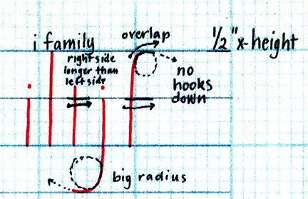
The first line of the exemplar is the sans serif (i.e. “no serif) Italic lowercase. We started with the i-family. Note that when you end the stroke at the baseline, the left-hand edge of the downstroke touches the baseline at a 45-degree angle, creating a triangle-shape. On the "t" the crossbar is longer on the right side. Similarly on the "f", the crossbar is longer on the right side and should be about even with the second stroke.


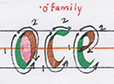
o-family:  the "e" should connect horizontally in the middle of the first stroke.

branching-family:  the width of the "n" should be the same width as the "o". The "r" should start to branch closer to the waistline instead of midway.


a-family:  the "u" is an upside-down "n". The counterspies (white spaces) of these letters should be similar to those of the branching-family and o-family letters.  For "d", once you make the loop, look at the left edge of your pen and draw your eye up to the ascender for the start point. Then keep your eye on the baseline where you will end your stroke as you pull down. Don't overlap the third stroke into the counterspace.


diagonal family:  when writing at the 5-degree slant, the first stroke of the v and w will be straighter than the second stroke. For the "x" flatten the pen nib slightly on the second stroke to thicken it.


Once  you’re comfortable with writing the sans serif letters, try adding serifs to the letters. Because DeAnn recommends rubbing back and forth slightly to start, the letters already have a slight entrance serif. To add an exit serif, continue the downstroke instead of stopping and exit upward with a hairline. Don’t flick the stroke.


close-up of the exit serifs on t and h

When practicing the lowercase letters from the exemplar, write a letter about 3 times, then move on. Compare your letter to the exemplar and really look at the shapes.

Remember:  write with even pressure, not too hard. Then less pressure on the upstrokes.

Homework:  Practice the sans-serif Italic lowercase letters. Write words and alphabet sentences.

Next week:  capitals!

Monday, October 31, 2016

10/31/16 Sinai Temple Fall 2016 Class #1: Monoline Italic

This semester DeAnn is teaching Italic, starting with Monoline Italic, then chisel-point Italic, and then helping students develop their own style of Italic.

First DeAnn explained the proper posture for writing so that you can move your whole hand. Sit at a slight angle to the table so that your right arm can rest on the table. User your left hand as an anchor. Left-handed folks should do the reverse. Use several sheets of paper underneath the sheet you're writing on for some padding. We'll be using a pencil on regular blank paper and use the 1/2-inch guidelines.

DeAnn explained the guideline sheet - we started with the 1/2-inch x-height guidelines. The x-height is the height on the letter x (or n, a, c, etc. - any letter without ascenders or descenders), waist is its height and base is the line on which the letter sits. The ascender-line is the height of the letter l and the descender-line is the length a letter like g dips below the baseline.


For monoline italic, the ascender and descender are the same height as the x-height.

The 1/2-inch x-height guideline in the handout has a 5-degree slant, which is the slant for Italic. All vertical strokes should be written parallel to the slant line. However, the Italic Monoline exemplar has no slant, so you can practice on the grid-paper and not worry about the slant line yet if you prefer.

First DeAnn had us write an i from the waist to the base, parallel to the slant. Then we practiced the l from ascender to base. For the "t", the crossbar is longer on the right side. For the "f", start slightly below the ascender.


o-family:  For the "o", start slight below the waist for the first stroke, then overlap the second stroke at the start and end. The "e" loop ends with a horizontal stroke, not a slanted one.


branching-family:  for the "n", go down, back up halfway, branch out, hit the waist line, then go down. Be aware of the distinct triangular shape made by the branching-out stroke of the "n"; it's not a Roman arch. The "b" is like an "h" except start to curve slight above the base, then connect to the first stroke along the base. For the "r", branch-out above the half-way point, as you don't want to make the letter too wide. For the "p", after pulling the first stroke down to the descender, lift your pencil and start at the base to form the branching-out stroke.


a-family:  the "u" should be exactly like an upside-down "n". For a, g, q, and d, start at the waist and curve slightly before making the "u"-shape. Then connect the top.


diagonal family and s:  if you're using the guidelines with the slant, for v & w, make the first downstroke straighter and the second stroke more slanted. This gives the impression that the letter is parallel to the slant.


For the "s", practice on the 8x8 grid paper by drawing a 1/2-inch rectangle that is 4 x 2 boxes. Draw a line at the midpoint and sketch a circle in each square. Then the main stroke of the s follow the curves and the top and bottom ending strokes are straighter than the circular curves.


Don’t move your wrist when writing – for long downstrokes, move your whole arm. Remember to use your left hand to anchor the paper. Using the other hand also helps to keep you from clenching your writing hand too tightly.


Picket Fence spacing:  for Italic monoline (and Italic,),picket fence spacing means that all the counterspaces, or negative spaces, match. The positive spaces (i.e. the strokes or the “pickets” of the fence) are equidistant. The counterspace is the inside space of the letter. This will be the basis of flourishing that you’ll learn later. If the picket fence foundation isn’t strong and steady, the flourishing will look weak. DeAnn says "look at the space you just created and create one that's similar."

HOMEWORK:  Practice the Monoline Italic alphabet with pen or pencil on regular paper or 8x8 grid paper. Trace the letter on see-through paper or tracing paper. DeAnn's mantra is:  quality of practice is more important than quantity of practice. Slow down and really study the exemplar.

Remember to put your name and date in the lower right-hand corner. DeAnn will review all homework and make corrections where needed.

Sunday, August 14, 2016

Fall schedule, Copperplate, Italic

DeANN SINGH:
4032 Marcasel Ave.
Los Angeles, CA 90066 
(Mar Vista, West Los Angeles)
310-702-4042
Private Lessons available during the 
week and weekends. Email for an 
appointment. Beginning Sept.13, 2016

DESIGNING LETTERS STUDIO  
$300  9 students max.
Copperplate: Beginning and intermediate. Elegant and formal style that's so fun to write, just in time for the holiday season. 
Tuesday 7- 9pm 10 weeks. 
Sept.13 - Nov.22, 2016
Roman capitals and variations including some simple book binding projects. Wednesday Sept. 13(?) 10 weeks This is an on-going intermediate class that anyone can join that has intermediate skills and wants to do a variety of calligraphic and book arts projects. Really fun!


Sinai Temple:  October 31- December 19, 2016
10400 Wilshire Blvd, LA 90024 10:30-1pm 8 weeks
Italic letterforms, then make it your own personal style. Writing in watercolor and using colored papers fun design arrangements.
Beginning through advanced students welcome
Register rbermanr@yahoo.com 18 student limit

Tuesday, April 23, 2013

April 15, 2013 - Last Italic class at Sinai Temple

DeAnn passed out 3 more guideline sheets for Italic:  x-height = ¼” using the 1.5 mm nib; x-height = 3/16” for the 1 mm nib; guidelines for the ¾ mm nib to use with the 1mm nib when addressing envelopes or writing placecards.

Student’s finished and in-progress Illuminated Manuscript projects. (click on image to see it at a larger size)

Judith's Can Can piece

Judith's Calder piece

Trini's piece
Barbara's piece

Linnea's piece

Caroline's piece (Uncial)


Sunday, March 10, 2013

February 25, 2013 - Class #5 at Sinai Temple

DeAnn demonstrated writing with the Brause 2.5mm chisel point nib at a 5-degree slant. She went over issues seen in the homework.


Homework review:
If you encounter drag on the upstroke when writing with the 5mm nib on the blue grid paper, try switching to the black grid paper. It seems to have a smoother surface and also bleeds less.
Be aware of your pen angle; if it’s too flat (i.e. less that 45-degrees), then the down-strokes will be thicker and the letters will look heavier on the page. Before you start a stroke, make sure your nib goes from corner-to-corner at a 45-degree angle.
The correct pen angle for Italic

Use heavier pressure on the down-stroke, lighter pressure on the up-stroke. Keep the nib flat on the paper.
The x-height (space from waist to base) for the 5mm nib is 1-inch. The x-height for the 2.5 mm nib is ½ inch (or 4 boxes on the 8x8 grid paper). Remember to line the paper correctly so that the letters will be the correct height.
Lining the grid paper for the 5 mm nib; x-height = 1 inch (step 1)

Lining the grid paper:  For the 5 mm nib, the black grid paper already has darker lines 1-inch apart. Label the lines as ascender, waist, base, descender, or put an “x” on the line to write on.

If you’re using the blue grid paper, line the paper at 1-inch intervals with a pencil so that it’s clear where the waist and base lines are. Using the 18” C-thru ruler easily creates a 2-inch margin on each side of the 17x22 sheet. By placing it in the middle, you don’t have to move it back & forth, just downward as you draw the lines with a sharp pencil, preferably with 2H lead. The grid of the ruler matches the grid paper (on the 1-inch = 8 boxes side of the double-sided grip paper, the Beinfang paper with the blue lines is the same-size grid on both sides). Match the appropriate line of the ruler to the grid and make the 1-inch lines darker.

For 2.5 mm nib, the x-height is ½-inch, so you need to draw lines between the darker lines on the 8x8 grid paper. Because pencil is hard to see against the black lines, use a colored thin marker or sharp color pencil.
Lining the paper for the 2.5 mm nib; x-height = 1/2 inch (step 2)

Accuracy is more important than speed. If using a pencil, twirl it slightly as you line so that it stays sharp. Hold the ruler with your left hand and with your right hand, draw the line from left to right.

If the 17x22 paper is too large and unwieldy to write on at the ½-inch x-height, tear it in half and then line it.

Drawing the slant lines:
The typical slant for Italic is 3 – 15 degrees. We’re going to use 5-degrees. You can use a protractor to make the first slant line. Then use the 18” c-thru ruler to make parallel lines ½-inch or 1-inch apart for the rest of the page.

Shortcut to make the 5-degree slant without a protractor:  Make 2 dots 11-inches apart vertically. Then make a 3rd dot 1-inch away horizontally from the top dot. Connect the bottom dot and the 3rd dot and you’ll have a 5-degree slant line.

grid paper lined for the 2.5 mm nib with slant lines of 5-degrees
Writing with a slant:  Keep the pen angle at 45-degrees, but instead of following the vertical grid lines, write against the slant lines. The downstrokes should be parallel with the slant lines. Your eye bounces back and forth between the slant line and the stroke you’re making to make them parallel. Look at the previous letter and try to make the next letter parallel to that one.

The exit serif (see Italic minuscule handout) should go in the direct of the pen angle to make a “hairline serif.” It’s not a flick; follow through the stroke on the paper.
radius of exit serif should be small. the one on the "i" is too big.
entrance serifs, picket-fence spacing, exit serifs


This is step 3. Step 1 is writing with the 5 mm nib at 90-degrees (i.e. no slant). Step 2 is writing with the 2.5 mm nib at 90-degrees. Step 3 is writing with the 2.5 mm nib with a 5-degree slant.

HOMEWORK:  Write alphabet sentences or other text with the 2.5 mm nib at a 5-degree slant. Remember to line the paper accurately. It might seem tedious, but it’s important to have the paper lined correctly.

Monday, February 25, 2013

February 11, 2013 - Class #4 at Sinai Temple

DeAnn demonstrated writing with the Brause 5mm chisel point nib. She explained pen angle and how it affects the thickness of the strokes.

Satomi's Italic monoline homework

Italic with the chisel point nib:  To start, we’ll be using the Brause 5mm nib (largest one). If you have the Brause holder that’s flat on one side, insert it toward the right side (when holding it) of the wooden nib holder. If you’re looking at the holder head-on, the nib will be toward the left edge.

Pen angle:  The Brause is a chisel-point pen, able to create thicks & thins within one stroke, based on the angle of the pen. Using a protractor as the reference, a pen angle of 0-degrees equates to holding the pen so that the nib is parallel to the horizontal lines of the grid paper.  A vertical stroke at this pen angle is the thickest; a horizontal stroke is the thinnest. If the pen angle is 90-degrees, then a vertical stroke is the thinnest and a horizontal stroke is the thickest. For a 45-degree pen angle, use a box as a reference and place the pen so that you’re placing it on the diagonal of the box. At this angle, both a vertical stroke and a horizontal stroke should be the same thickness.


x-height: is the height between the waist and base. Each hand has a specific x-height measured in pen-widths. At a pen angle of 90-degrees, draw short horizontal strokes to measure by pen widths.


Italic has a pen angle of 45-degrees and an x-height of 5 pen widths, which equals 8 boxes or 1-inch on the 8x8 grid paper. The 5mm nib should fit one box corner-to-corner.
the 5mm Brause nib has an x-height of 1-inch

In class we practiced writing downstrokes & cross-strokes at 0 and 90 degrees, at an inch in height. Dip the pen so the reservoir is 3/4 full. Wipe the nib on the edge of the ink well to take off any excess. We need to get fully familiar with this chisel point nib. Practice making straight lines with the nib. You need even pressure on both sides of the nib. Not a lot of pressure, just even pressure. The ink will flow better to begin with if you give a little side-to-side "rub" (like an ice-skate) with the nib. Or touch the tip to some wet ink on a previous stroke. As you draw the stroke down the page, EXHALE. This helps give a more controlled stroke. Also, set your opposite hand near the work so you can give slight pressure as you start down. These tips will help you have success quicker. At this large size, ink will puddle at the end of the downstrokes; don’t worry about it now, it’s natural & expected.

Writing vertical strokes at a 45-degree pen angle:  set your nib corner-to-corner and don’t move until you achieve that angle. Watch the left side of your nib and pull straight down. Keep the angle steady and constant; don’t turn the pen holder in your fingers. The angle at the top of the stroke should be the same at the bottom; look at the triangle shapes – they should be the same.

The chisel point pen doesn’t push well, especially at the larger sizes like 5mm. So you can make a “pull” stroke at the end of the “b”, for example (similar to top of the “a”).

To achieve the thicks and thins with the chisel point nib, you must keep it at the same angle. Don’t turn the pen-holder in your fingers as you make a curved stroke.

When practicing the lowercase letters from Satomi’s exemplar, write a letter about 3 times, then move on. Compare your letter to the exemplar and really look at the shapes.


Satomi’s exemplar is the sans serif (i.e. “no serif) Italic lowercase. Once  you’re comfortable with writing the sans serif letters, try adding serifs to the letters. Because DeAnn recommends rubbing back and forth slightly to start, the letters already have a slight entrance serif. To add an exit serif, continue the downstroke instead of stopping and exit upward with a hairline. Don’t flick the stroke.


close-up of the exit serifs on t and h

Remember:  write with even pressure, not too hard. Then less pressure on the upstrokes.

Cleaning the Brause chisel point nib:  Usually, wiping off the nib is enough between practice sessions. But if it has become crusty with dried ink, then it should be rinsed in water. To remove the nib from the holder, hold the nib in a rag – the sharp metal of the nib can cut your finger – and pull it out of the holder. Still holding the nib in the rag, then pull the reservoir off of the nib. Don’t let the reservoir wash down the drain! Put it aside. Wash the nib under running water and dry it off. Use an old soft toothbrush if you need to scrub it some more.

Putting the nib back together:  Make sure the nib and reservoir are dry; then put the reservoir on your finger (flat side down). Place the nib into it and hold onto the reservoir with your thumb and first finger as you push the nib back in.

If you do lose a reservoir, the reservoir from any other Brause chisel point nib will fit.

Homework:  Practice the spacing words and alphabet sentences with the 5mm nib. Once you’re comfortable, go down to the 2.5 mm nib (it says “2 ½ mm” on the nib). The x-height will be 4 boxes or ½-inch. Be sure to line your paper with the proper x-height.