Showing posts with label painting. Show all posts

Monday, January 24, 2011

January 24, 2011 - Beverly Hills Adult School Uncial Class #2

Detail of Satomi's name-tag

Beverly Hills Adult School Uncial Class #2:  The handouts this week are the monoline Uncial stroke sequence sheet, a chisel-point Uncial stroke sequence sheet, and a packet of Uncial examples. DeAnn had us warm-up by writing letters with the Speedbal B1 nib and an x-height of 1-inch. Then we practiced writing our names so we could make a name-tag for ourselves. We then painted the counterspaces with watercolors.

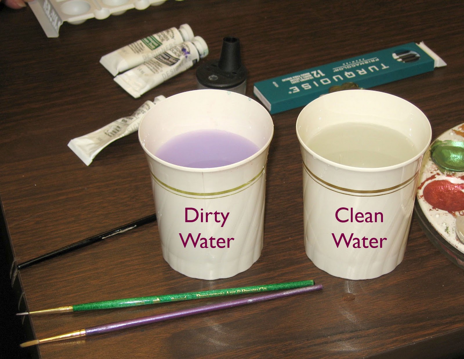
Setting up your workspace for watercolors:  have 2 water containers, one for dirty, one for clean. Always rinse brush in the dirty container first, then rinse again in the clean container. DeAnn highly recommends the 16-color Prang watercolor set, which is full of bright colors and is quite economical.

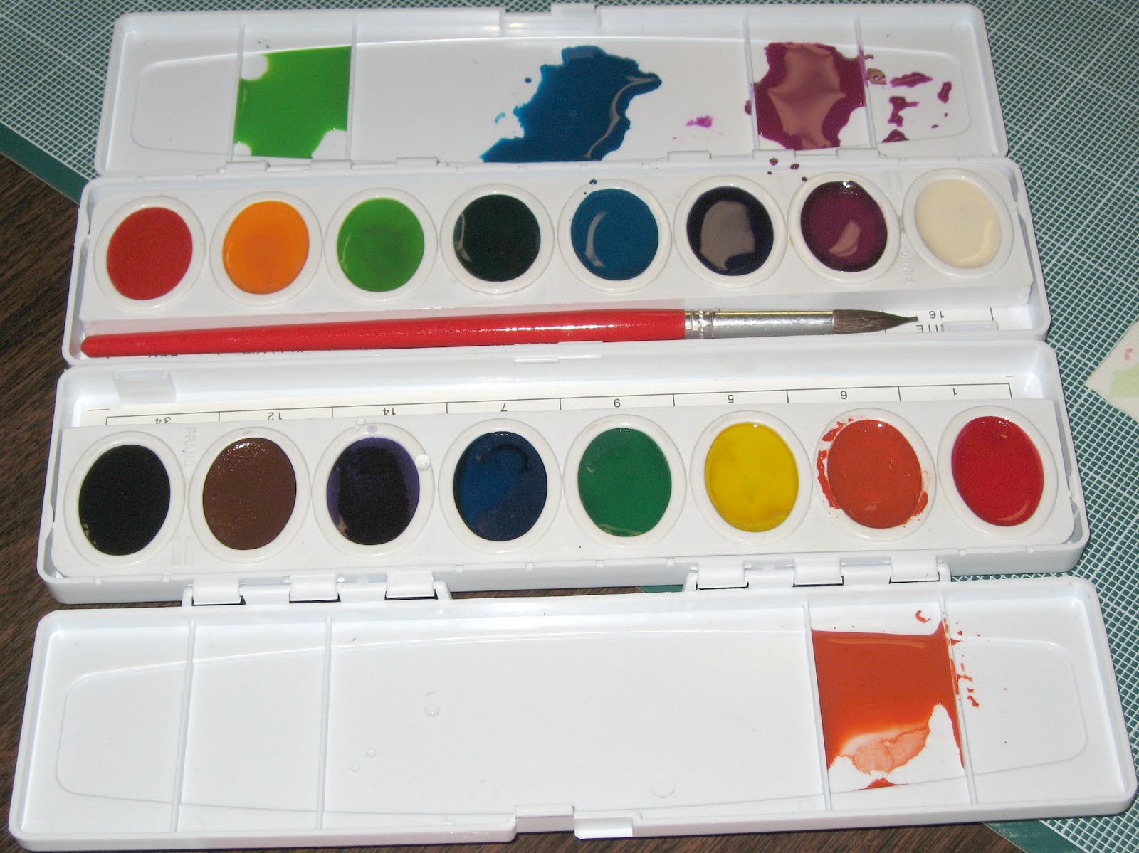
Use the lids of the Prang watercolor set as your palette. Soften the pan with a couple drops of water, then put the colors you want to use in a clean palette space and add drops of water to thin the watercolor to an ink consistency. The Prang colors stay vibrant even with considerable thinning. If you use the watercolor pan itself as the palette, the ink will get thicker and thicker.
Watercolor brushes:  The best quality brushes are sable Winsor Newton Series 7. DeAnn recommends getting sizes 2, 1, and 00. These brushes can be expensive. A more economical brush is the Utrecht equivalent of a Winsor Newton Series 7 (see Suppliers). Be sure to ask for the tube to store it in so that it will stay pristine if you go to Utrecht’s.

Creating name-tags: DeAnn handed out strips of Rives BFK paper. First line the paper so you have guidelines with an x-height of 1-inch, i.e. the waistline/headline and baseline are 1-inch apart. Line-up the bottom of the C-thru ruler with the bottom of the strip and draw a line; center it.
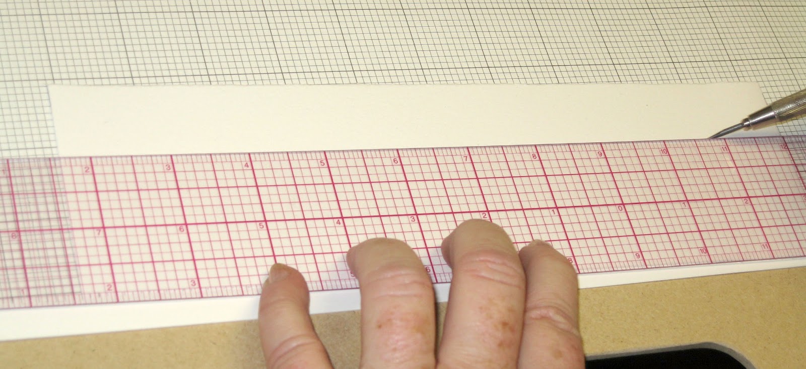
Then turn the paper and using the inch-line (the middle line of the ruler), draw a line 1-inch away.

Write your name in black ink with the Speedball B1 nib. Let it dry completely.
Then paint the counterspaces (the whitespace of the letters) with watercolors.

Use a size 2 watercolor brush. First wet the counterspace with water, leaving a thin “moat” of dry paper next to the ink stroke itself. Because Higgins Eternal is not a waterproof ink, wetting it will cause it to bleed. Then add a color into the wet area, letting the watercolor spread to the edge of the “moat”.
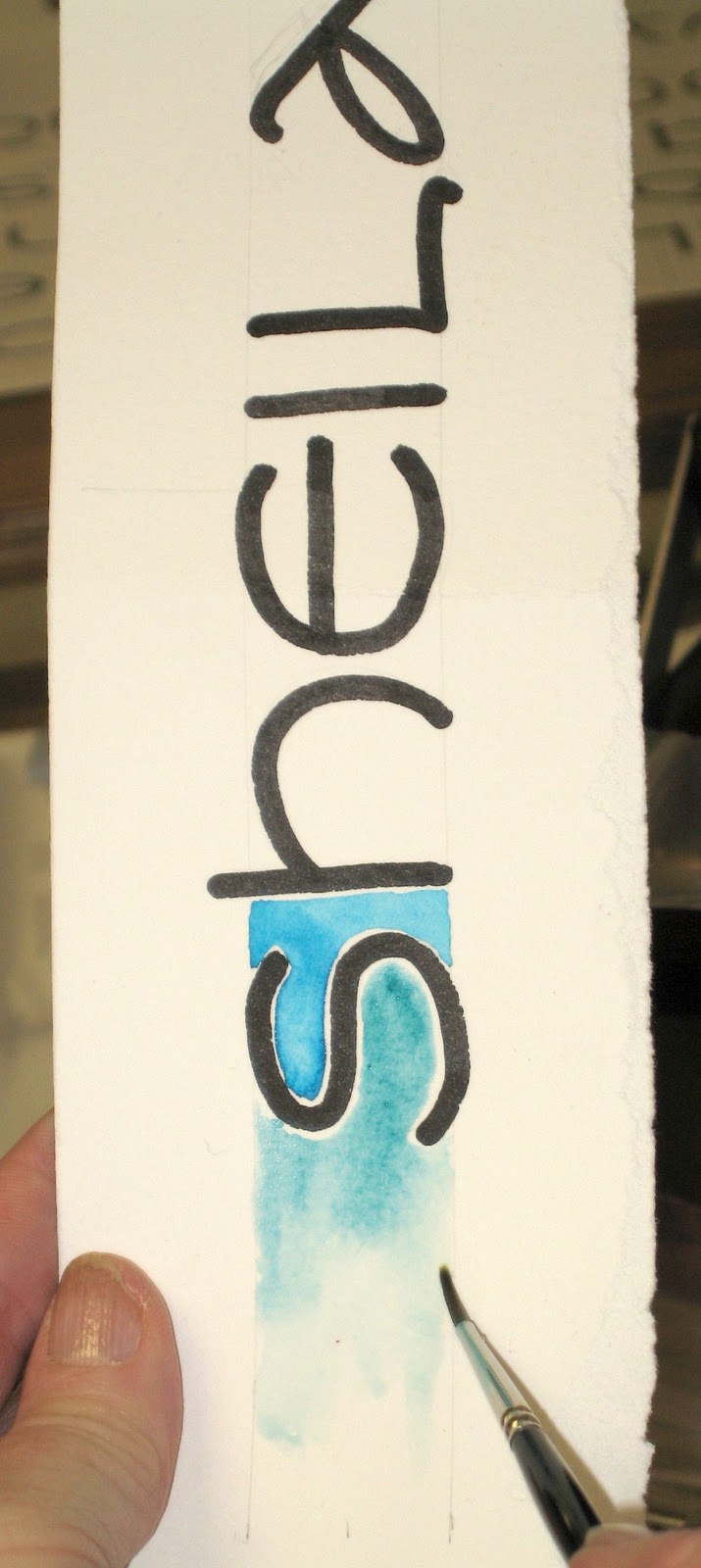
Also paint the space between the letters. Let the penciled waistline and baseline be the limits. For the beginning and end, let the watercolor fade away by spreading the color with water.

This technique can be used to make a unique card or other personalized application.


Satomi painted flower petals to match the shape of the A's counterspace

Writing Sequence for the following week:
1. Write with the Speedball B1 nib at an x-height of 1-inch.
2. Write with the Speedball B6 nib at an x-height of 1-inch.
3. Then write with the Speedball B6 nib at an x-height of ½-inch (4 boxes). You’ll need to line the paper.
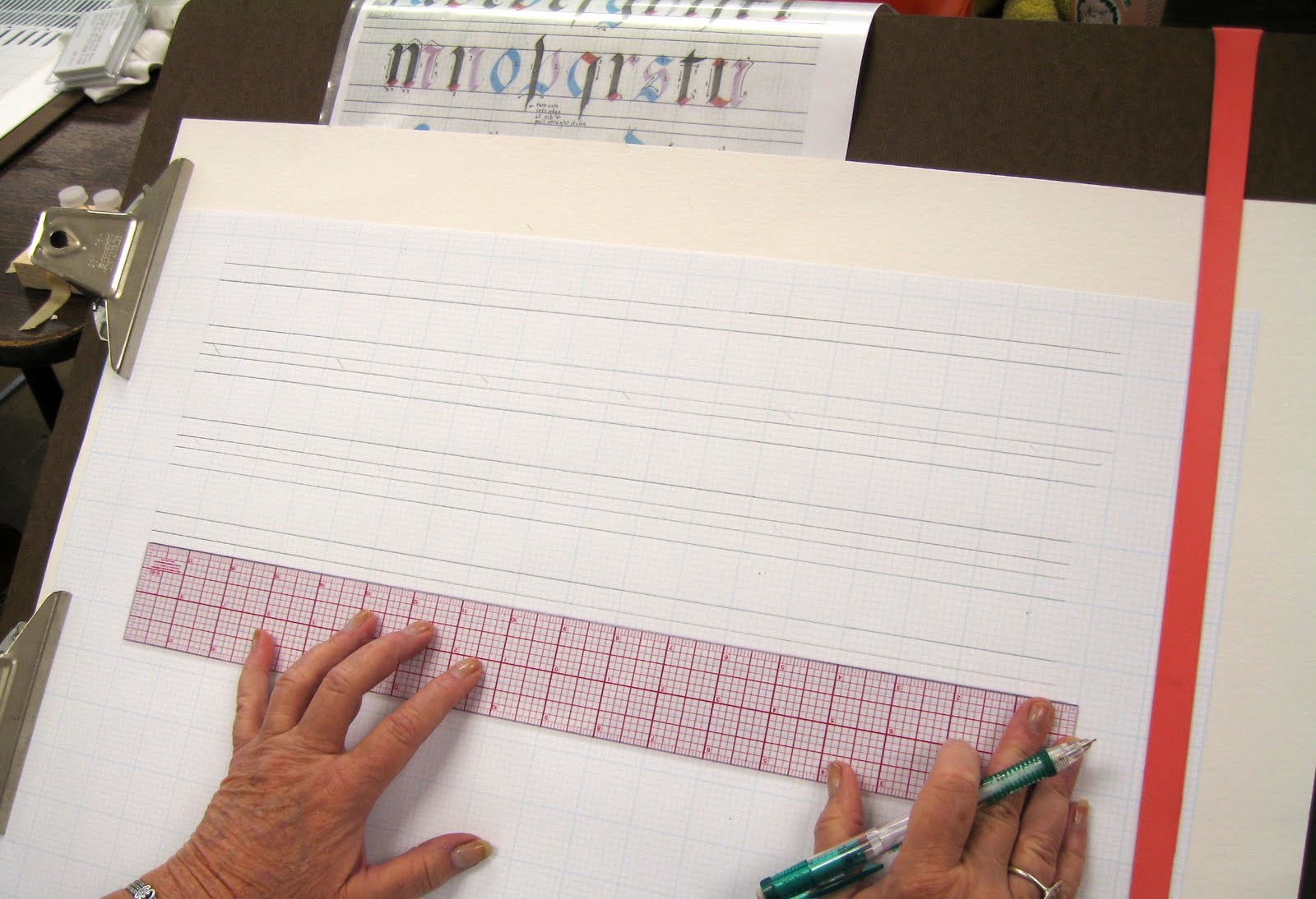

Lining the grid paper:  Using the 18” C-thru ruler easily creates a 2-inch margin on each side of the 17x22 sheet. By placing it in the middle, you don’t have to move it back & forth, just downward as you draw the lines with a sharp pencil, preferably with 2H lead. The grid of the ruler matches the grid paper (on the 1-inch = 8 boxes side of the double-sided grip paper, the Beinfang paper with the blue lines is the same-size grid on both sides). Match the appropriate line of the ruler to the grid and draw ½-inch lines between the darker lines that every inch.

If the 17x22 paper is too large and unwieldy to write on at the ½-inch x-height, tear it in half.

Speedball B6 nib, x-height = 1-inch, half page

HOMEWORK:  Practice with the smaller B6 nib. Start at an x-height of 1-inch. Then go down to an x-height of ½-inch. Practice by writing alphabet sentences. DeAnn will talk about spacing next time.

Wednesday, May 12, 2010

May 10, 2010 - Beverly Hills Adult School Copperplate Class #6

ANNOUNCEMENT:   Copperplate class returns to its normal schedule next week, 5/17/10. Class will start at 10:00 am again and end at 1:00 pm for the rest of the semester.


Today DeAnn provided different papers and liquids for us to experiment with.  She then demonstrated writing Copperplate on watercolor paper and painting dot flowers. The handouts were copies of Satomi’s friendship exercise and project sample and a packet of Copperplate examples.

DeAnn had us write on each type of paper with all the nibs using the different inks she brought. The papers were in different colors, textures, and weights.  Guidelines weren’t used because most of the papers are too thick to see through.


The goal of this exercise was to observe how the different nibs behaved on the different papers using the different inks. Label nib and ink on each writing sample and record observations. For example, shiny paper may need a sharp nib.

One of the sample papers is pergamenata, which will be used for the project. This paper is closest in appearance to vellum. It has a very smooth surface.

The following inks were used:
1. Vermillion to start with.
2. Black ink
3. Acrylic inks (FW Acrylic Artists Ink, Daler Rowney Pearlescent, Dr. Ph Martin Spectralite)
4. Watercolor (if you have it, Prang) and/or gouache

DeAnn provided little plastic containers as inkwells to hold the acrylic inks. Use masking tape folded over on itself to tape the inkwell to the table so it doesn’t tip over.

You could also easily create an inkwell holder from a sponge by cutting an “x”-shape into it. Dampen the sponge and push the inkwell in – when it dries, it’ll hold the shape of the inkwell.

Demonstration of writing Copperplate with watercolor and painting dot flowers: DeAnn used 90 lb. cold press watercolor paper, but you can use any weight watercolor paper. The best nib to use on cold press watercolor paper is the Hiro 41. The watercolors are Prang with 16 colors.

Use a pointed smaller size watercolor brush for the flowers and a stiff bristle brush (like the Royal soft grip #3) to load your pen nib. To set up your workspace for watercolor, have 2 containers of water – one is for dirty, one is for clean. When changing colors, you’ll be rinsing  your brush first in the “dirty” container, then in the “clean” water to ensure no color contamination. Change the water as needed when it gets too dirty.

1. For demonstration purposes DeAnn wrote free-hand, but you should line the paper for a real project that is important to you. Use the lids of the Prang watercolor set as your palette. Soften the pan with a couple drops of water, then put the colors you want to use in a clean palette space and add drops of water to thin the watercolor to an ink consistency. The Prang colors stay vibrant even with considerable thinning. If you use the watercolor pan itself as the palette, the ink will get thicker and thicker.

2. Use a small stiff bristle brush to load your pen nib.  Initially, brush color on top and bottom of nib. Then feed by just brushing the top of the nib. DeAnn likes the stiff brush because it cleans your nib even as it loads it with color. Hold the brush in your left hand with the tip pointed away so you can load your nib away from your paper and avoid splattering the paper.

3. Start with one color and add a 2nd color to the nib before the first one is completely gone so it blends. When switching colors on your brush, first rinse it in the “dirty” cup, then in the “clean” cup. Wipe off excess ink or water on rag. Be careful of colors on opposite sides of the color wheel (e.g. red & green), the blend may be brown/gray. This look can be organic though.

4. If the color changes too abruptly, go back and touch some of the second color into the still-wet strokes for a smoother transition. As long as it’s still wet, the color will continue to migrate out.

5. Continue adding new colors in this way, and/or go back to the original color.

Painting dot flowers:
1. Add a few drops of water to the watercolor pans you’ll be using to hydrate them. Create odd-numbered groupings of dots – these should be very concentrated color. Groups of 3 or 5 dots is optimal.

2. While these dots dry, you can write your message with watercolors (see above).

3. Once the dots are dry, first draw a triangular shape with just water at the base of a dot. Then slowly pull color into the wet area. Leave some white space (non-colored areas). Paint other flowers; when overlapping petals, leave a thin white border so the colors don’t mix together.

4. After you’ve painted the flowers, paint some leaves in with yellow-green. These should be subtle, so use lots of water to a little watercolor.

5. When the petals are dry, outline the petals with a pointy brush held upright. Don’t make the outline solid or heavy; leave white space especially if you didn’t leave much white space in the petals themselves.

6. As a finishing touch, put some orange or yellow dots at the center of the flowers and as accents around the flowers. Put a sharp point on your brush and hold it very straight to make the accent dots.

Preview of metallic effect for the project:  using Trini’s practice piece on pergamenata, DeAnn gilded the decorative capital with composite.

HOMEWORK:  Continue writing with all your nibs on the different papers with the various inks. Remember to label each writing sample. Record your observations so we can discuss them next week. Find some text for the project – it should be about 70 words and can be any text that you like (e.g. poem, song lyrics, quote, etc.). Practice writing text using the Small Guideline (x-height = 1/8 inch); this will be the size for the project. If you haven’t practiced yet on the Medium Guideline (x-height = 3/16 inch), then do that first, then go on to the Small guideline.

Monday, November 2, 2009

Nov. 2, 2009 Bev Hills

November 2, 2009

Beverly Hills Adult School Class #7: Today DeAnn demonstrated illuminating and had the class traced an initial capital and paint it.

The handouts were the sample initial capital (an “S”), a piece of pergamanata paper and a piece of and palette paper to work on, two Lombardic samples.

Illuminating a letter:

1. Choose 3 colors (include one of the greens) and zinc white. Gouache, an opaque watercolor, is used for the paint. Place a dab of each color on the palette paper; even if it dries, you can reconstitute it with water.

2. Trace pattern (initial capital) onto Pergamanata paper. A pencil that you can use for outlining is the Staedtler lead holder, which is a mechanical drafting pencil. Its sharpener has both a sharp & dull setting and also a pad to brush off the excess graphite after sharpening. Use 2H.

3. Paint glue (adhesive for gold leaf, recipe: 2/3 Sobo glue, 1/3 water, touch of red watercolor) onto initial capital with pointed brush (e.g. size 0 or 1). Try to paint on a smooth layer (you’ll be painting 3 layers). Let dry, then paint another layer.

4. For the colors, put zinc white next to each color. Add the tiniest bit of color, then a drop of water, to mix a tint. (TIP: have 2 water containers, one for dirty, one for clean. Always rinse brush in the dirty container first, then rinse in the clean container).

5. Paint each leaf half of one color, half in that color’s tint. Make sure the first color is dry before painting on the other half. (Don’t paint the leaves around the capital “S” yet – paint that after the gold leaf is applied).

6. Once all the leaves are painted & dry, “diaper” them with permanent white gouache. With a small pointed brush (e.g. size 0 or 00), decorate each leaf with lines, cross-hatching, or dots.

7. Once the gold leaf adhesive is dry, you’re ready to apply the gold leaf. To prepare, clean a “gold only” pair of scissors with silk – you don’t want any sizing on the scissors or else the gold will stick to them. Cut the sheet of gold leaf to the estimated size of the initial cap.

8. Breathe on the glue so that it absorbs some moisture. Then place the gold leaf on it and press gently all around. Press the outlines, making sure the sides (the glue will be slightly raised) are also completely covered with the gold leaf.

9. Remove the backing paper carefully so that you can save any gold that sticks to the paper.

10. Place a piece of glassine (acid-free, non-stick paper; the Post Office envelopes for stamps are glassine) over the gold leaf and press the outlines, making sure the sides (the glue will be slightly raised) are also completely

11. Burnish the gold leaf (several types of burnishers in different shapes & sizes: e.g. Griffold, Agate).

12. Clean up the edges with an X-acto knife with the #16 blade. (TIP: Every calligrapher should have the #11 blade and #16 blade.) Scrape toward you to clean the edges of excess gold.

13. Outline each leaf in black with a Pigma Micron 005 pen.

14. Paint the stems with the small pointed brush in green, then again right next to that stroke with the green tint.

REMEMBER: with illumination, you can never be too garish!

Next week: DeAnn will have the gold leaf and the adhesive for students to purchase.

HOMEWORK: Practice writing your project text with 1 1/2 mm Brause nib (use project template for lines). Begin blocking out project on pregamanata.

Wednesday, September 2, 2009