Showing posts with label uncial. Show all posts

Saturday, January 6, 2018

Winter 2018 Sinai Temple Calligraphy class: All Things Uncial

All Things Uncial
Mondays, 10:30 am - 1:00 pm, January 8 - March 16, 2018 (10 classes)
Sinai Temple
10400 Wilshire Blvd., LA 90024
to register, contact Rosa Berman at rbermanr@yahoo.com

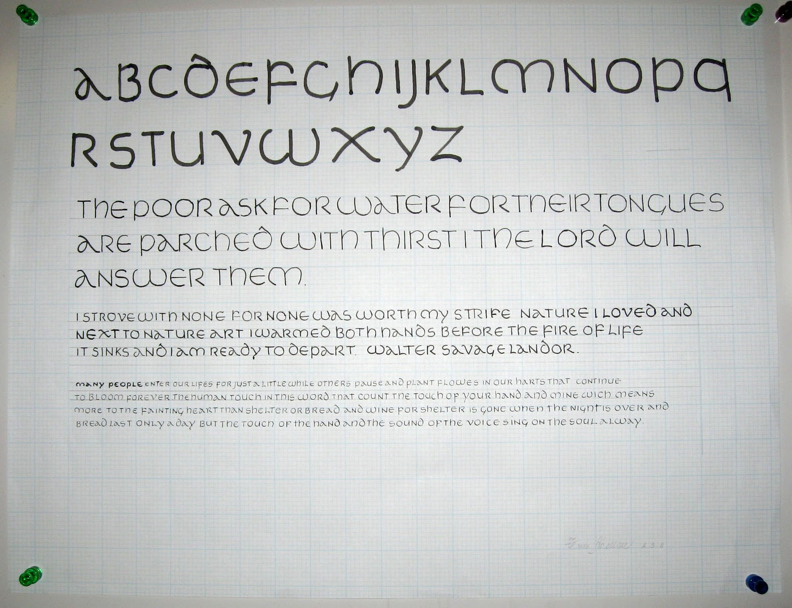
monoline uncial


The beautiful “chunky” style that everyone loves. It is useful for many types of writing. We’ll do monoline, chisel point and pointed pen uncial styles. We’ll use watercolors and gouache to produce a stab binding book structure with the different styles included. This will be a 10 week course so there will be plenty of time to learn the letterform and do the project. Sinai Temple is a very nice learning environment and we can accomplish a lot of beautiful work in a calm and relaxed atmosphere. The parking is underneath and nearby, don’t have to worry about weather. The price is reasonable and the room is easy to get to and comfortable. Please join us for this great new semester.

chisel point uncial


pointed pen uncial

Friday, January 3, 2014

New Opportunities and Classes


I have a couple of opportunities to share with my friends.

I am hiring a few people to work as part time calligraphers for the County of Los Angeles. I am the contractor to train and provide artists for a few months as As-Needed calligraphers. There is a full time calligrapher job now posted and I can also help anyone who is interested in that job to train and send you for part time work to see if you’re suited for that position. Please contact me if you are interested in this job. You would work once or twice per week or every other week. You need to have a little knowledge of Quark Express and have sufficient italic and roman lettering skills and be able to decorate with flowers and other decorative elements. You have to work fast but efficiently. You must have skill with gouache and gold gouache.  E-mail:  DeAnnSingh@me.com

The next opportunity is an exhibit that will be in New York City featuring my calligraphy. I would like to invite some of my calligraphy friends to produce artwork for this event. I will be teaching workshops and hosting art events during the run. We are coming up with the theme and title of this exhibit. At present, I am thinking that I would like to give some of you some words and quotes to use for both paper and canvas broadsides, as well as books etc. Maybe some collaborative pieces where one person does the art and callig and someone else does the book binding. The theme will be along the lines of Spiritual Journeys. Not necessarily religious spirituality but your quest to be your best and progress as far as possible in this life and beyond. There are billions of ways to this progress, as demonstrated by the billions of lives that have lived, and the progress from one generation to the next. I have quotes from people who are not artists that I’d like to assign to my calligraphy friends. There is room for quite a few pieces, both large and small. Contact me if you are interested in joining me with this project:  DeAnnSingh@me.com

Classes 

Even though my ankle is still broken but hopefully mending well, I wanted to say that 2 more class opportunities have opened up.

I’ll be teaching for RAND in Santa Monica on Thursday evenings 5:30-7:30pm starting Jan. 16th for 8 weeks. We will be doing the beautiful style of Uncial. Beginning through intermediate. $96 Contact Shirley Cromb if you are interested (shirleycromb@hotmail.com) or Marian Oshiro  (Marian_oshiro@rand.org).

OTIS starting February 4 on Tuesday evenings from 6:30-9:30pm, Spencerian (4 weeks) $99, March 4 (4 weeks) Italic (separate class). Otis is located in Westchester. See www.otis.edu/ce for registration, $99.

See my Classes page for more details.

Tuesday, March 8, 2011

March 7, 2011 - Beverly Hills Adult School Uncial Class #7

Beverly Hills Adult School Uncial Class #7:  Today DeAnn demonstrated gilding for the beginners. Students continued working on their illuminated manuscript projects.


For inspiration, take a look at Trini's work in progress:

Recipe for adhesive for flat gilding
1/3 part Sobo glue
2/3 part Water
Make in small jar
Add a tiny amount of red or orange watercolor to tint it lightly so that you can see where you’ve painted the glue. Red or orange color will enhance the gold color.

Demonstration of Illuminating a Decorative initial capital letter:
(see Gilding Notes for detailed instructions on Gilding)

Trace pattern (initial capital) onto Pergamenata paper.

Paint glue (adhesive for gold leaf, recipe: 2/3 Sobo glue, 1/3 water) onto initial capital with pointed brush (e.g. size 0 or 1). Try to paint on a smooth layer (you’ll be painting 3 layers). Let dry, then paint another layer. Cover the pencil outline.

Rinse brush frequently; don’t let the glue dry on the brush. TIP: Don’t let the brush sit in the water, the tip will be ruined.

Once the gold leaf adhesive is dry, you’re ready to apply the gold leaf. To prepare, clean a “gold only” pair of scissors with silk; you don’t want any sizing on the scissors or else the gold will stick to them. Cut the sheet of gold leaf to the estimated size of the initial cap.

Make sure to wipe off any lipstick or chapstick on your lips. Breathe on the glue so that it absorbs some moisture. Then place the gold leaf on it and press gently all around. Press the outlines, making sure the sides (the glue will be slightly raised) are also completely covered with the gold leaf.

Remove the backing paper carefully so that you can save any gold that sticks to the paper.

Place a piece of glassine (acid-free, non-stick paper; the Post Office envelopes for stamps are glass-ine) over the gold leaf and press the outlines, making sure the sides (the glue will be slightly raised) are also completely covered with gold leaf. Then brush excess gold off with a soft brush; brush in the direction of the lines, not across them.

Burnish the gold leaf (several types of burnishers in different shapes & sizes: e.g. Grifhold, Agate).

Clean up the edges with an X-acto knife with the #16 blade. (TIP: Every calligrapher should have the #11 blade and #16 blade.) Scrape toward you to clean the edges of excess gold.

Cleaned and burnished gilded initial capital:

Paint background of the gold decorative capital with gouache (choose a color that will make the gold stand-out; e.g. yellow is not a good choice.)

Once you’re done painting, outline the gold decorative capital with the Micron Pigma 005 pen.

Example of painting a decorative leaf half in a color and half in that color's tint. Then DeAnn added decorative cross-hatching, lines, and dots. This is called "diapering."

February 28, 2011 - Beverly Hills Adult School Uncial Class #6

Beverly Hills Adult School Uncial Class #6:  Today DeAnn showed us how to carve a rubber stamp from an eraser and has us carve an acanthus leaf stamp.

Materials used:  white eraser (e.g. Mars Staedtler), Speedball Linoleum Cutting blades 1 & 6 (DeAnn had these for us to borrow). Also a sharp pencil, tracing paper, and stamp pad.


Find a sample from an illuminated manuscript page that you want to use. Photocopy it to make it larger if needed.

Trace a leaf or group of leaves onto tracing paper with a very sharp pencil.

Place the tracing paper pencil-side down on the eraser; find a piece big enough for your drawing but with as little blank space surrounding the drawing as possible.

Rub the tracing paper with your finger or some smooth object to transfer the drawing to the rubber.

If the image transferred onto the eraser is too light, go over the lines with a sharp pencil to darken.

Start with the larger cutting blade to cut excess rubber from the edges. Switch to the smaller blade for detailed areas.

Stamp your eraser with the stamp pad to see how the image is; continue shaving off raised areas until you’re satisfied.

Now you have a stamp to create leaves quickly as decorative elements on your illuminated manuscript project. These can be painted with gouache.

DeAnn demonstrated painting the leaves with gouache.

If you run out of time to finish gilding your decorative letter, you can paint it with gold gouache. A set she found recently has bright gold colors, Finetec Mica Artist Color Set.


Meanwhile students continued working on their illuminated manuscript projects.
Trini's inspiring work-in-progress
Judith's creative work-in-progress

DeAnn worked with individual students and reviewed troublesome letters.

For the Y, think martini glass. Note the spacing on "AZE".


H and M - start the curved strokes within the stem stroke for a smooth transition.

Monday, February 14, 2011

February 14, 2011 - Beverly Hills Adult School Uncial Class #5

Beverly Hills Adult School Uncial Class #5:  The warm-up was writing text with the Brause 2 ½ mm nib, at an x-height of 3 boxes (on the 8 boxes per inch grid paper). DeAnn talked about the illuminated manuscript project and handed out some templates.
Trini's homework:  chisel point Uncial in different sizes.
Close-up of Trini's homework

Warm-Up: Write text with the 2 1/2 mm Brause nib at an x-height of 3 boxes (on the 8 boxes/inch grid paper). Line the paper every 3 boxes and write on every other line.

Review:  Keep the pen angle steady. For example, on the “T”, the horizontal stroke will not be the same width as the vertical stroke, but thinner. Also, don’t twist your pen on the curve strokes.

Satomi's project layout from last semester, Fraktur.

Illuminated Manuscript Project:  This will be done on Pergamenata paper, which looks the most like real vellum. DeAnn has 8 ½ x 11 sheets for sale at $0.75 each. She passed out templates to use for the project. The pergamenata is translucent enough that you can see the template underneath. This way, you won’t have to line the pergamenata sheet separately. A decorative initial capital letter will go into the 2”x 2” square and versals into the first couple lines next to it. The text below will be written in Uncial with the 1 ½ mm Brause nib. Highlighting the text lines makes them more visible. DeAnn will talk more about the details next time.


Next class DeAnn plans to show how to carve a leaf shape from an eraser. This will help make painting the decorative leaves for the illuminated manuscript easier. Materials to bring:  white eraser (e.g. Mars Staedtler), Speedball Linoleum Cutting blades 1 & 6 (DeAnn has this tool for you to borrow), stamp pads (if you have any).

Sample of grid paper lined every 3 boxes for the 2 1/2 mm Brause nib.
HOMEWORK:  Continue practicing with the 2 ½ mm Brause nib at an x-height of 3 boxes. Then go down to the 1 ½ mm Brause at an x-height of 2 boxes (on the 8 boxes/inch grid). Line the grid paper every 2 boxes and write on every other line. Cut the paper into quarters for a more manageable size. Choose the text for your project.

NOTE:  No class next Monday, 2/21/11, in honor of President’s Day. Class resumes on Monday, 2/28/11.

Thursday, February 10, 2011

February 7, 2011 - Beverly Hills Adult School Uncial Class #4

Beverly Hills Adult School Uncial Class #4:  The warm-up was writing alphabet sentences with the Speedball B1 nib at an x-height of 1-inch. DeAnn reviewed some homework observations. Then she introduced writing Uncial with the chisel point nib.
Satomi's homework using watercolors
Trini's homework: monoline Uncial at different sizes
Judith's homework - fun and colorful!

DeAnn reviewed common mistakes she found in the homework:

D :  start the second stroke above the waistline to the left, not at the mid-point.


Z and L :  Don’t exaggerate the horizontal strokes, they slant just a little.

Uncial with the chisel point nib:  To start, we’ll be using the Brause 5mm nib (largest one). Use it with a round pen-holder. If you have the Brause holder that’s flat on one side, insert it toward the right side (when holding it) of the wooden nib holder. If you’re looking at the holder head-on, the nib will be toward the left edge.

Pen angle:  The Brause is a chisel-point pen, able to create thicks & thins within one stroke, based on the angle of the pen. Using a protractor as the reference, a pen angle of 0-degrees equates to holding the pen so that the nib is parallel to the horizontal lines of the grid paper.  A vertical stroke at this pen angle is the thickest; a horizontal stroke is the thinnest.

If the pen angle is 90-degrees, then a vertical stroke is the thinnest and a horizontal stroke is the thickest. For a 45-degree pen angle, use a box as a reference and place the pen so that you’re placing it on the diagonal of the box. At this angle, both a vertical stroke and a horizontal stroke should be the same thickness.

x-height: is the height between the waist and base. Each hand has a specific x-height measured in pen-widths. At a pen angle of 90-degrees, draw short horizontal strokes to measure by pen widths.

Uncial has a pen angle of 15-degrees (up to 30 degrees) and an x-height of 4 pen widths (equal 6 boxes on the grid paper). Since 15-degrees is one-third of 45-degrees, eye-ball the angle from the waistline. Look at the top of the chisel point Uncial exemplar.

Protractor on top of grid paper - note where 15-degree pen angle intersects grid.
In class we practiced writing downstrokes & cross-strokes at 0 and 90 degrees, at an inch in height. Dip the pen so the reservoir is 3/4 full. Wipe the nib on the edge of the ink well to take off any excess. We need to get fully familiar with this chisel point nib. Practice making straight lines with the nib. You need even pressure on both sides of the nib. Not a lot of pressure, just even pressure. The ink will flow better to begin with if you give a little side-to-side "rub" (like an ice-skate) with the nib. Or touch the tip to some wet ink on a previous stroke. As you draw the stroke down the page, EXHALE. This helps give a more controlled stroke. Also, set your opposite hand near the work so you can give slight pressure as you start down. These tips will help you have success quicker. At this large size, ink will puddle at the end of the downstrokes; don’t worry about it now, it’s natural & expected.

To achieve the thicks and thins with the chisel point nib, you must keep it at the same angle. Don’t turn the pen-holder in your fingers as you make a curved stroke.

At this time it’s OK to wipe off your nib to clean it. DeAnn will show you how to remove the reservoir next time so don’t worry about washing it with water yet. When practicing, wipe your nib every 20 minutes or so to remove any paper residue, etc.

Preparing (lining) the grid paper:  8 boxes on the grid paper equal an inch, with the darker lines indicating the inch-marks. The x-height for Uncial with the 5mm Brause nib is 6 boxes. So after each darker line, line the sheet at 2 boxes, dividing the 8 boxes into 2 boxes and 6 boxes. We will be writing in the rows that are 6 boxes tall. The 2-box row in between will be for the ascenders (e.g. H, L) and descenders (P, Q). Write an “x” in the margin if that will help you see which lines to write on.
sample of lined grid paper - click on it to enlarge.

Notes on individual letters:

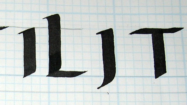
I :  pierces the baseline slightly
L :  almost 2 boxes above the waistline, slight serif at base
J :  don’t pull it longer than 2 boxes below the baseline
T :  Marcia Brady’s “T” which is on the exemplar, goes off to the right slightly.
Also alternate T:
T from Exemplar and alternate T

O :  be careful not to turn the pen when curving
G :  top stroke doesn’t go farther than the bottom stroke

D :  DeAnn prefers it not to be that flat; it’s OK if there’s a space between the first stroke and the second.

Q :  curved stroke is above the baseline
S :  need to start below the waistline

A :  beginners can just go out, then back, without worrying about the hairline for now. And don’t worry about flattening the first stroke against the baseline. Intermediates – pull the stroke into a hairline. Also twist pen to flatten stroke 1 to the baseline. You need a round pen holder for this.

B :  start with serif; come down, pause, then move over. Don’t make this last stroke too round. Set pen inside stem stroke and come out to make the next 2 strokes.
F :  Make the horizontal strokes longer than the exemplar.

H :  Don’t curve in too much; it’s more of an optical illusion.
K :  beginners don’t have to put the serif on the top stroke or flatten the last stroke. Intermediates can.

M :  start inside the stem stroke to make the last stroke.

N :  pen angle is slightly steeper; diagonal-stroke is slightly S-shaped. When making the last stroke, aim for the inner corner to match.

P :  curved stroke doesn’t touch the baseline
R :  intermediates can flatten the last stroke

U :  thicken the curve slightly so it’ll connect nicely
V :  put a nice curve in the second stroke so it’ll balance. Don’t let it lean to the side.

W :  like the “U”, first stroke is straight-ish, the last stroke is curvy.

X :  you can follow the exemplar and make the cross-stroke in 3 strokes. Or pull one stroke from the bottom, putting serifs on each end.

Y :  think martini-glass to create a balanced triangular shape

Z :  if the diagonal stroke is too thin, then your pen angle is too steep; flatten it to thicken the stroke.


HOMEWORK:  Practice the letters with the 5mm Brause nib and an x-height of 6-boxes. Write each letter only 3 times in a row before moving on. Study the exemplar closely and compare your written letter to it. Trace the exemplar if you’re having difficulty.

Once you’re comfortable with the letters, write words. Intermediates can go down to the 2 ½ mm Brause nib with an x-height of 3 boxes.