Tuesday, April 6, 2010

April 5, 2010 - Copperplate Class #1 at Beverly Hills Adult School

DeAnn introduced herself and gave a short history of Copperplate. At the time it was originally in use, it was called Roundhand and appeared in England, France and some of Italy in the 1600s. Around 1900 it had become almost a business style of writing and then several different methods developed, such as Palmer, Spencerian, Zaner-Bloser.

DeAnn’s Philosophy for learning Copperplate: For success in writing beautiful Copperplate, think of the Copperplate letters as a series of STROKES, which you’ll be learning in today’s class. By disassociating them from the letters you’re familiar with, you can avoid common mistakes that could make your Copperplate letters look like cursive writing.

DeAnn distributed supplies and handouts. The handouts are the Copperplate Exemplar, nib chart, and large guideline sheet. We will be starting out using the Gillot 404 nib and Vermillion ink. The Gillot 404 nib has a ridge that distinguishes it from the Gillot 303.

Preparing your supplies for ease of transportation: pour ink from their containers into the dropper bottles. Start with the Vermillion ink (the Higgins Eternal ink needs to be mixed with the gum Arabic so DeAnn will go over that recipe next session). The dropper bottles are leak-proof so bring those to class; it’s OK to leave the original containers of ink at home. From the dropper bottles, fill one of the ink wells (or “dinky dip”) to at least the ridge-line. You want to be able to dip your pen and cover the nib’s reservoir area (“eye of the needle”) completely.

Learn Your Nibs:  Unlike calligraphy written with a chisel-point nib, Copperplate nibs create thicks & thins by pressing & releasing. The more pressure you apply when pressing on a down stroke, the wider the stroke. So unlike chisel-point nibs that come in different set widths (e.g. 5mm, 1mm), Copperplate nibs come in a wide variety of sharpness and flexibility. This is another important area to explore & learn. By the end of this semester, you will have filled out your nib chart with notes on each of the nibs, paying particular attention to each nib’s sharpness and flexibility.

Preparing the Pen: Put the nib into the oblique pen holder so that the “eye of the needle” (the opening in the nib) points directly upward. The fit may feel tight, but push the nib in at least halfway for a secure hold. Hold the oblique holder as you would normally hold your pen, with the angled nib to the left side. If you have a brand new nib, you’ll need to prepare it by rubbing gum Arabic all around so that the ink will adhere to the nib and not just bead-up and slide off. New nibs usually have a waxy coating and you may have to rub with gum Arabic several times until the ink will stay in the reservoir. NOTE: Vermillion ink will rust your nib, so wash it off with water after you’re done practicing.

Preparing the paper: Make a crease in the cover of the cotton comp paper pad about an inch down from the top. Fold this back so that you’ll have a flat writing surface without the cover bunching up to the left. Place the guideline sheet underneath the first sheet.

Guideline sheet: We’ll be starting with the large 1/4-inch guideline sheet. 1/4-inch refers to the x-height, the space between the waist and the base. These lines are indicated by the black box on the left margin. The line above the waist is the ascender, the line below the base is the descender. 3:2:3 at the bottom of the guideline sheet refers to the ratio of the spaces between the horizontal lines. 3:2:3 is the same as 1:1.5:1. If the x-height (base to waist space) is considered 2 units of space, then the ascender & descender lengths are 3 units of space. The 35-degree slant lines are there as guides for the angle of writing, not for spacing.

TIP: DeAnn suggests highlighting the waist to base space so that it’s easier to distinguish as the line to write on underneath the cotton comp sheet.

Prepare your work space: The key to being able to write Copperplate correctly is to set up your work space correctly and sit in the right position in relation to your paper. Position the paper so that the slant lines are pointing toward your stomach. This angle may seem extreme, with the paper pad almost at right angles to the table’s edge, so you need to position yourself so that your elbow rests completely on the tabletop, which means you’ll probably have to sit at an angle to the table edge so you’re not twisting your torso. Place the ink well above the paper pad and tape down to avoid accidental spills. Place your exemplar in front of you, preferably in a stand like a Page-Up, so it's easy to refer to.

Use your left arm to take the weight off your body by placing your left hand above the area where you’re writing. Try to learn NOT to have a heavy writing hand, but practice having a light touch. Putting the pressure on your left hand helps with this. REMEMBER to breathe! If you’re having trouble writing the strokes, exhale.

Writing with the nib: 
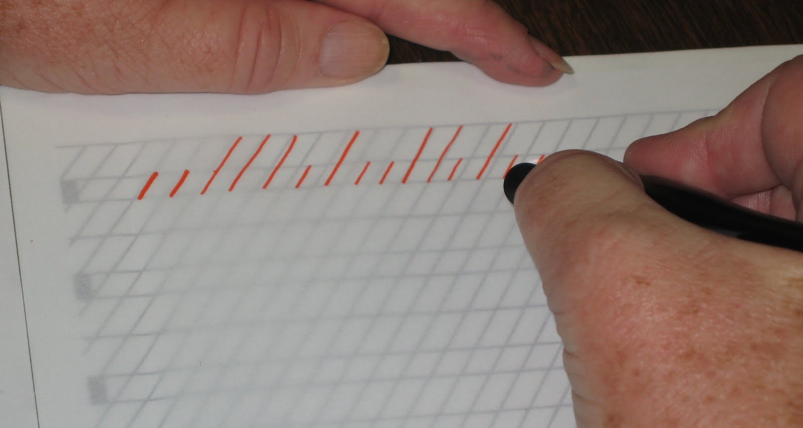
1. Write straight lines (with slant) 
2. Pen should be in the direction of the slant lines 
3. To create the square top & bottom edges, set – press – pull – stop – release 
4. If the nib is sticking into the paper, adjust the angle of how you’re holding the nib. Lowering the angle may help.

Writing the basic strokes: You apply pressure on the down stroke (thick), no pressure on the up stroke (thin). This is how you create thicks & thins. The goal is for all the down strokes to have the same width (i.e. consistent pressure). Look carefully at the exemplar handout, it has a lot of important information on it.

Notes on individual strokes: 
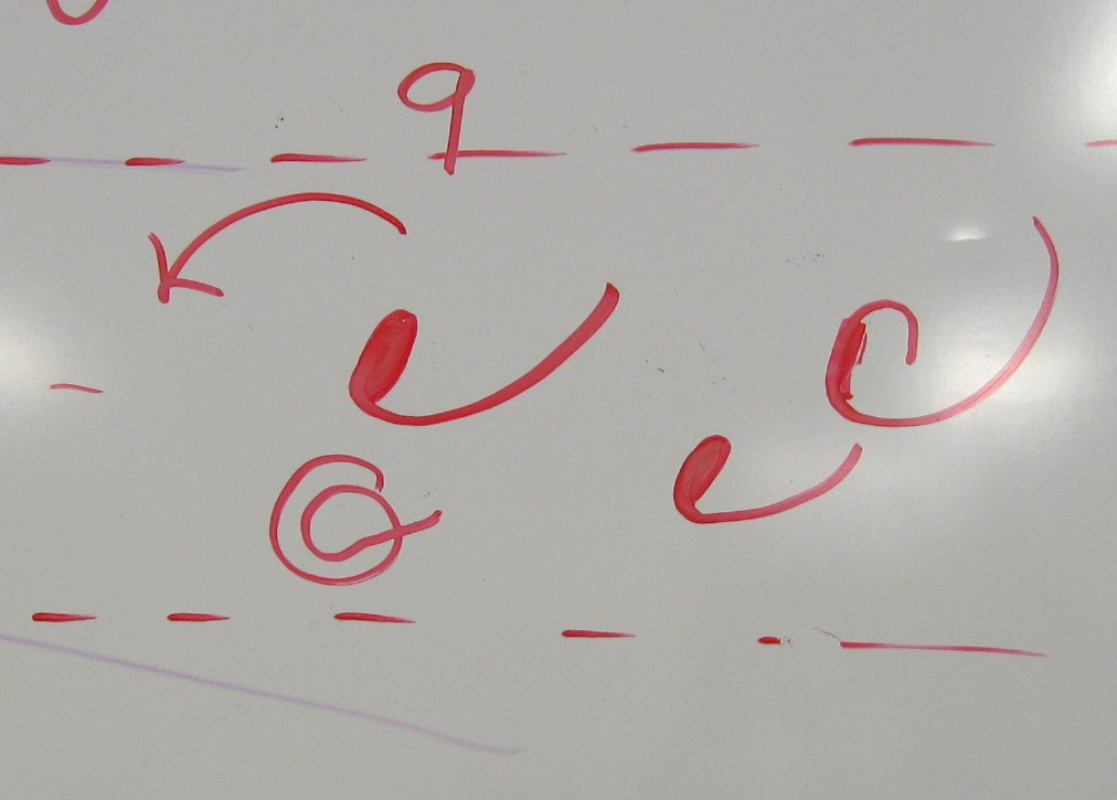
1. #2, #3, #4: the up strokes and the down strokes should be parallel and also parallel to the #1 strokes.
2. #2, #3, #4, #8 should all have the same white space. White space is the space between the down strokes & the up strokes. 
3. #2, #3, #4: the arch should be like a paperclip. 
4. #2, #4: start the curve with no pressure, build up to full pressure by midpoint on the down stroke. 
5. #4: start the second curve before you hit the baseline so you don’t have a “staple” instead of a paperclip curve. 
6. #5, #6: the size of their white space should be similar, though they are not exactly the same shape. 
7. #8: start at 3:00 and think of it as an oval shape, more hot dog than hamburger.  It’s thickest through the center. The inner white space should match the width of #2, #3, #4 strokes. 
8. #9: start counterclockwise to create a tiny filled oval, then exit. Like the #7, it’s an exit stroke to the next letter.

REMEMBER:  Don’t get overwhelmed! If you get really anxious, go back to the last step you were comfortable with and practice that. You can even practice the Copperplate strokes with a pencil if it all seems to be too much at the moment.

HOMEWORK: Continue practicing the strokes with the Vermillion ink and Gillot 404 nib. Memorize the basic stroke numbers – DeAnn will test you next week. If you feel really comfortable with the Gillot 404 nib, you can try out another nib and see how it’s different frm the Gillot 404. Be sure to note on your nib chart that the Gillot 404 is “medium sharp, medium flexible”.

NOTE:  On your practice sheets, write the nib, ink type, and date in the lower right corner.

Homework for intermediates: write the strokes and letters as perfectly as you can this week. DeAnn will then give a thorough critique. Start thinking about text you want to use in the project.

Saturday, April 3, 2010

Spring Calligraphy Classes Are Starting!

Copperplate Calligraphy
Beverly Hills Adult School 
April 5-June 7th.  10-1pm
Level: Beginning and/or Intermediate
9 weeks approx. $100
701 Whittier Drive
Beverly Hills, CA 90210
Map

Copperplate calligraphy is a style of cursive calligraphy. 
Unlike broad pen calligraphy styles, copperplate uses a pointed calligraphy pen. Copperplate alphabets are determined by the pressure applied to the pen. The more pressure applied in the copperplate style, the thicker the stroke. The hair-line strokes produced, contrasts beautifully with the thicker downward strokes.
Materials List


Journal Your Vacation and Special Events
Beverly Hills Adult School 
April 5 - May10th  1:30-3:30
6 weeks approx. $90. 1:30-3:30
701 Whittier Drive
Beverly Hills, CA 90210
Map

Have you ever wanted to journal some of your vacations or special events? You’ll learn how to draw and write what you see. You don’t have to draw well to journal. We will create drawings, paintings, collages, and use other interesting techniques to add to your pages. You will be taught enough to get started on your journal. If you already journal, you can work on improvements or just get new ideas to make your journal better.
Materials List

Beginning and/or Advanced Calligraphy Classes
Emerson Adult Learning Center
April 6th-May 25th
Beginning 9:30-11:30am    
Intermediate / Advanced 12:00-2:00pm  (some calligraphy experience needed)
8 classes approx. $80
8810 Emerson Ave.
Westchester, Los Angeles
Map

Many styles of calligraphy will be taught, including Roman Capitals in pencil and pen. Small classes with a maximum of 10 students per class.
Call to register: 310.258-2000
Materials List (TBA)

Calligraphy Classes
Stampin' from the Heart
CALL  310.391.0466
11720 Washington Place
Los Angeles, CA 90066
Map

Calligraphy classes for students of all levels and continuing studies.  Stampin from the Heart Classes begin on April 7th.  You can buy 6-10 lessons for $20 per lesson ($120. for 6 lessons, $200. for 10 lessons for the semester.
All calligraphic subjects, including illuminated manuscripts will be covered. Maximum of 10 students.
Materials List (TBA)


Uncial
Rand Corporation
Thursdays  5:30-7:30pm (6 weeks - $72)
Class begins April 29th
Space is limited
For more enrollment information, contact: shirleycromb@hotmail.com

Uncial is a beautiful majuscule script (written entirely in capital letters) with a broad pen.  It was commonly used from the 3rd to 8th centuries AD by Latin and Greek scribes.  It was brought to Ireland and England in the 5th century and was used on some stunning illuminated manuscripts, including the Book of Kells.
Materials List (TBA)

Wednesday, March 31, 2010

March 15, 2010: BHAS Last Class


Beverly Hills Adult School Class #7: This is the final class of the semester and we had a potluck. DeAnn reviewed everyone's final projects, in whatever state they were in. Then she helped individual students with specific issues.


DeAnn's tip: Date every piece you create on the back. Other information you may want to include: nib size, type of ink/medium, purpose or reason for project.

Some useful tips from students for working on the illuminated manuscript project:

  1. Once you've finalized your decorate capital and surrounding decorative elements, copy it to experiment with different color combinations and/or practice various background patterning techniques.
  2. Once you've written out your text, copy it and cut it out into lines. As you write the final version on the pergamenata, remove each line from the paste-up as you go so you won't accidentally re-write a line you've already written. Another related tip: use a post-it to mark which line you're on.
  3. Copy the project template or your own lined paper onto your own paper for practicing.


Next semester DeAnn will be teaching copperplate. Spring semester starts 4/5/10.

Tuesday, March 9, 2010

Beverly Hills Adult School Gothic Class #6

Beverly Hills Adult School Class #6: DeAnn reviewed students’ in-progress Illuminated Manuscript projects and gave advice on common problems.


Bare patches of gold: Placing a piece of glassine on top of the gilded letter will make it easier to see the bare spots in the gold layer. If there are such spots in your illuminated letter where the gold didn’t adhere to the gesso (glue mixture), rehydrate the glue by breathing on it (reminder: remove any lipstick/chapstick first). Then rub more gold on the bare areas. You may need to do this a few more times to cover all the spots. Then re-burnish the whole letter & scrape any excess off to have clean edges.Bumpy gold: If the glue layer wasn’t completely smooth, the gold may look bumpy, uneven or seem to have ridges in it. To minimize this look, add an embossed pattern into the gold with a bead burnisher. Place some padding beneath the sheet, then “draw” a pattern in the gold (for example, curves or a zig-zagging line, dots, etc.). If you’re afraid of working directly on the gold, place a piece of glassine on top and emboss a pattern through that.


Solidly painted decorative elements: if you didn’t paint leaves or flowers half with the full color and half with its tint, decorate the solid areas with patterns painted in permanent white gouache. Add just enough water to hydrate the paint. Then using a 00 pointed brush, paint dots or cross-hatching or diagonal lines to pattern or “diaper” the elements. This can also be done on a solid background of the decorative capital. See example from last week.

Paint the background of the decorative capitals: If you’re also gilding decorative capitals within your text, paint a background around it so that it is highlighted. Use a contrasting color to the gold like blue or red, not yellow, for example.


Next Monday, 3/15/10, will be the last Gothic class and we’re planning on having a potluck. This is an additional class to the number of classes stated in the BHAS catalog, so DeAnn will collect a voluntary class fee of $10. Even if you’re not finished with your illuminated manuscript project, bring it to class so that DeAnn can help you with any questions or issues you have. It’s an on-going process and if you sign-up for next semester’s class, you can continue working on it.


HOMEWORK: continue working on your illuminated manuscript project.

Monday, March 1, 2010

Beverly Hills Adult School Gothic Class #5

Beverly Hills Adult School Class #5:  DeAnn reviewed the steps for the Illuminated Manuscript project and demonstrated painting the decorative elements with gouache.

Text:  Gothic textura doesn’t have any white space, so don’t indent or leave white space after a line or put space between stanzas of a poem. Write out your text without any spacing. If you want to distinguish the stanzas of a poem, consider making the initial capital a decorative Lombardic, which can be illuminated if desired. Otherwise paint it in.


More important than what the text says is how it looks. Don’t be too concerned with misspellings or accidentally dropped words or other grammatical errors. As long as the letters are spaced correctly like a picket fence, the text block will look good.

The text should be flush left, but it doesn’t have to be completely right justified; it can look a little ragged, but don’t use hyphens. If you do decide to break apart a word at the end of a line, don’t use a hyphen, just continue the word on the next line.

From some of the illuminated manuscript books, DeAnn pointed out examples of decorative fillers that would take up the end of a line. Too many in a row begin to look repetitive. But if you need to fill up a line as a last resort, you can use a space filler. Draw a bar and paint it with the colors you’re using in the project. Decorate it with gold lines.


You can also use decorative aspects in various places on the page to fill space. For example, if you have a floral decoration on the left side with vines, you can repeat a flower or vines in other strategic places where there seems to be too much white space.

Alternate letterforms: to break up the look, consider using these alternate forms of some letters.

n, h, m, k: instead of a square stroke to end, pull the downstroke below the base-line.


n, m: pull the rectangle stroke slightly longer into a wedge shape, then pull it down into the downstroke (for the “m”, the second half only).


a:  if you can’t stand the “a” from the exemplar, try this simplified version.


s: here are some alternate forms of "s":


DeAnn demonstrated painting the decorative elements of the illuminated manuscript project.

  1. Set up your workspace: have 2 water containers, one for dirty, one for clean. Always rinse brush in the dirty container first, then rinse in the clean container
  2. Choose 3 colors (one of the greens) and zinc white. Gouache, an opaque watercolor, is used for the paint. Place a dab of each color on the palette; even if it dries, you can reconstitute it with water.
  3. For the colors, put zinc white next to each color. Add the tiniest bit of color, then a drop of water, to mix a tint.
  4. Paint each leaf half of one color, then half in that color’s tint. Make sure the first color is dry before painting on the other half.  Paint right over the pencil outline.
  5. Once all the leaves are painted & dry, “diaper” them with permanent white gouache.  With a small pointed brush (e.g. size 0/0), decorate each leaf with lines, cross-hatching, or dots.
  6. Since illuminated manuscripts rarely ever had plain surfaces, you can also “diaper” the background. Using the 2H lead, draw diagonal lines with the C-thru ruler, 1/8-inch apart, to create a cross-hatch pattern. If desired, draw dots or a trio of dots in each space with permanent white.
  7. Clean up the edges with an X-acto knife with the #16 blade. (TIP:  Every calligrapher should have the #11 blade and #16 blade.)  If you need to clean any blobs of paint, you can scrape them off too.
  8. Outline each leaf in black with a Pigma Micron 005 pen.
  9. If you have leftover paint in the palette, let it dry. Don’t cover it while it’s wet, it may mold. Once it’s dry, cover with wax paper to keep out dust. You can reconstitute it with water.


REMEMBER: with illumination, you can never be too garish!

HOMEWORK:  Continue working on your illuminated manuscript project. 2 more weeks left in class. DeAnn will help you with painting and any other issues you encounter.