Text: Gothic textura doesn’t have any white space, so don’t indent or leave white space after a line or put space between stanzas of a poem. Write out your text without any spacing. If you want to distinguish the stanzas of a poem, consider making the initial capital a decorative Lombardic, which can be illuminated if desired. Otherwise paint it in.
More important than what the text says is how it looks. Don’t be too concerned with misspellings or accidentally dropped words or other grammatical errors. As long as the letters are spaced correctly like a picket fence, the text block will look good.
The text should be flush left, but it doesn’t have to be completely right justified; it can look a little ragged, but don’t use hyphens. If you do decide to break apart a word at the end of a line, don’t use a hyphen, just continue the word on the next line.
From some of the illuminated manuscript books, DeAnn pointed out examples of decorative fillers that would take up the end of a line. Too many in a row begin to look repetitive. But if you need to fill up a line as a last resort, you can use a space filler. Draw a bar and paint it with the colors you’re using in the project. Decorate it with gold lines.
You can also use decorative aspects in various places on the page to fill space. For example, if you have a floral decoration on the left side with vines, you can repeat a flower or vines in other strategic places where there seems to be too much white space.
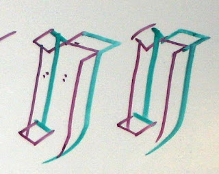
Alternate letterforms: to break up the look, consider using these alternate forms of some letters.
n, h, m, k: instead of a square stroke to end, pull the downstroke below the base-line.
n, m: pull the rectangle stroke slightly longer into a wedge shape, then pull it down into the downstroke (for the “m”, the second half only).
a: if you can’t stand the “a” from the exemplar, try this simplified version.
DeAnn demonstrated painting the decorative elements of the illuminated manuscript project.
- Set up your workspace: have 2 water containers, one for dirty, one for clean. Always rinse brush in the dirty container first, then rinse in the clean container
- Choose 3 colors (one of the greens) and zinc white. Gouache, an opaque watercolor, is used for the paint. Place a dab of each color on the palette; even if it dries, you can reconstitute it with water.
- For the colors, put zinc white next to each color. Add the tiniest bit of color, then a drop of water, to mix a tint.
- Paint each leaf half of one color, then half in that color’s tint. Make sure the first color is dry before painting on the other half. Paint right over the pencil outline.
- Once all the leaves are painted & dry, “diaper” them with permanent white gouache. With a small pointed brush (e.g. size 0/0), decorate each leaf with lines, cross-hatching, or dots.
- Since illuminated manuscripts rarely ever had plain surfaces, you can also “diaper” the background. Using the 2H lead, draw diagonal lines with the C-thru ruler, 1/8-inch apart, to create a cross-hatch pattern. If desired, draw dots or a trio of dots in each space with permanent white.
- Clean up the edges with an X-acto knife with the #16 blade. (TIP: Every calligrapher should have the #11 blade and #16 blade.) If you need to clean any blobs of paint, you can scrape them off too.
- Outline each leaf in black with a Pigma Micron 005 pen.
- If you have leftover paint in the palette, let it dry. Don’t cover it while it’s wet, it may mold. Once it’s dry, cover with wax paper to keep out dust. You can reconstitute it with water.
REMEMBER: with illumination, you can never be too garish!
HOMEWORK: Continue working on your illuminated manuscript project. 2 more weeks left in class. DeAnn will help you with painting and any other issues you encounter.


No comments:
Post a Comment