Tuesday, April 27, 2010

April 26, 2010 - Beverly Hills Adult School Copperplate Class #4

ANNOUNCEMENT:  Due to a scheduling conflict, Copperplate class will start at 9:30am for the next 2 weeks. So for Mondays 5/3 and 5/10, Copperplate class will be from 9:30 am to 12:30 pm.

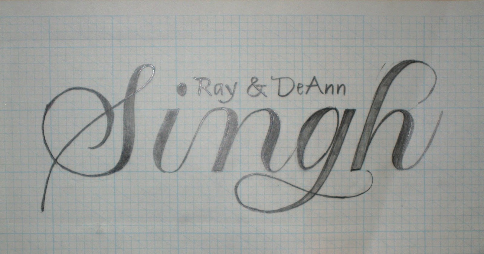
Today DeAnn reviewed common problems and demonstrated drawing a word in the Copperplate lowercase alphabet.

For warm-up, we practiced writing alphabet sentences. DeAnn took questions from the class about any problems that occurred during the week’s practice.

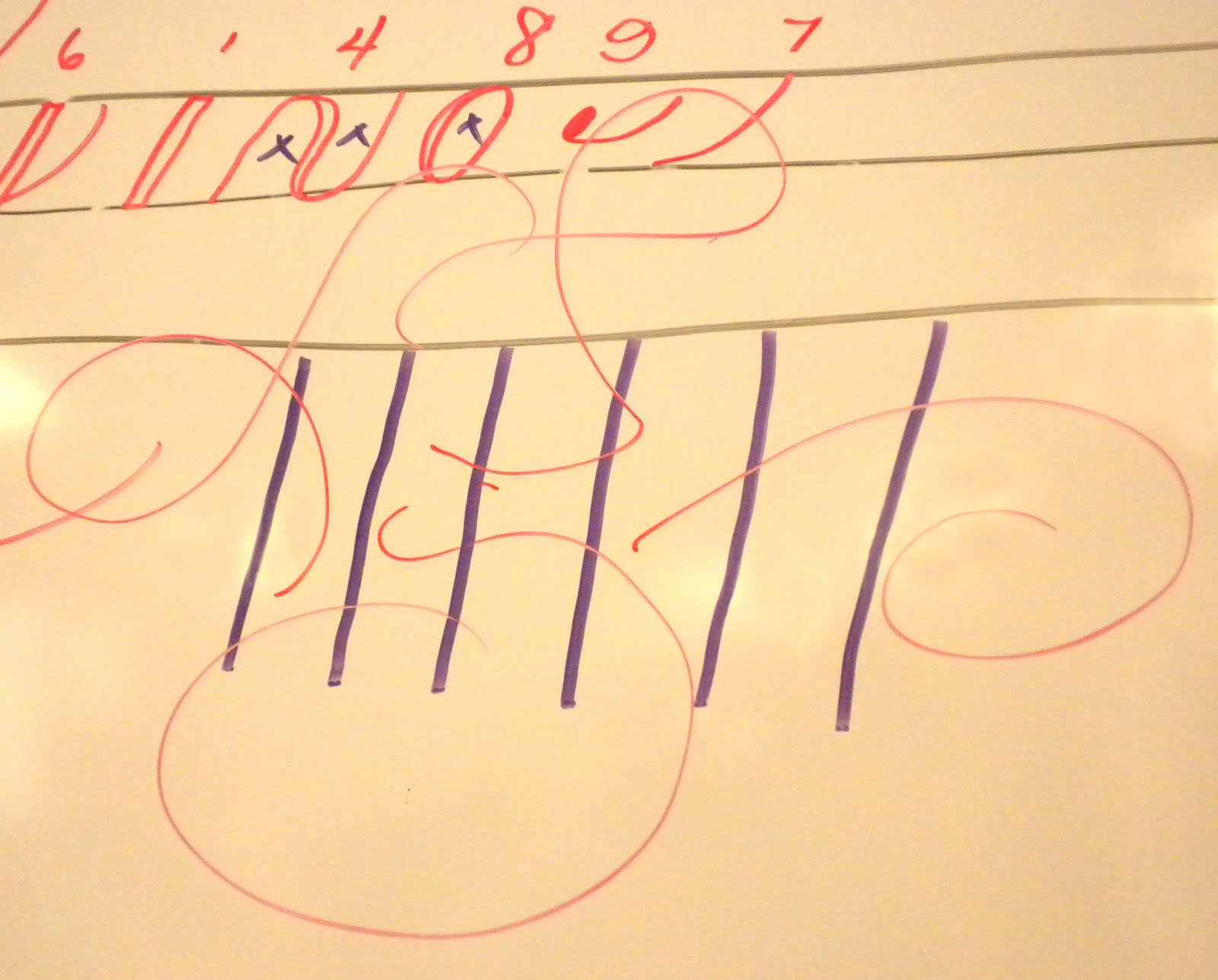
Review of writing “x”:  start with a #4 stroke but make the downstroke a diagonal.  Imagine parallel lines running  down the center of the arches of the #4 stroke. Then start the initial dot of the upstroke slightly above the base line which intersects the imaginary center of the arch. The alternate “x” is a #2 stroke that curves inward and ends with a terminal dot. Then a “c”-like stroke.

Example of a word with double-f:

Good habits:  put your rag on your lap so that it’s easily accessible. Wipe your nib off every 20 minutes to prevent it from getting clogged up. Be aware of your posture: is your whole right arm on the table? Is your left hand placed above your writing as a weight? The nib should be in the direction of the slant lines. Otherwise the nib will eventually get tweaked if you’re not writing with it in the direction of the slant lines.

Be aware of the pen angle at which you’re writing. If you’re holding the pen at too high of an angle, then pressurizing the nib won’t give you good downstrokes. If you’re holding the pen at too low on an angle, your upstrokes may be too thick.

If you’re having problems seeing where you’re writing clearly, try writing on the board at an angle. This may give you a better view of your paper.

Diagnosing  the problem when you’re having problems writing with a nib:  If you’re having problems writing with the sepia (brown)  or black ink, switch over to the vermillion. If you’re able to write with the vermillion ink, then it’s probably the ink’s fault, not the nib.  If the ink is too thick, it won’t flow smoothly down from the reservoir even after you’ve just dipped it. Add a drop or 2 of water until it flows better. If the black ink just runs out of the nib, add a drop of gum Arabic until it sticks better to the nib.

Tips for really difficult nibs: some nibs like the Hiro 40 are really difficult to “break-in”. If the ink still doesn’t stick after rubbing it with gum Arabic many times, try sanding the nib with very fine sandpaper or crocus cloth (Armenian bole pressed into cloth), available at a hardware store. Sand both sides of the nib. This is to roughen up the surface so that the ink will stick better. Try dipping the nib into the ink – it shouldn’t bead up and roll off.

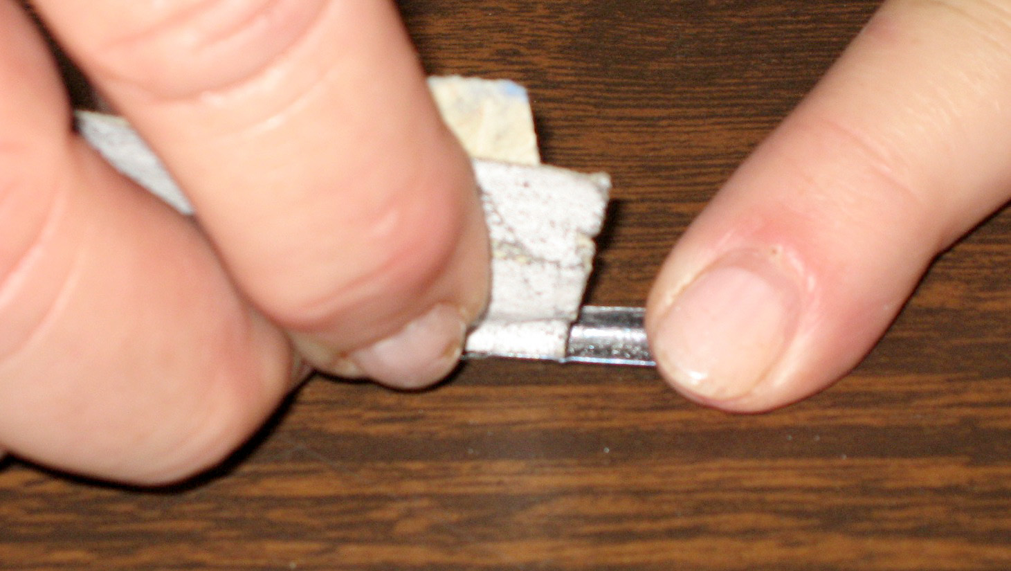
As a very last resort, use a match to heat the nib.  Place the nib into your holder very shallowly so it sticks out a lot. Then light the match & pass the nib through the flame just twice.

WARNING:  Don’t heat it too much, it ruins the nib so that the first time you write with it afterward, the tips bends backwards.

Friendship Exercise: Use a pencil that’s been sharpened. Have an eraser handy. DeAnn recommends the Staedtler Mars Plastic Eraser. Cut pieces off with an X-acto knife so that you have an eraser piece with sharp corners and edges. This enables you to erase with better precision.

Study the exemplar and the “friendship” handout. The x-height is 1-inch. First trace the word “friendship” on your paper. Pay close attention to where the thicks and thins start as you increase and decrease pressure. Study the width of the downstrokes and the spacing.  Work one letter at a time. After you’re comfortable with tracing “friendship” from the handout, try drawing it yourself on the 1-inch x-height guide line sheet. Then draw your name. DeAnn will review this very critically next week. Don't worry about capitals yet, DeAnn will go over capitals next week.

Banner paper: DeAnn handed out yellow or blue banner paper for us to write our names. Once you’ve drawn your name on the cotton comp paper at the 1-inch x-height, draw it on the banner paper. Use the C-thru ruler to make your guidelines. If the x-height is 1-inch, then the space to the ascender & descender is 1 1/2 inches (Remember the 3 : 2 : 3 ratio). To make the slant guide lines, lay the banner paper over the 1-inch x-height guideline & draw some slant lines with the C-thru ruler.

See pictures of banners from last year’s Copperplate class here. Scroll down the page to entry entitled "Copperplate Banners" and dated Monday, June 1, 2009.

HOMEWORK:  Do “friendship”  in pencil using the 1-inch x-height handout.  It’ll be helpful to trace DeAnn’s “friendship” handout a couple times. Also draw your name (first, last, or both is OK) using the 1-inch x-height guideline. Then write your name  on the colored banner paper DeAnn gave us. Don't worry about using capitals yet.

This week’s GOAL: Learn how Copperplate works.

Next week: Capitals.

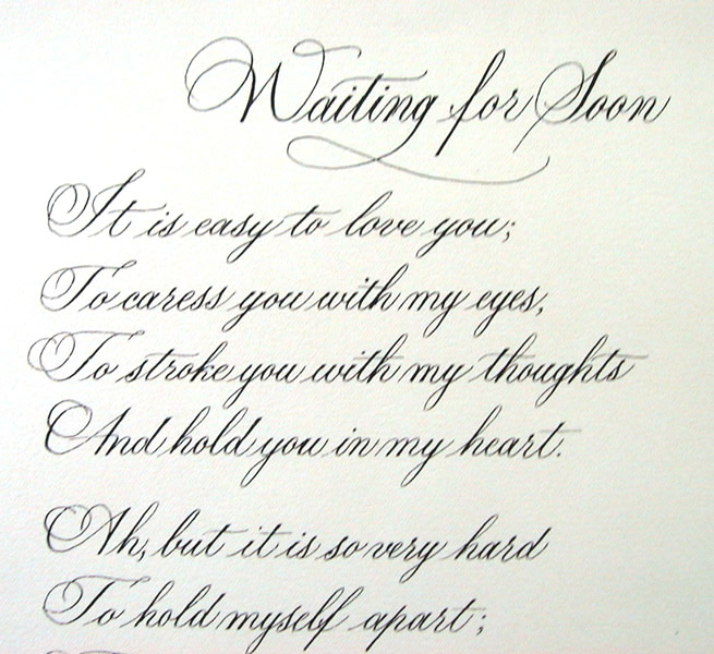
Project text: think about what you want to write for your project. It could be a poem, song lyrics, quote, or other text. From Satomi’s example, it should be about 60 – 75 words.

Thursday, April 22, 2010

April 19, 2010 - Beverly Hills Adult School Copperplate Class #3

Today DeAnn reviewed ratio and demonstrated connecting the lowercase letters to form words and sentences. The handout was the project template.

For warm-up, we practiced writing the letters (not words). Use the large guidelines, use a different nib, and use black or sepia ink.  Don’t write the same letter 20 times. Write a letter once, then study the Exemplar and compare them. If you find something to improve, write it once or twice more. Then move on to the next letter. It’s more helpful to study the Exemplar & your written letter than just writing it many times without any observation.

If the ink beads off and rolls right off the nib, rub more gum Arabic onto the nib. Really rub it in using your fingers. Don’t worry about getting gum Arabic on your hands, it’s non-toxic and will wash off.

The Gillot 1068 nib is made of thinner metal than the others so it may be loose in your pen holder. Flatten it slightly (be careful not to flatten it too much!) just at the very end (NOT the tip!) with small needle-nose pliers.


What is Ratio: In Copperplate, pen width doesn’t determine x-height (height of the letter “x”) like it does for chisel-point nibs. Instead, the ascender and descender length depends on the ratio and x-height being used.  On the Large 1/4” Guideline sheet that we’re currently using, note the “(3 : 2 : 3)”. 1/4” is the x-height and the ratio shows that the ascender is 1 1/2 times the x-height (3 : 2 : 3 = 1.5 : 1 : 1.5).  So if the x-height is 1/4” (= 2/8”), then the ascender is 3/8” from the waist and the descender is 3/8” from the base.

If you’ve taken DeAnn’s class before and are familiar with boxes in the 8x8 grid paper, think of the ratio as boxes. 3 : 2 : 3 means that the x-height is two boxes tall, the space from the waist to the ascender is 3 boxes, and from the base to the descender is 3 boxes. So the ratio of 2 : 1 : 2 means that if the x-height is 2 boxes, then the ascender is 4 boxes and so is the descender (2 : 1 : 2 is the same as 4 : 2 : 4).

The ratio of 3 : 2 : 3 is normal.  DeAnn addresses envelopes in this ratio. 2 : 1 : 2 is elegant. This ratio leaves more room for flourishing if you’re creating an invitation or writing  a poem. 1 : 1 : 1 is simple. This is like writing in a spiral bound notebook.

Practice with all nibs and with the different inks. If a particular nib isn’t working for you, try another one.  As DeAnn says “Work the problem.” The purpose of working with different nibs and inks is to become aware of which nibs work better with which inks in certain situations.  Vermillion is great to work with, but not a very practical color to use for actual projects in real life. In a later class, DeAnn will bring in a variety of papers for us to try so we can see how different nibs and inks react to these papers.

Nib Identification Chart:  As you try the different nibs, write down your observations on the Nib Identification Chart. If the Gillot 404 is medium sharp and medium flexible, rate the sharpness and flexibility of the other nibs in comparison. Also make any other notes that make a particular nib different from the others.

Notes on individual nibs:
Gillot 404:  medium sharp, medium flexible
Gillot 1068:  medium sharp, stiff
Gillot 303:  very sharp, very flexible
Hiro 40:  sharp, flexible. Known as the “blue pumpkin”. You may have to rub gum Arabic on this many times as it doesn’t want to hold on to ink. DeAnn has also heated it with a match and sanded it. It her writes best on paper that isn’t textured.
Hiro 40:  dull, stiff. On smooth paper it doesn’t make thin hairlines or thick downstrokes, but it works very well on watercolor paper.
Brause Steno:  medium sharp, medium flexible. This is DeAnn’s favorite for most papers. Its tip is less square edged than the Gillot 404 so it doesn’t get hung up in the paper. It doesn’t make as thin hairlines, but works well in addressing envelopes.
Brause EF66:  sharp, very very flexible. This is best for big writing because its flexibility can create thick downstrokes.

Sepia recipe:  Add 6 drops of Higgins Eternal (with gum Arabic) to half an inkwell of Vermillion. Other black inks don’t mix well with the Vermillion.  For example, black sumi ink won’t blend with the Vermillion.

Connecting letters into words: start with the sentence “the quick brown fox jumps over the lazy dog.” Don’t worry about capitals yet. To connect the individual letters, the last stroke becomes the entry stroke for the next letter. For “the”, only the “t” has an actual #7 stroke. The #3 stroke of the “t” becomes the #7 for “h”, the #4 stroke of the “h” becomes the #7 for the “e”. Leave a little space between the exit strokes and the #7 entry strokes, just enough to separate the words. The sentence shouldn’t look like a list of words but a sentence.

Stroke #9 exit: for the letters b, v, and w, the initial dot should be on the inside of the previous stroke. Try to exit at 3:00 to make a smooth connection to the next letter. The #9 exits above are incorrect.

Space the letters so that the whitespaces are all equivalent. The downstrokes should all be the same width and the same distance apart so that it looks like true picket fence spacing.

Special cases: for the “f” in a word like “off”, start the #9 stroke a little above the base line in its usual place; don’t worry that it doesn’t cross the #7 stroke. For double “t”s, cross both in one stroke.

Start thinking  about what text you want to use in your project. It could be a poem or song or a quote, like an excerpt from something longer. It should be about 50 words.

HOMEWORK:
1. Large guidelines
2. medium guidelines
3. use all nibs (don’t forget to label your paper & nib ID chart)
4. use black, sepia, vermillion
5. write alphabet sentences (no capitals)

Sunday, April 18, 2010

April 12, 2010 - Beverly Hills Adult School Copperplate Class #2

Today DeAnn reviewed last week’s information and demonstrated writing the Copperplate lowercase alphabet.

For warm-up, we practiced the strokes with the Gillot 404 nib. On the Nib Identification Chart, label the Gillot 404 nib as “medium sharp, medium flexible.” DeAnn reminded us to maintain the correct posture – elbow on the table, left hand at the top of the page, pen nib in line with the slant line.

Review: The pen should be held so that the nib is in line with the slant-lines on the guideline sheet. The slant lines aren’t for spacing, only as guides for the slant. The letters are written on the line with the black rectangle at the beginning. This is the waist-base line. The line above the waist is the ascender, the line below the base is the descender. Strokes  #1 (most of the time), #2, #3, #4,  #7, #8,  and #9 are written between the waist and the base. Stroke #5 goes up to the ascender, stroke #6 goes down to the descender.


Spacing: the goal is for the whitespaces of strokes #2, #3, #4 and #8 to be the same so that your Copperplate looks like picket fence spacing, very even and regular. This will be the basis of flourishing that you’ll learn later. If the picket fence foundation isn’t strong and steady, the flourishing will look weak.

Student questions:
How much space should be in the loop of the #5 or #6 stroke? Enough so that there isn’t a dark spot there. For example, if DeAnn is addressing  envelopes, she’ll make the spaces smaller to take up less space. In any case, the white space of stroke #5 should be equivalent to that of stroke #6.

Nibs: from now on, practice with all the nibs. If you’re having a nightmare with a particular nib, switch! Note on your Nib Identification Chart your observations of each nib, using the Gillot 404 as the measure for “medium sharp, medium flexible.” For example, you may find the EF 66 nib “very flexible” compared to the Gillot 404. Become familiar enough with your nibs that you can recognize them by sight. For example, the Gillot 404 has a ridge and the Gillot is shorter than the Gillot 1068. Learning your nibs is important because one nib doesn’t work for everything. Depending on the effect you want to achieve, different nibs will be able to do the job. For example, DeAnn prefers the Gillot 1068 or Brause Steno for envelope addressing because those are stiffer, duller nibs.

Lowercase alphabet: DeAnn had us write the stroke numbers and notes for each letter on the Copperplate Stroke Sequence handout. Remember: all the downstrokes should be the same width. All the whitespaces should be the same. DeAnn does pick up her pen with each stroke. The Copperplate exemplar that’s in color contains a lot of information – study the notes DeAnn has written on it.


Notes on individual letters:
a: 7 – 8 – 3.  The entrance stroke #7 goes up 2/3 of the way to the waist. The outer edge  of the #8 stroke doesn’t overlap the #7, but meets it. Then the #3 stroke should not overlap, but just kiss the #8 stroke so the the whitespace of #8 is still oval.
b: 7 – 5 – 3 – 9:  #7 goes up to the waist, then jog over to make the #5 stroke. The downstroke going all the way to the base will cover the jog-over. #9 should come down from the waist to exit at 3:00. If it’s too high, it’ll be difficult to connect to the next letter.
c:  7 – 8 but leave open – dot.
d:  7 – 8 – long 3: stroke #3 starts halfway between the ascender and waist and should just kiss #8.
e:  7 – jog-over & 8: all the #8 strokes should be the same width, so be careful not to make the jog-over too small.
f:  7 – jog-over & long 5 – 9: stroke #5 ends halfway between the base and descender. Start stroke #9 a little above the base-line, then touch the baseline before surving upward.
g:  7 – 8 – 6:  the loop of stroke #6 should cross below the baseline to avoid a dark spot.
h:  7 – jog-over – 5 – 4:  start stroke #4 from the base line, go upward along edge of wet ink. This creates a better connection; you don’t want to start stroke #4 near the waist – this creates an awkward jog from #5’s downstroke.
i:  7 – 3, then dot: the dot on the “i” and “j” is also called a jot or a tittle. The dot should be the same width as the downstroke.
j:  7 – 6, then dot.
k:  special case: 7 – jog-over & 5 – upstroke with terminal dot – modified #3
l:  7 – jog-over & 5 – 3
m:  2 – 2 – 4. For the 2nd #2 stroke and #4, slide up the edge of the wet ink. All the whitespaces should be the same width.
n:  2 – 4. Same as for “m”.
o: 7 – 8 – 9. Start the #9 at about 2:30 so that it comes out at 3:00
p:  7 – long 1 – 4. Stroke #1 should start halfway between the ascender and waist. It should end halfway between the base and descender.
q:  7 – 8 – 6 (backwards loop): the downstroke of #6 should just kiss #8, not overlap. The loop should not touch the downstroke.
r:  special case: 7 – loop – modified #3. The loop is above the waist with no pressure on the upstroke; fill the loop on the downstroke. This is the French “r”. The English “r” is a #2 – loop.
bad r: make the modified #3 stroke smooth, not a corner.
s:   special case: 7 – loop – curvy downsroke with terminal dot – 7. Downstroke starts with little pressure, increase to full pressure for belly of “s”, then no pressure before the terminal dot. Pick up pen to make the final #7 stroke.
t:  7 – long 3 – crossbar. Start stroke #3 halfway between ascender and waist. Crossbar should be slightly longer on the right side.
u:  7 – 3 – 3.
v:  4 – 9. Dot of #9 should be inside #4.
w:  7 – 3 – 3 – 9. Dot of #9 should be inside #4.
x:  special case:  4 with diagonal downstroke – upstroke with initial dot and terminal dot. The alternate x is a modified #2 that curves inward with a terminal dot, then an open #8 (like a "c") stroke.
y:  4 – 6 or 7 – 3 – 6. Loop of #6 should cross below the base. Use alternate “y” depending on previous letter.
z:  special case:  2 with loop at end – 6. It’s OK for the #6 loop to go beyond the top half – don’t squish it.

Preparing black ink for Copperplate: the Higgins Eternal black as-is doesn’t work well in the Copperplate nibs. Fill a dropper bottle almost full with Higgins Eternal. Then add 25 drops of Gum Arabic into it. Don’t shake to mix; use the end of your pen holder to stir it. Label the dropper bottle with a sticky label that says “Higgins Eternal + 25 drops Gum Arabic” to distinguish it from plain black ink.

Mix sepia ink: Vermillion ink with a few drops of Higgins Eternal makes a sepia-colored ink. Fill one of the inkwells about halfway with Vermillion ink, then add 6 drops of black ink from your Higgins Eternal + gum Arabic dropper bottle. Stir with the end of your pen holder. It may not mix right away; wait a day and the color will look more blended. Add less or more black ink for a lighter or darker shade of brown.


HOMEWORK:
1. Practice the letters
2. Try different nibs
3. Label the writing (also label the nib ID chart)
4. Use black & vermillion ink. & sepia

If you get confused and discouraged, just go back one step and practice the strokes. Practice the letters slowly and carefully and think of all the stroke numbers.  It may be helpful to trace the letters of the exemplar.

Tuesday, April 6, 2010

April 5, 2010 - Copperplate Class #1 at Beverly Hills Adult School

DeAnn introduced herself and gave a short history of Copperplate. At the time it was originally in use, it was called Roundhand and appeared in England, France and some of Italy in the 1600s. Around 1900 it had become almost a business style of writing and then several different methods developed, such as Palmer, Spencerian, Zaner-Bloser.

DeAnn’s Philosophy for learning Copperplate: For success in writing beautiful Copperplate, think of the Copperplate letters as a series of STROKES, which you’ll be learning in today’s class. By disassociating them from the letters you’re familiar with, you can avoid common mistakes that could make your Copperplate letters look like cursive writing.

DeAnn distributed supplies and handouts. The handouts are the Copperplate Exemplar, nib chart, and large guideline sheet. We will be starting out using the Gillot 404 nib and Vermillion ink. The Gillot 404 nib has a ridge that distinguishes it from the Gillot 303.

Preparing your supplies for ease of transportation: pour ink from their containers into the dropper bottles. Start with the Vermillion ink (the Higgins Eternal ink needs to be mixed with the gum Arabic so DeAnn will go over that recipe next session). The dropper bottles are leak-proof so bring those to class; it’s OK to leave the original containers of ink at home. From the dropper bottles, fill one of the ink wells (or “dinky dip”) to at least the ridge-line. You want to be able to dip your pen and cover the nib’s reservoir area (“eye of the needle”) completely.

Learn Your Nibs:  Unlike calligraphy written with a chisel-point nib, Copperplate nibs create thicks & thins by pressing & releasing. The more pressure you apply when pressing on a down stroke, the wider the stroke. So unlike chisel-point nibs that come in different set widths (e.g. 5mm, 1mm), Copperplate nibs come in a wide variety of sharpness and flexibility. This is another important area to explore & learn. By the end of this semester, you will have filled out your nib chart with notes on each of the nibs, paying particular attention to each nib’s sharpness and flexibility.

Preparing the Pen: Put the nib into the oblique pen holder so that the “eye of the needle” (the opening in the nib) points directly upward. The fit may feel tight, but push the nib in at least halfway for a secure hold. Hold the oblique holder as you would normally hold your pen, with the angled nib to the left side. If you have a brand new nib, you’ll need to prepare it by rubbing gum Arabic all around so that the ink will adhere to the nib and not just bead-up and slide off. New nibs usually have a waxy coating and you may have to rub with gum Arabic several times until the ink will stay in the reservoir. NOTE: Vermillion ink will rust your nib, so wash it off with water after you’re done practicing.

Preparing the paper: Make a crease in the cover of the cotton comp paper pad about an inch down from the top. Fold this back so that you’ll have a flat writing surface without the cover bunching up to the left. Place the guideline sheet underneath the first sheet.

Guideline sheet: We’ll be starting with the large 1/4-inch guideline sheet. 1/4-inch refers to the x-height, the space between the waist and the base. These lines are indicated by the black box on the left margin. The line above the waist is the ascender, the line below the base is the descender. 3:2:3 at the bottom of the guideline sheet refers to the ratio of the spaces between the horizontal lines. 3:2:3 is the same as 1:1.5:1. If the x-height (base to waist space) is considered 2 units of space, then the ascender & descender lengths are 3 units of space. The 35-degree slant lines are there as guides for the angle of writing, not for spacing.

TIP: DeAnn suggests highlighting the waist to base space so that it’s easier to distinguish as the line to write on underneath the cotton comp sheet.

Prepare your work space: The key to being able to write Copperplate correctly is to set up your work space correctly and sit in the right position in relation to your paper. Position the paper so that the slant lines are pointing toward your stomach. This angle may seem extreme, with the paper pad almost at right angles to the table’s edge, so you need to position yourself so that your elbow rests completely on the tabletop, which means you’ll probably have to sit at an angle to the table edge so you’re not twisting your torso. Place the ink well above the paper pad and tape down to avoid accidental spills. Place your exemplar in front of you, preferably in a stand like a Page-Up, so it's easy to refer to.

Use your left arm to take the weight off your body by placing your left hand above the area where you’re writing. Try to learn NOT to have a heavy writing hand, but practice having a light touch. Putting the pressure on your left hand helps with this. REMEMBER to breathe! If you’re having trouble writing the strokes, exhale.

Writing with the nib: 
1. Write straight lines (with slant) 
2. Pen should be in the direction of the slant lines 
3. To create the square top & bottom edges, set – press – pull – stop – release 
4. If the nib is sticking into the paper, adjust the angle of how you’re holding the nib. Lowering the angle may help.

Writing the basic strokes: You apply pressure on the down stroke (thick), no pressure on the up stroke (thin). This is how you create thicks & thins. The goal is for all the down strokes to have the same width (i.e. consistent pressure). Look carefully at the exemplar handout, it has a lot of important information on it.

Notes on individual strokes: 
1. #2, #3, #4: the up strokes and the down strokes should be parallel and also parallel to the #1 strokes.
2. #2, #3, #4, #8 should all have the same white space. White space is the space between the down strokes & the up strokes. 
3. #2, #3, #4: the arch should be like a paperclip. 
4. #2, #4: start the curve with no pressure, build up to full pressure by midpoint on the down stroke. 
5. #4: start the second curve before you hit the baseline so you don’t have a “staple” instead of a paperclip curve. 
6. #5, #6: the size of their white space should be similar, though they are not exactly the same shape. 
7. #8: start at 3:00 and think of it as an oval shape, more hot dog than hamburger.  It’s thickest through the center. The inner white space should match the width of #2, #3, #4 strokes. 
8. #9: start counterclockwise to create a tiny filled oval, then exit. Like the #7, it’s an exit stroke to the next letter.

REMEMBER:  Don’t get overwhelmed! If you get really anxious, go back to the last step you were comfortable with and practice that. You can even practice the Copperplate strokes with a pencil if it all seems to be too much at the moment.

HOMEWORK: Continue practicing the strokes with the Vermillion ink and Gillot 404 nib. Memorize the basic stroke numbers – DeAnn will test you next week. If you feel really comfortable with the Gillot 404 nib, you can try out another nib and see how it’s different frm the Gillot 404. Be sure to note on your nib chart that the Gillot 404 is “medium sharp, medium flexible”.

NOTE:  On your practice sheets, write the nib, ink type, and date in the lower right corner.

Homework for intermediates: write the strokes and letters as perfectly as you can this week. DeAnn will then give a thorough critique. Start thinking about text you want to use in the project.

Saturday, April 3, 2010

Spring Calligraphy Classes Are Starting!

Copperplate Calligraphy
Beverly Hills Adult School 
April 5-June 7th.  10-1pm
Level: Beginning and/or Intermediate
9 weeks approx. $100
701 Whittier Drive
Beverly Hills, CA 90210
Map

Copperplate calligraphy is a style of cursive calligraphy. 
Unlike broad pen calligraphy styles, copperplate uses a pointed calligraphy pen. Copperplate alphabets are determined by the pressure applied to the pen. The more pressure applied in the copperplate style, the thicker the stroke. The hair-line strokes produced, contrasts beautifully with the thicker downward strokes.
Materials List


Journal Your Vacation and Special Events
Beverly Hills Adult School 
April 5 - May10th  1:30-3:30
6 weeks approx. $90. 1:30-3:30
701 Whittier Drive
Beverly Hills, CA 90210
Map

Have you ever wanted to journal some of your vacations or special events? You’ll learn how to draw and write what you see. You don’t have to draw well to journal. We will create drawings, paintings, collages, and use other interesting techniques to add to your pages. You will be taught enough to get started on your journal. If you already journal, you can work on improvements or just get new ideas to make your journal better.
Materials List

Beginning and/or Advanced Calligraphy Classes
Emerson Adult Learning Center
April 6th-May 25th
Beginning 9:30-11:30am    
Intermediate / Advanced 12:00-2:00pm  (some calligraphy experience needed)
8 classes approx. $80
8810 Emerson Ave.
Westchester, Los Angeles
Map

Many styles of calligraphy will be taught, including Roman Capitals in pencil and pen. Small classes with a maximum of 10 students per class.
Call to register: 310.258-2000
Materials List (TBA)

Calligraphy Classes
Stampin' from the Heart
CALL  310.391.0466
11720 Washington Place
Los Angeles, CA 90066
Map

Calligraphy classes for students of all levels and continuing studies.  Stampin from the Heart Classes begin on April 7th.  You can buy 6-10 lessons for $20 per lesson ($120. for 6 lessons, $200. for 10 lessons for the semester.
All calligraphic subjects, including illuminated manuscripts will be covered. Maximum of 10 students.
Materials List (TBA)


Uncial
Rand Corporation
Thursdays  5:30-7:30pm (6 weeks - $72)
Class begins April 29th
Space is limited
For more enrollment information, contact: shirleycromb@hotmail.com

Uncial is a beautiful majuscule script (written entirely in capital letters) with a broad pen.  It was commonly used from the 3rd to 8th centuries AD by Latin and Greek scribes.  It was brought to Ireland and England in the 5th century and was used on some stunning illuminated manuscripts, including the Book of Kells.
Materials List (TBA)