
For warm-up, we practiced the strokes with the Gillot 404 nib. On the Nib Identification Chart, label the Gillot 404 nib as “medium sharp, medium flexible.” DeAnn reminded us to maintain the correct posture – elbow on the table, left hand at the top of the page, pen nib in line with the slant line.


Spacing: the goal is for the whitespaces of strokes #2, #3, #4 and #8 to be the same so that your Copperplate looks like picket fence spacing, very even and regular. This will be the basis of flourishing that you’ll learn later. If the picket fence foundation isn’t strong and steady, the flourishing will look weak.
How much space should be in the loop of the #5 or #6 stroke? Enough so that there isn’t a dark spot there. For example, if DeAnn is addressing envelopes, she’ll make the spaces smaller to take up less space. In any case, the white space of stroke #5 should be equivalent to that of stroke #6.

Nibs: from now on, practice with all the nibs. If you’re having a nightmare with a particular nib, switch! Note on your Nib Identification Chart your observations of each nib, using the Gillot 404 as the measure for “medium sharp, medium flexible.” For example, you may find the EF 66 nib “very flexible” compared to the Gillot 404. Become familiar enough with your nibs that you can recognize them by sight. For example, the Gillot 404 has a ridge and the Gillot is shorter than the Gillot 1068. Learning your nibs is important because one nib doesn’t work for everything. Depending on the effect you want to achieve, different nibs will be able to do the job. For example, DeAnn prefers the Gillot 1068 or Brause Steno for envelope addressing because those are stiffer, duller nibs.

Notes on individual letters:
a: 7 – 8 – 3. The entrance stroke #7 goes up 2/3 of the way to the waist. The outer edge of the #8 stroke doesn’t overlap the #7, but meets it. Then the #3 stroke should not overlap, but just kiss the #8 stroke so the the whitespace of #8 is still oval.
b: 7 – 5 – 3 – 9: #7 goes up to the waist, then jog over to make the #5 stroke. The downstroke going all the way to the base will cover the jog-over. #9 should come down from the waist to exit at 3:00. If it’s too high, it’ll be difficult to connect to the next letter.
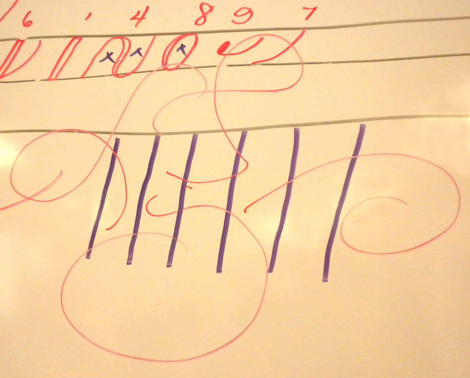
c: 7 – 8 but leave open – dot.
d: 7 – 8 – long 3: stroke #3 starts halfway between the ascender and waist and should just kiss #8.
e: 7 – jog-over & 8: all the #8 strokes should be the same width, so be careful not to make the jog-over too small.
f: 7 – jog-over & long 5 – 9: stroke #5 ends halfway between the base and descender. Start stroke #9 a little above the base-line, then touch the baseline before surving upward.
g: 7 – 8 – 6: the loop of stroke #6 should cross below the baseline to avoid a dark spot.
h: 7 – jog-over – 5 – 4: start stroke #4 from the base line, go upward along edge of wet ink. This creates a better connection; you don’t want to start stroke #4 near the waist – this creates an awkward jog from #5’s downstroke.
i: 7 – 3, then dot: the dot on the “i” and “j” is also called a jot or a tittle. The dot should be the same width as the downstroke.
j: 7 – 6, then dot.
k: special case: 7 – jog-over & 5 – upstroke with terminal dot – modified #3
l: 7 – jog-over & 5 – 3
m: 2 – 2 – 4. For the 2nd #2 stroke and #4, slide up the edge of the wet ink. All the whitespaces should be the same width.
n: 2 – 4. Same as for “m”.
o: 7 – 8 – 9. Start the #9 at about 2:30 so that it comes out at 3:00
p: 7 – long 1 – 4. Stroke #1 should start halfway between the ascender and waist. It should end halfway between the base and descender.
q: 7 – 8 – 6 (backwards loop): the downstroke of #6 should just kiss #8, not overlap. The loop should not touch the downstroke.
r: special case: 7 – loop – modified #3. The loop is above the waist with no pressure on the upstroke; fill the loop on the downstroke. This is the French “r”. The English “r” is a #2 – loop.


t: 7 – long 3 – crossbar. Start stroke #3 halfway between ascender and waist. Crossbar should be slightly longer on the right side.
u: 7 – 3 – 3.
v: 4 – 9. Dot of #9 should be inside #4.
w: 7 – 3 – 3 – 9. Dot of #9 should be inside #4.
x: special case: 4 with diagonal downstroke – upstroke with initial dot and terminal dot. The alternate x is a modified #2 that curves inward with a terminal dot, then an open #8 (like a "c") stroke.

z: special case: 2 with loop at end – 6. It’s OK for the #6 loop to go beyond the top half – don’t squish it.
Preparing black ink for Copperplate: the Higgins Eternal black as-is doesn’t work well in the Copperplate nibs. Fill a dropper bottle almost full with Higgins Eternal. Then add 25 drops of Gum Arabic into it. Don’t shake to mix; use the end of your pen holder to stir it. Label the dropper bottle with a sticky label that says “Higgins Eternal + 25 drops Gum Arabic” to distinguish it from plain black ink.


HOMEWORK:
1. Practice the letters
2. Try different nibs
3. Label the writing (also label the nib ID chart)
4. Use black & vermillion ink. & sepia
If you get confused and discouraged, just go back one step and practice the strokes. Practice the letters slowly and carefully and think of all the stroke numbers. It may be helpful to trace the letters of the exemplar.
I've been looking for hints and tips about copperplate and this is very useful! Even though I didn't attend the class, I'm combining these ideas and pictures with Elaine Winter's book about copperplate to improve my own practice. Thanks!
ReplyDelete