
Review: make sure the triangular shapes of the a-family and branching-family are the same. If you're going to err, err on making it too pointy than too round.
Italic with the chisel point nib: To start, we used the 2.4 mm Parallel Pen and the 1/2-inch guidelines with 5-degree slant. If you have the Brause holder that’s flat on one side, insert it toward the right side (when holding it) of the wooden nib holder. If you’re looking at the holder head-on, the nib will be toward the left edge.

Pen angle: A chisel-point pen is able to create thicks & thins within one stroke, based on the angle of the pen. Using a protractor as the reference, a pen angle of 0-degrees equates to holding the pen so that the nib is parallel to the horizontal lines of the grid paper. A vertical stroke at this pen angle is the thickest; a horizontal stroke is the thinnest. If the pen angle is 90-degrees, then a vertical stroke is the thinnest and a horizontal stroke is the thickest. For a 45-degree pen angle, use a box as a reference and place the pen so that you’re placing it on the diagonal of the box. At this angle, both a vertical stroke and a horizontal stroke should be the same thickness.

x-height: is the height between the waist and base. Each hand has a specific x-height measured in pen-widths. At a pen angle of 90-degrees, draw short horizontal strokes to measure by pen widths.

Italic has a pen angle of 45-degrees and an x-height of 5 pen widths, which equals 1/2-inch for the Brause 2 1/2 mm nib or 2.4 mm Parallel Pen.

In class we practiced writing downstrokes & cross-strokes at 0 and 90 degrees. Practice making straight lines with the Parallel Pen. You need even pressure on both sides of the nib. Not a lot of pressure, just even pressure. The ink will flow better to begin with if you give a little side-to-side "rub" (like an ice-skate) with the nib. Or touch the tip to some wet ink on a previous stroke. As you draw the stroke down the page, EXHALE. This helps give a more controlled stroke. Also, set your opposite hand near the work so you can give slight pressure as you start down. These tips will help you have success quicker.

Writing vertical strokes at a 45-degree pen angle: set your nib corner-to-corner and don’t move until you achieve that angle. Watch the left side of your nib and pull straight down. Keep the angle steady and constant; don’t turn the pen holder in your fingers. The angle at the top of the stroke should be the same at the bottom; look at the triangle shapes – they should be the same.
The chisel point dip pen doesn’t push well, especially at the larger sizes like 5mm. So you can make a “pull” stroke at the end of the “b”, for example (similar to top of the “a”). The Parallel pen is a fountain pen so you may be able to "push" a stroke more easily.
To achieve the thicks and thins with the chisel point nib, you must keep it at the same angle. Don’t turn the pen-holder in your fingers as you make a curved stroke.
The first line of the exemplar is the sans serif (i.e. “no serif) Italic lowercase. We started with the i-family. Note that when you end the stroke at the baseline, the left-hand edge of the downstroke touches the baseline at a 45-degree angle, creating a triangle-shape. On the "t" the crossbar is longer on the right side. Similarly on the "f", the crossbar is longer on the right side and should be about even with the second stroke.

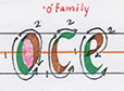
o-family: the "e" should connect horizontally in the middle of the first stroke.
branching-family: the width of the "n" should be the same width as the "o". The "r" should start to branch closer to the waistline instead of midway.

a-family: the "u" is an upside-down "n". The counterspies (white spaces) of these letters should be similar to those of the branching-family and o-family letters. For "d", once you make the loop, look at the left edge of your pen and draw your eye up to the ascender for the start point. Then keep your eye on the baseline where you will end your stroke as you pull down. Don't overlap the third stroke into the counterspace.

diagonal family: when writing at the 5-degree slant, the first stroke of the v and w will be straighter than the second stroke. For the "x" flatten the pen nib slightly on the second stroke to thicken it.

Once you’re comfortable with writing the sans serif letters, try adding serifs to the letters. Because DeAnn recommends rubbing back and forth slightly to start, the letters already have a slight entrance serif. To add an exit serif, continue the downstroke instead of stopping and exit upward with a hairline. Don’t flick the stroke.

 |
| close-up of the exit serifs on t and h |
When practicing the lowercase letters from the exemplar, write a letter about 3 times, then move on. Compare your letter to the exemplar and really look at the shapes.
Remember: write with even pressure, not too hard. Then less pressure on the upstrokes.
Homework: Practice the sans-serif Italic lowercase letters. Write words and alphabet sentences.
Next week: capitals!
No comments:
Post a Comment