 |
| Satomi's Audrey Hepburn piece in Copperplate |
DeAnn’s Philosophy for learning Copperplate: For success in writing beautiful Copperplate, think of the Copperplate letters as a series of STROKES, which you’ll be learning in today’s class. By disassociating them from the letters you’re familiar with, you can avoid common mistakes that could make your Copperplate letters look like cursive writing.
Guideline sheet: We’ll be starting with the large ¼ - inch guideline sheet. ¼-inch refers to the x-height, the space between the waist and the base. These lines are indicated by the black box on the left margin. The line above the waist is the ascender, the line below the base is the descender. 3:2:3 at the bottom of the guideline sheet refers to the ratio of the spaces between the horizontal lines. 3:2:3 is the same as 1:1.5:1. If the x-height (base to waist space) is considered 2 units of space, then the ascender & descender lengths are 3 units of space. The 35-degree slant lines are there as guides for the angle of writing, not for spacing.
TIP: DeAnn suggests highlighting the waist to base space so that it’s easier to distinguish as the line to write on underneath the cotton comp sheet. The handouts are already highlighted, but remember this tip for guideline sheets you later create yourself.
Prepare your work space: The key to being able to write Copperplate correctly is to set up your work space correctly and sit in the right position in relation to your paper. Position the paper so that the slant lines are pointing toward your stomach. This angle may seem extreme, with the paper pad almost at right angles to the table’s edge, so you need to position yourself so that your elbow rests completely on the tabletop, which means you’ll probably have to sit at an angle to the table edge so you’re not twisting your torso.
Use your left arm to take the weight off your body by placing your left hand above the area where you’re writing. Try to learn NOT to have a heavy writing hand, but practice having a light touch. Putting the pressure on your left hand helps with this. REMEMBER to breathe! If you’re having trouble writing the strokes, exhale.
Writing with the nib:
1. Pen should be in the direction of the slant lines
2. Put thumb right behind shaft so pen doesn’t twist
3. To create the square top & bottom edges, set – press – pull – stop – release
4. If the nib is sticking into the paper, adjust the angle of how you’re holding the nib. Lowering the angle may help.
To practice the strokes, we started with Satomi’s Copperplate Strokes worksheet.
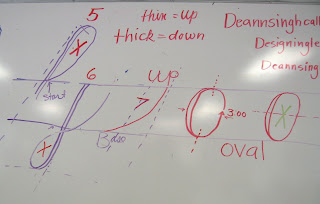
Writing the basic strokes: You apply pressure on the down stroke (thick), no pressure on the up stroke (thin). This is how you create thicks & thins. The goal is for all the down strokes to have the same width (i.e. consistent pressure). Look carefully at the exemplar handout, it has a lot of important information on it.
Notes on individual strokes:
1. #2, #3, #4, #8 should all have the same white space. White space is the space between the down strokes & the up strokes.
2. #2, #3, #4: the arch should be like a paperclip.
3. #2, #4: start the curve with no pressure, build up to full pressure by midpoint on the down stroke.
4. #4: start the second curve before you hit the baseline so you don’t have a “staple” instead of a paperclip curve.
5. #5, #6: the size of their white space should be similar, though they are not exactly the same shape.
6. #8: start at 3:00 and think of it as an oval shape, more hot dog than hamburger. It’s thickest through the center. The inner white space should match the width of #2, #3, #4 strokes.
7. #9: start counterclockwise to create a tiny filled oval, then exit. Like the #7, it’s an exit stroke to the next letter.
Spacing: the goal is for the whitespaces of strokes #2, #3, #4 and #8 to be the same so that your Copperplate looks like picket fence spacing, very even and regular. This will be the basis of flourishing that you’ll learn later. If the picket fence foundation isn’t strong and steady, the flourishing will look weak.
Lowercase alphabet: Refer to the Exemplar and the Copperplate Stroke Sequence handout. Remember: all the downstrokes should be the same width. All the whitespaces should be the same. DeAnn does pick up her pen with each stroke. The Copperplate exemplar that’s in color contains a lot of information – study the notes DeAnn has written on it.
See also blog entry from January 23, 2012 for detailed notes on each lowercase letter.
HOMEWORK:
1. Practice the strokes
2. Go on to practice the letters ONLY (even intermediates)
3. Label the writing (also label the nib ID chart)
4. Trace if having difficulty forming the letters or strokes.
If you get confused and discouraged, just go back one step and practice the strokes. Practice the letters slowly and carefully and think of all the stroke numbers. It may be helpful to trace the letters of the exemplar .


No comments:
Post a Comment