Tuesday, October 25, 2011

October 24, 2011 - Pointed Pen Variations Class #3 at Sinai Temple

(note: more photos to come)
Today’s lesson was getting control of your pen and paper so that your letters come out correctly.

For warm-up, we practiced writing the strokes and letters. Don’t write the same letter 20 times. Write a letter once, then study the Exemplar and compare them. If you find something to improve, write it once or twice more. Then move on to the next letter. It’s more helpful to study the Exemplar & your written letter than just writing it many times without any observation.


Review:  DeAnn reviewed parts of the guideline – ascender, waist, base, descender. She also emphasized setting up your materials and self correctly. Tape down the inkwell in front of your paper pad so you can develop a rhythm of dipping and writing. Make sure the pen point is in line with the slant line. DeAnn recommends methodical practice:  start at the top left of the sheet of paper and keep going until all the lines are filled. Don’t crumple up the practice sheet in frustration; don’t skip areas or lines to write in random areas.

Remember:  Proportion is really important.

If it seems like you can’t get crisp thins, try making the angle of the pen higher. This is the angle of the pen point to the sheet of paper.


Be aware of the pen angle at which you’re writing. If you’re holding the pen at too high of an angle, then pressurizing the nib won’t give you good downstrokes. If you’re holding the pen at too low on an angle, your upstrokes may be too thick.

If the ink beads off and rolls right off the nib, rub more gum Arabic onto the nib. Really rub it in using your fingers. Don’t worry about getting gum Arabic on your hands, it’s non-toxic and will wash off.

Then DeAnn had us trace the handout that starts out “Forsaking monastic…” for practice. She gave us a see-through version so that when we put it under a sheet of paper, we could still see the guideline sheet underneath. Practice the larger lettering; we don’t have a guideline sheet for the smaller size lettering yet. Move the "Forsaking..." sheet down as you go so that the line you're tracing lines up with the red guideline.


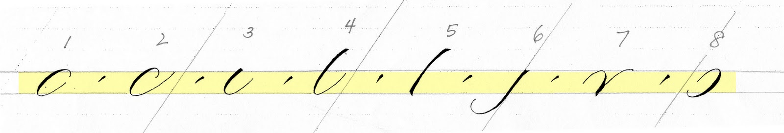
Making the #5 stroke: First write the stroke straight 3 times:  set – press – pull – stop – release, so that the top and bottom are square and it’s the same thickness throughout. This stroke is “waisted”, meaning it’s just a tiny bit thinner in the middle, so that it’s thick – thinner – thick. Now try writing the stroke as before, but slightly decreasing the pressure in the middle. Be slow and methodical. Beware of ending up with such a thin middle that it looks like two triangles. The letters with stroke #5 are:  b, h, k, p, q. (next week:  manipulation to make it bowed).


DeAnn brought out 7 different nibs for us to purchase as we wanted. They are:  Brause Steno, Hiro 40, Hiro 41, Hiro 30EF, Brause EF66, Gillot 1068, and Hunt 101.

This is just a small sampling of the nibs available out there. It’s important to try different nibs because the nib you choose for a piece will be determined by the paper and liquid you choose to work with. To help us beginners keep track of the different nibs introduced in class, DeAnn gave us the Nib Identification Chart.


Nib Identification Chart:  The two qualities that differentiate nibs are how flexible/stiff and sharp/dull it is. The Nib Identification Chart is for us to make note of these qualities for each nib. DeAnn gave us a great start by telling us what they are for the nibs on this chart. Also make any other notes that make a particular nib different from the others.

Notes on individual nibs:

Gillot 404:  medium sharp, medium flexible

Gillot 1068:  medium sharp, stiff

Hiro 40:  medium sharp, flexible. Known as the “blue pumpkin”. You may have to rub gum Arabic on this many times as it doesn’t want to hold on to ink. DeAnn has also heated it with a match and sanded it. It writes best on paper that isn’t textured.

Hiro 41:  dull, stiff. On smooth paper it doesn’t make thin hairlines or thick downstrokes, but it works very well on watercolor paper.

Brause Steno:  medium sharp, medium flexible. This is DeAnn’s favorite for most papers. Its tip is less square edged than the Gillot 404 so it doesn’t get hung up in the paper. It doesn’t make as thin hairlines, but works well in addressing envelopes.

Brause EF66:  sharp, very very flexible. This is best for big writing because its flexibility can create thick downstrokes.

Hunt 101:  sharp, medium flexible

Hunt 56:  medium shart, medium flexible; similar to Gillot 404

Hiro 30EF:  silver-colored; sharp, medium flexible

Gillot 303:  very sharp, flexible

Mitchell Copperplate:  sharp, stiff

For the nibs that aren’t pictured on the Nib Identification Chart (Hiro 30EF, Hunt 101), draw them in and add notes.

At first some of the nibs may look the same, but observe the differences carefully. Become familiar enough with your nibs that you can recognize them by sight. For example, the Gillot 404 has a ridge and the Gillot 303 is shorter than the Gillot 1068.  The Hiro 40 is slightly more flared than the Brause Steno. Learning your nibs is important because one nib doesn’t work for everything. Depending on the effect you want to achieve, different nibs will be able to do the job. For example, DeAnn prefers the Gillot 1068 or Brause Steno for envelope addressing because those are stiffer, duller nibs.


The Gillot 1068 nib is made of thinner metal than the others so it may be loose in your pen holder. Flatten it slightly (be careful not to flatten it too much!) just at the very end (NOT the tip!) with small needle-nose pliers.


Most of the nibs need only one gum Arabic treatment, BUT the Hunt 101 and Hiro 40 can be particularly stubborn and require more treatments. If you wash your nib and the ink beads up the next time you dip it into ink, you need to do another gum Arabic treatment – rub it in good.

Before treating the Hiro 40 or Hunt 101 nibs with gum Arabic, an alternative that DeAnn has done before is to stick it in your mouth and suck on it. Saliva tends to take off the resin coating a new nib. If you don’t want to stick a metal object into your mouth, consider rubbing the nib with your saliva.


A 2nd alternative:  If a nib is being particularly difficult, put the nib into the pen holder and then run it over a lit match once on each side.  This either burns off the resin coating or covers the nib with soot; DeAnn isn’t quite sure, but this method has worked for her in the past. DON’T hold it over the flame or the plastic pen holder will melt. And don’t hold the nib in your fingers to avoid getting burned.

Vermillion ink tends to rust your nib if left on it, so you should at least rub the ink off your nib after practicing. If you wash your nib, take it out of the pen holder (you might want to use a paper towel to grip it so you don’t cut your finger) and be careful not to drop it down the sink. Don’t be alarmed if the pen holder comes apart, the part that holds the nib is removable.

If your nib becomes stuck in the pen holder (because it’s rusted or stuck from dried gum Arabic), fill a small container with very  hot water and dip the pen holder in there to loosen the plastic. Once you pull out the nib, leave it out.

Don’t store the nib in the pen holder if you’re not going to be using it for a while. It’s safer to store it separately. See how Satomi labels and stores her nibs:


Practice with all nibs. If a particular nib isn’t working for you, try another one.  As DeAnn says “Work the problem.” The purpose of working with different nibs and inks and papers is to become aware of which nibs work better with which inks in certain situations.  Vermillion is great to work with, but not a very practical color to use for actual projects in real life. In a later class, DeAnn will bring in a variety of papers for us to try so we can see how different nibs and inks react to these papers.


HOMEWORK:
Do a combination of tracing and writing, using the handout sheets that start “Forsaking monastic…” and “Quick zephys blow…”. For now, practice the larger size of “Forsaking…” and the top line of “Quick zephys …” You don’t have to go down in size or try the variations yet. Next week DeAnn will bring in a guideline with a smaller x-height (our current guideline has an x-height = ¼”). Try the different nibs and make any notes on the Nib Identification Chart. On your practice sheet, identify which nib you used (e.g. in the margin or at the bottom of the page).

Friday, October 21, 2011

TODAY video: Beautiful handwritten bible made over 12 years


Donald Jackson crafts a handwritten, illuminated bible over 12 years, believed to be the first of its kind since the dawn of the printing press.

http://today.msnbc.msn.com/id/26184891/vp/44958686#44958686

Wednesday, October 19, 2011

October 17, 2011: Pointed Pen Variations Class #2 at Sinai Temple

(note: more photos to come)
Today DeAnn reviewed last week’s information and demonstrated writing the lowercase alphabet.

DeAnn reminded us to maintain the correct posture – elbow on the table, left hand at the top of the page, and most important:  pen nib in line with the slant line.

Tape down your ink-well for two reasons: to prevent spills and also so you don’t lose your rhythm.

Review: The pen should be held so that the nib is in line with the slant-lines on the guideline sheet. The slant lines aren’t for spacing, only as guides for the slant. The letters are written within the red-shaded. This is the waist-base line, also called the x-height. The line above the waist is the ascender, the line below the base is the descender.


Strokes:  apply no pressure on the upstroke for thin lines, pressure on the downstroke for thick lines. DeAnn quizzed us on the stroke numbers.

Spacing: the goal is for the whitespaces (i.e. the inner spaces) of strokes #1, #2, #3, #4, #7 and #8 to be similar in size. For now, make strokes #4 and #5 straight – DeAnn will show us how to make them bend when we have more dexterity with the pointed pen.


DeAnn’s advice:  It’s more useful to practice slowly and be careful to write each stroke correctly once than to write it wrong 20 times quickly. Compare your strokes/letters to the exemplar. Trace them if it helps you understand where you’re having difficulties.


Helpful TIP:  From one of the students Flavia – she highlighted the x-height line on the basic strokes exemplar to better see where the strokes start and end.


Lowercase alphabet: See the exemplar created by Jane Shibata. Remember: all the downstrokes should be the same width. All the whitespaces should be similar. The exemplar contains a lot of information – study the notes on each letter.

Notes on individual letters:


a: like a #1, then #3 that’s smaller and slightly below the baseline.  The shape of #1 should be more like a cucumber, not a hotdog, and should be slanted more than the slant line to make a nice triangular shape with stroke #3.


b: 4 - 8:  For now, it OK for #4 to be straight. End this stroke slightly above the baseline. Start #8 to branch at the right corner of #4 to create a nice triangular shape.

Branching on "b" 


c:  2 plus a carrot. The carrot stroke is set-press-release after a short pull.

d:  1 but close it up, then 4: stroke #4 just barely kisses #8. Don’t overlap the strokes; if you make a mistake, it’s better to err on the side of not touching rather than overlapping.


e:  can be 2 strokes or 1. The difference is that the 2nd stroke would make the “e” thicker, but starting on the upstroke would make the stroke thinner.


f:  Start at the ascender, then like a #6, carrot, then crossbar like a figure-eight.


g:  1 - 6:  start stroke #1 below the waistline. TIP:  make the #1 more slanted and #6 more slanted to get a nice triangular shape.


h:  5 - 7:  branch early enough to make a nice triangular shape.

i:  3 plus carrot. Carrot should be the same thickness as the downstroke and the same slant as the slantline.


j:  6 plus carrot. Carrot should be the same thickness as the downstroke and the same slant as the slantline. We can think of the carrot as stroke #9.

k:  special case: 5 – then no pressure, little pressure, leg can go below the baseline, depending on the letter after it.

l:  4


m:  7 – 7 - 7. All the whitespaces should be the same width.
Alternate m: 5 – 7 – 7.


n:  7 – 7 or 5 - 7. Same as for “m”.


o: 1 plus carrot. DeAnn prefers that the “carrot” is inside of the #1 stroke, but on Jane’s exemplar, it’s half in, half out.


p:  5 - 8. Stroke #5 should start halfway between the ascender and waist. It should end halfway between the base and descender. Stroke #8 starts from the baseline.


q:  1 – then like #5.

r:  special case: upstroke and stop slightly above the waistline. Then pick up pen and set pen to make a square top, press, slide over, then like a #3. This is the French r.


Alternate r:  start like a #7, then loop. This is the English r.


s:   special case: come up until slightly above waistline, then pick up pen and set, downstroke is a figure-8 shape.

t:  4 – crossbar.

u:  3 – 3.

v:  7.


w:  start like a #7, but for the upstroke, go out and up; this helps make a better connection to the #3-like stroke.


x:  special case:  goes with the slant line or a little straighter. Think of the x being in a slanted box (parallelogram). The cross-stroke is thick, then thinner, then thick again.

y:  7 – then 6.


z:  two different ones.

Practice:  Start from the top left corner of the page and write all the way through. If one letter is causing you problems, go on and come back to it. Don’t get discouraged. Take a breath.

HOMEWORK:
1. Practice the letters.
2. Trace the letters, especially if you’re having problems with any of them.
3. Once you’ve practiced all the letters, place the see-through exemplar on top of your practice sheet to check your letter against the exemplar.

The GOAL:  you want consistency; your letters don’t have to be an exact match to the exemplar.

If you get confused and discouraged, just go back one step and practice the strokes. Practice the letters slowly and carefully and think of all the stroke numbers.

Tuesday, October 18, 2011

DeAnn on KCRW's DNA: From Calligraphy Buff to Design Guru: Steve Jobs Remembered

DeAnn's interview can be heard on KCRW.


If you missed today's DNA program that aired on KCRW (89.9FM) where DeAnn was interviewed about Steve Jobs and calligraphy, you can listen to it here online at KCRW or download the program as a podcast to listen on  your iPod.

Monday, October 17, 2011

DeAnn Singh Profiled on Al Jazeera!


DeAnn was recently profiled on Al Jazeera. See her interview here:
http://www.youtube.com/watch?v=EiwMoDgNiTY

The narration is in Arabic, but you can listen to DeAnn's interview and see some of her work.

DeAnn interview on KCRW - Tuesday, October 18, 2:30 pm

DeAnn was interviewed for a piece on Steve Jobs and the role calligraphy played in his design decisions. The interview airs on KCRW (89.9 FM in Los Angeles County) on Tuesday, October 18, at 2:30 pm.

Friday, October 14, 2011

Italic Saturation

Italic is one of the most useful of all the styles of calligraphy, in my opinion. It can be done with many variations on it's classic form to meet any calligraphic subject. Lets starts with the beginning.
Italic

History:
In the 1400's when the renaissance was dawning, Europe became more literate and needed more secretaries, penman, accountants, scribes to record and write for business and church. In Italy classical letterforms and subjects were taking over from the church leading all commerce and literature. A style of calligraphy was developing that was more a descendant of Caroline styles than the more recent blackletter styles. With the "need for speed" it also took on a forward slant. It was called chancery cursive.
We use it today to write everything from wedding invitations and envelopes to posters and signs. It can look very plain or very decorative. I want the student to know where it came from and where it stands in the history of writing.
Materials Needed: Beginning Material List for chisel point pens.
Start with a pencil at 1/2 inch x-height.  Learn the letterforms and spacing thoroughly before using a chisel point nib.
1. Write all the letters using the exemplar to learn the letter structure. Trace if you find that helpful. These letters are based on a triangle rather than a circle. Method of practice: Look at the example, trace it in your mind, write the letter, look back at the example, "what did I do right, what did I do wrong?" Write it again, compare again, write it again and go on to another letter. It's not useful to keep writing the same letter over and over if you are not improving on it each time. You are reinforcing the wrong shape in your hand and head if you aren't looking back at the example and writing it correctly. Most students are in too big of hurry, so take a breath and slow down. Really LOOK at the example and emulate it as best you can. Write letters in their family groups, it helps learn their shapes better.
2. The letter families are: i,l,j,f,t = i family. o,e,c = o family. n,h,b,m,k,p,r,u,y = branching family.
a,g,d,q = a family. s,v,w,x,z = diagonals.
3. Practice writing letters, systematically and in an organized fashion. Leaving margins all around, not crossing anything out, but starting and finishing the whole page.
4. Spacing: Picket fence spacing. Equal amount of space within the letters and between letters. Take the space between the legs of n, this is the amount of space between letters. 2 vertical strokes use the same space as inside n, such as il, ll, tl, ni, minimum have equal space. 1 vertical and 1 curve stroke are a little closer together to make up for the extra space in the curve. 2 curves or diagonals are closest together. Try to think of the volume of space, between letters and within letters, the same.
Write alphabet sentences. There is a little more space between words. About the space of the n from one side to the other. If you put too much space between words it creates "rivers" of space in a paragraph of writing. The look of the page of writing is more important than the individual word or the individual letter.
5. TBA

Monday, October 10, 2011

October 10, 2011 - Pointed Pen Variations Class #1 at Sinai Temple

DeAnn introduced herself and distributed supplies and handouts. The handouts are by Jane Shibata, noted calligrapher and artist. They are based on the informal pen hand created by Michael Kecseg. We will be starting out using the Gillot 404 nib and Vermillion ink.


Preparing your supplies for ease of transportation: pour ink from the container into the dropper bottle. The dropper bottles are leak-proof so bring those to class; it’s OK to leave the original containers of ink at home. From the dropper bottles, fill one of the ink wells (or “dinky dip”) to at least the ridge-line. You want to be able to dip your pen and cover the nib’s reservoir area (“eye of the needle”) completely.


Preparing the Pen: Put the nib into the oblique pen holder so that the “eye of the needle” (the opening in the nib) points directly upward. The fit may feel tight, but push the nib in at least halfway for a secure hold. Hold the oblique holder as you would normally hold your pen, with the angled nib to the left side. If you have a brand new nib, you’ll need to prepare it by rubbing gum Arabic all around so that the ink will adhere to the nib and not just bead-up and slide off. New nibs usually have a waxy coating and you may have to rub with gum Arabic several times until the ink will stay in the reservoir. NOTE: Vermillion ink will rust your nib, so wash it off with water after you’re done practicing.

Preparing the paper: Make a crease in the cover of the cotton comp paper pad about an inch down from the top. Fold this back so that you’ll have a flat writing surface without the cover bunching up to the left. Place the guideline sheet underneath the first sheet.

Guideline sheet: DeAnn has highlighted in red the lines where we’ll be writing. This area is the x-height, defined by the waist (top edge) and base (bottom edge). The line above the waist is the ascender, the line below the base is the descender. When practicing, we will be writing on the “red” lines.


Prepare your work space: The key to being able to write correctly is to set up your work space correctly and sit in the right position in relation to your paper. Position the paper so that the slant lines are pointing toward your stomach. This angle may seem extreme, with the paper pad almost at right angles to the table’s edge, so you need to position yourself so that your elbow rests completely on the tabletop, which means you’ll probably have to sit at an angle to the table edge so you’re not twisting your torso. Place the ink well above the paper pad and tape down to avoid accidental spills. Place your exemplar in front of you, preferably in a stand like a Page-Up, so it's easy to refer to.


If your shoulder is hunching up, then the table is too high; sit on a cushion so that your shoulder stays down. Stretch regularly if you start getting stiff.

Use your left arm to take the weight off your body by placing your left hand above the area where you’re writing. Try to learn NOT to have a heavy writing hand, but practice having a light touch. Putting the pressure on your left hand helps with this. This will help your writing hand from getting sore. REMEMBER to breathe! If you’re having trouble writing the strokes, exhale.

Writing with the nib:
1. Write straight lines (with slant)
2. Pen should be in the direction of the slant lines
3. To create the square top & bottom edges, set – press – pull – stop – release
4. If the nib is sticking into the paper, adjust the angle of how you’re holding the nib. Lowering the angle may help. Also make sure that your nib is pointing in the direction of the slant line.

Writing the basic strokes: You apply pressure on the down stroke (thick), no pressure on the up stroke (thin). This is how you create thicks & thins. The goal is for all the down strokes to have the same width (i.e. consistent pressure). Look carefully at the exemplar handout, it has a lot of important information on it.

NOTE:  If your pen nib is not aligned in the correct direction (along the slant line), it will become tweaked over time.

DeAnn began with having us practice writing straight lines in the direction of the slant line. From now on, everything will be written with this slant.

Notes on individual strokes (study the exemplar – lots of great notes by Jane):
1. Start at 1:00 and think “cucumber” – not too round. Start with no pressure, then pressure, then no pressure. This should be more slanted than the slant line.
2. #2 is like #1, but with longer upstroke.
3. The curve should be like a paperclip.


4. For right now, it’s OK to make this stroke straight. DeAnn will go over the slight taper when you’re more comfortable with writing with a pointed pen.
5. Make this stroke slightly bowed. For now it’s OK that you write it with the same pressure all the way down; DeAnn will go over making the pressure changes to make the stroke taper when you’re more comfortable with writing with a pointed pen.
6. Don’t worry about the top for now; OK to pull the stroke straight down.


7. Once you make the first arch, pick up the pen and put the point at the right side of the base of the downstroke to start your upstroke. Branching from this point makes a nice triangle space.


8. This is like an upside-down version of stroke #1 – start at 8:00.


REMEMBER:  Don’t get overwhelmed! If you get really anxious, go back to the last step you were comfortable with and practice that.

DeAnn says:  in pointed pen, you really have to become the master of your materials.

HOMEWORK: Continue practicing the strokes with the Vermillion ink and Gillot 404 nib. Memorize the basic stroke numbers – DeAnn will test you next week. Your practice will be more effective if you go slowly and carefully. Study the exemplar; if you’re having trouble with a stroke, try tracing it.

NOTE:  On your practice sheets, write the nib, ink type, and date in the lower right corner.

Homework for intermediates: After practicing the strokes, you can go ahead and try the letters.

If you turn in homework, DeAnn will then give a thorough critique.