
Today DeAnn reviewed last week’s information and demonstrated writing the lowercase alphabet.
DeAnn reminded us to maintain the correct posture – elbow on the table, left hand at the top of the page, and most important: pen nib in line with the slant line.
Tape down your ink-well for two reasons: to prevent spills and also so you don’t lose your rhythm.
Review: The pen should be held so that the nib is in line with the slant-lines on the guideline sheet. The slant lines aren’t for spacing, only as guides for the slant. The letters are written within the red-shaded. This is the waist-base line, also called the x-height. The line above the waist is the ascender, the line below the base is the descender.

Strokes: apply no pressure on the upstroke for thin lines, pressure on the downstroke for thick lines. DeAnn quizzed us on the stroke numbers.
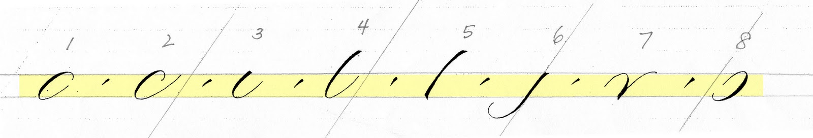
Spacing: the goal is for the whitespaces (i.e. the inner spaces) of strokes #1, #2, #3, #4, #7 and #8 to be similar in size. For now, make strokes #4 and #5 straight – DeAnn will show us how to make them bend when we have more dexterity with the pointed pen.

DeAnn’s advice: It’s more useful to practice slowly and be careful to write each stroke correctly once than to write it wrong 20 times quickly. Compare your strokes/letters to the exemplar. Trace them if it helps you understand where you’re having difficulties.
Helpful TIP: From one of the students Flavia – she highlighted the x-height line on the basic strokes exemplar to better see where the strokes start and end.
Lowercase alphabet: See the exemplar created by Jane Shibata. Remember: all the downstrokes should be the same width. All the whitespaces should be similar. The exemplar contains a lot of information – study the notes on each letter.
Notes on individual letters:

a: like a #1, then #3 that’s smaller and slightly below the baseline. The shape of #1 should be more like a cucumber, not a hotdog, and should be slanted more than the slant line to make a nice triangular shape with stroke #3.

b: 4 - 8: For now, it OK for #4 to be straight. End this stroke slightly above the baseline. Start #8 to branch at the right corner of #4 to create a nice triangular shape.
 |
| Branching on "b" |

c: 2 plus a carrot. The carrot stroke is set-press-release after a short pull.

d: 1 but close it up, then 4: stroke #4 just barely kisses #8. Don’t overlap the strokes; if you make a mistake, it’s better to err on the side of not touching rather than overlapping.

e: can be 2 strokes or 1. The difference is that the 2nd stroke would make the “e” thicker, but starting on the upstroke would make the stroke thinner.

f: Start at the ascender, then like a #6, carrot, then crossbar like a figure-eight.

g: 1 - 6: start stroke #1 below the waistline. TIP: make the #1 more slanted and #6 more slanted to get a nice triangular shape.

h: 5 - 7: branch early enough to make a nice triangular shape.
i: 3 plus carrot. Carrot should be the same thickness as the downstroke and the same slant as the slantline.

j: 6 plus carrot. Carrot should be the same thickness as the downstroke and the same slant as the slantline. We can think of the carrot as stroke #9.
k: special case: 5 – then no pressure, little pressure, leg can go below the baseline, depending on the letter after it.
l: 4

m: 7 – 7 - 7. All the whitespaces should be the same width.
Alternate m: 5 – 7 – 7.

n: 7 – 7 or 5 - 7. Same as for “m”.

o: 1 plus carrot. DeAnn prefers that the “carrot” is inside of the #1 stroke, but on Jane’s exemplar, it’s half in, half out.

p: 5 - 8. Stroke #5 should start halfway between the ascender and waist. It should end halfway between the base and descender. Stroke #8 starts from the baseline.

q: 1 – then like #5.
r: special case: upstroke and stop slightly above the waistline. Then pick up pen and set pen to make a square top, press, slide over, then like a #3. This is the French r.

Alternate r: start like a #7, then loop. This is the English r.

s: special case: come up until slightly above waistline, then pick up pen and set, downstroke is a figure-8 shape.
t: 4 – crossbar.
u: 3 – 3.
v: 7.

w: start like a #7, but for the upstroke, go out and up; this helps make a better connection to the #3-like stroke.

x: special case: goes with the slant line or a little straighter. Think of the x being in a slanted box (parallelogram). The cross-stroke is thick, then thinner, then thick again.
y: 7 – then 6.

z: two different ones.
Practice: Start from the top left corner of the page and write all the way through. If one letter is causing you problems, go on and come back to it. Don’t get discouraged. Take a breath.
HOMEWORK:
1. Practice the letters.
2. Trace the letters, especially if you’re having problems with any of them.
3. Once you’ve practiced all the letters, place the see-through exemplar on top of your practice sheet to check your letter against the exemplar.
The GOAL: you want consistency; your letters don’t have to be an exact match to the exemplar.
If you get confused and discouraged, just go back one step and practice the strokes. Practice the letters slowly and carefully and think of all the stroke numbers.
No comments:
Post a Comment