
Beverly Hills Adult School Uncial Class #1: The hand this semester is Uncial. After student introductions, DeAnn reviewed the supplies needed for this first week: Speedball B1 nib, Higgins Eternal black ink, round pen holder, dinky dip, dropper bottle, clipboard, 17” x 22” grid paper, C-thru 18-inch ruler. See also Beginning Supplies.
Uncial is an all majuscule alphabet, meaning the letter forms are all capitals, with no lowercase letters. Miniscule refers to an alphabet which has both capitals and lowercase letters. The terms “uppercase” and “lowercase” appeared with the creation of the letterpress (1450) when metal type was stored with capitals in the upper part of a type case or drawer and miniscule letters in the lower part. Uncial was common in the 3rd to 8th centuries AD. Historically, it was written with no break between words and no punctuation.
DeAnn will be starting with teaching monoline Uncial using the Speedball B1 nib. Later she’ll teach writing Uncial with the chisel point pen using Brause nibs. Then students will create an illuminated manuscript project using Uncial. Intermediates who’ve done illuminated manuscript projects in previous semesters can talk with DeAnn about different projects.
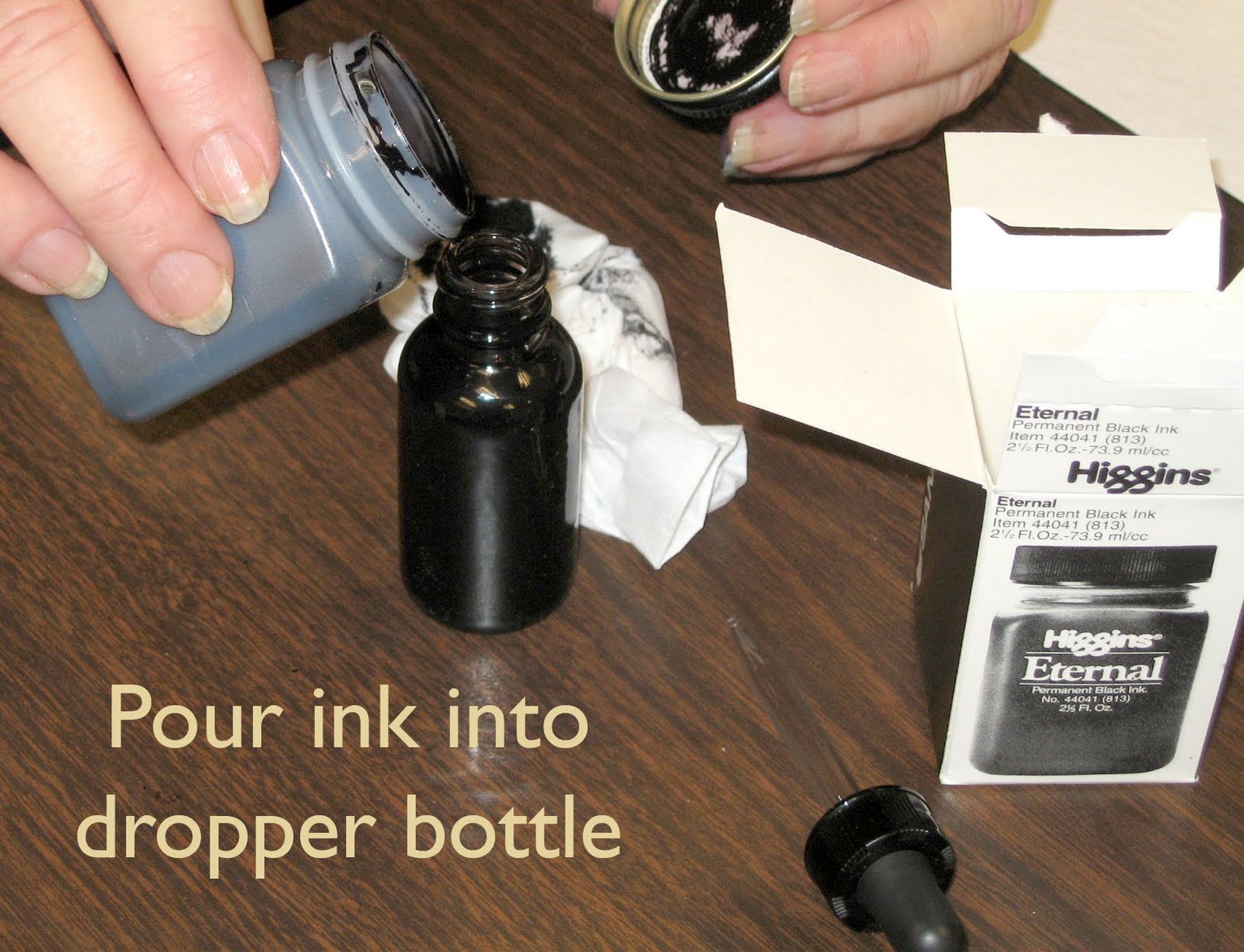
Preparing the ink: once you open the Higgins Eternal ink, the bottle may leak if it falls over. So transfer the ink to a dropper bottle and leave the remaining Higgins Eternal ink at home. The dropper bottle shouldn’t leak even if it’s on its side. Fill one of the ink wells in your inky-dip almost to the rim. You’ll be taping down the whole inky-dip at the table’s edge; if you’re right-handed, it should be on the right side, if you’re left-handed, then it’s on the left side.


Proper Set-up: Set up your tools and workspace correctly so that it will be easier to write without any back or wrist pain. Remember to tape down your dinky dip on the right (or left, if you’re a left-hander) to avoid spills and for ease of dipping your pen. Sit so that the angle of the board in your lap isn’t too high. The ideal writing area of the board is slightly above table level where it’s the most stable. So adjust your chair accordingly. If you’re right-handed, the clips of the board should be on the left so they don’t interfere with the movement of your arm as you write. Remember to use your left-hand as an anchor. Clip several sheets of paper to the board or use a blotter sheet for some padding. The sheet you’re writing on should NOT be taped down; instead, you should move it as needed so that you’re always writing in the same area of the board and not stretching or hunched over.

Use a document holder (like a PageUp) so that it’s easy to see your exemplar or whatever sheet you’re looking at. Place it so that you don’t have to move your board to see it.
Writing on the grid paper: The 17” x 22” grid paper is 2-sided, but one side has 8 boxes per inch and the other side has 10 boxes per inch. For now, we’ll be using the 8 boxes per inch. This lines up exactly with the C-thru ruler.
Leave at least a 1-inch margin all around. We’ll be starting with an x-height of 1-inch, so you don’t need to line the paper. Write the letters between two “dark” lines. X-height is the height of the lowercase letter “x” in the hand, but since Uncial is all capitals, ascender/descender lines won’t be needed. All the letters will be written between the baseline and the waistline.

Using the pen: DeAnn recommends a round pen holder for the Speedball B1 nib. The tip of the nib is like a pancake. You want this pancake to be flat on the paper always. Hold the pen naturally, like you would a pencil. Don’t force your hand to hold the pen so that the pancake is vertically placed on a page. Your elbow should be at an angle and so should the pancake.
Dip the nib into the inkwell so that about half of the reservoir is filled. Wipe off any excess with the rim of the inkwell. Start by making vertical strokes that are 1-inch long. Put even pressure on the pancake, not a lot of pressure, just even pressure – the stroke should be the same width all the way down. A brand new nib can leave dips or jagged edges.
As you draw the stroke down the page, EXHALE. This helps give a more controlled stroke. Also, set your opposite hand near the work so you can give slight pressure as you start down. These tips will help you have success quicker. At this large size, ink will puddle at the end of the downstrokes; don’t worry about it now, it’s natural & expected.
TIP: if your hand hurts soon after starting to write, you’re probably holding the pen too tight.
At this time it’s OK to wipe off your nib to clean it. When practicing, wipe your nib every 20 minutes or so to remove any paper residue, etc. For a more thorough cleaning, remove the nib from the pen holder and rinse it in water. Be sure to dry it before putting it away.
Notes on individual letters: Uncial is a very wide and round hand, hence it’s called the “chunky hand.” To get a better idea of how wide each letter form is, place your C-thru ruler over the letter and count the boxes. DeAnn has written some of the widths in, but not all.

I : should be the same thickness throughout.
J : the descender is short, about 2 boxes at most. Originally Uncial had no “J”. “I” was used for both sounds.
L : The cross-stroke is not curvy, but slightly diagonal.
T : The exemplar has the stroke sequence with the horizontal stroke first, but practice writing it both ways.

O : imagine a grapefruit to visualize its shape. At 10 boxes, the O is wider than it is tall.
C : it’s like an “O”, but end stroke 1 about 1 box above the baseline.
D : think of it as an “O” with a serif – you can practice writing it that way if it helps you with the proportion.
E : like a “C”. The crossbar is higher than center and extends a little beyond the top & bottom strokes.
G : like a “C”, but take the first stroke a bit higher, than go back diagonally.

Q : stroke 1 is at least 1 box above the baseline.
P : set the pen inside the vertical stroke for a smoother transition for strokes 2 and 3.

H : start about 1 box above the waistline. Then place the pen inside the vertical stroke and curve stroke 2 in slightly.

M : start stroke 3 inside of vertical stroke for a nice connection.

S : think on an O-shape, the S should fit inside. Stroke 1 should go horizontally at the middle.
A : is the problem letter since it is so slanted. The belly of stroke 2 should extend slightly beyond the start of stroke 1.
N : start stroke 1 slightly below the waistline to make room for stroke 2.
TIP: if you’re having a hard time writing any of the letters, try tracing them to get a better feel for them. Use tracing paper over the exemplar.
HOMEWORK: Go ahead and practice the rest of the letters by studying the exemplar. DeAnn will go over them again at the next class. Practice the letters, then write alphabet words. See DeAnn’s website for a list of alphabet flowers: www.designingletters.com. Go to “About”, then “About Calligraphy.”
NOTE: No class next Monday, 1/17/11, in honor of Martin Luther King, Jr. Class will resume on Monday, 1/24/11.
No comments:
Post a Comment