
DeAnn distributed handouts for the semester. She had us do dexterity exercises, then demonstrated the Pointed Pen Fraktur strokes and also went over the lowercase letters.
Organizing your supplies: Find a container to carry your supplies. Study your handout and put it in a folder or binder that will help you find the appropriate page quickly. A lot of information is in the handouts, so even if you miss something DeAnn says in class, reading the handout later will be very helpful.
Preparing your supplies for ease of transportation: pour ink from their containers into the dropper bottles. The dropper bottles are leak-proof so bring those to class; it’s OK to leave the original containers of ink at home. From the dropper bottles, fill one of the ink wells (or “dinky dip”) to at least the ridge-line. You want to be able to dip your pen and cover the nib’s reservoir area (“eye of the needle”) completely.
Learn Your Nibs: Unlike calligraphy written with a chisel-point nib, Copperplate nibs create thicks & thins by pressing & releasing. The more pressure you apply when pressing on a down stroke, the wider the stroke. So unlike chisel-point nibs that come in different set widths (e.g. 5mm, 1mm), Copperplate nibs come in a wide variety of sharpness and flexibility. This is another important area to explore & learn. By the end of this semester, you will have filled out your nib chart with notes on each of the nibs, paying particular attention to each nib’s sharpness and flexibility.
Preparing the Pen: Put the nib into the oblique pen holder so that the “eye of the needle” (the opening in the nib) points directly upward. The fit may feel tight, but push the nib in at least halfway for a secure hold. Hold the oblique holder as you would normally hold your pen, with the angled nib to the left side. If you have a brand new nib, you’ll need to prepare it by rubbing gum Arabic all around so that the ink will adhere to the nib and not just bead-up and slide off. New nibs usually have a waxy coating and you may have to rub with gum Arabic several times until the ink will stay in the reservoir. NOTE: Vermillion ink will rust your nib, so wash it off with water after you’re done practicing.
Pointed Pen Fraktur has a 90-degree “slant” line, i.e. no slant. It’s written vertically up & down. So you have the option of using a regular pen holder with the pointed pen nib. Try it both ways and see which way is more comfortable for you.
Preparing the paper: Make a crease in the cover of the cotton comp paper pad about an inch down from the top. Fold this back so that you’ll have a flat writing surface without the cover bunching up to the left. Place the guideline sheet underneath the first sheet.
Guideline sheet: The lines are ¼-inch apart; this space refers to the x-height, the space between the waist and the base. These lines are indicated hilighting. The line above the waist is the ascender, the line below the base is the descender. The vertical slant lines are there as guides for the angle of writing, not for spacing.
TIP: DeAnn suggests highlighting the waist to base space so that it’s easier to distinguish as the line to write on underneath the cotton comp sheet. Skip the first space, hi-light, then skip 3 lines, then hi-light, etc.
Prepare your work space: The key to being able to write correctly is to set up your work space correctly and sit in the right position in relation to your paper. You need to position yourself so that your elbow (of your writing hand) rests completely on the tabletop, which means you’ll probably have to sit at an angle to the table edge so you’re not twisting your torso.
Use your left arm to take the weight off your body by placing your left hand above the area where you’re writing. Try to learn NOT to have a heavy writing hand, but practice having a light touch. Putting the pressure on your left hand helps with this. REMEMBER to breathe! If you’re having trouble writing the strokes, exhale.
Dexterity exercises: to loosen up your hand and get used to the pointed pen nib. Don’t move just your wrist – practice moving your arm to make the circles.
Preparatory exercises (using 2 lines on the guideline sheet): Write straight lines with pen in the direction of the “slant” lines. To create the square top & bottom edges, set – press – pull – stop – release. If the nib is sticking into the paper, adjust the angle of how you’re holding the nib. Lowering the angle may help.
Then write strokes with full pressure to no pressure. Next write strokes from no pressure to full pressure. Work on making them look similar in size. Write strokes with less pressure in the middle – but not a hairline. Then write this stroke but at the base, create a diagonal by pulling straight down on the right side as you release pressure.
Then write a stroke with even pressure but curving slightly in the middle, along with the diagonal ending. It should be an even stroke.
Next write a stroke starting with no pressure at the top that curves into a hook; increase pressure to full by the time you reach the base.
Then a smaller version of the hooked curve but after the diagonal ending, make a serif on the upstroke. Then try a curved short stroke.
Writing the basic strokes: Refer to the Handout with an “H” in the corner, that says “basic strokes – Pointed Pen Blackletter” along the left side. You apply pressure on the down stroke (thick), no pressure on the up stroke (thin). This is how you create thicks & thins. ]
NOTE: Strokes #3, #4, and #9 have a diagonal serif at the top of the stroke, but DeAnn doesn’t really like it, so ignore it for now and start the stroke “normally” with set-press-pull.
Notes on individual strokes:
1. #7 – is only slightly diagonal, then the serif.
2. #8 – more slanted than #7 and serif goes up to the waist.
3. #9 – has a slight s-curve in it; if you can put in this subtle curve, try it.
Lowercase letters: See handout with “I” in the corner and “the lowercase – pointed pen blackletter” along the left side.
HOMEWORK: Practice all the strokes. Try the different nibs. Study the exemplar carefully – it is more important to be accurate than to write a stroke many times. Memorize the basic stroke numbers – DeAnn will test you next week. Then practice the lowercase letters. Try practicing them in families (for example, i-l-t, or a-d-g-q).
Wednesday, April 18, 2012
Friday, March 16, 2012
March 12, 2012 - Copperplate Last Class at Sinai Temple
Today was the last Copperplate class of the semester so we had a potluck. DeAnn demonstrated writing Copperplate with watercolor. First she demonstrated a project where she framed a flourished capital written with metallic watercolor on black paper. Then she demonstrated writing with regular watercolors on watercolor paper and blending colors.

Framed Letter Project: DeAnn found pretty purse frames as well as other small frames. She pre-cut black paper in 3” x 3”, 2.5” x 3”, and other sizes to fit the frames. TIP: Keep the paper in the frame to use as a guide. Then with metallic watercolor, she wrote a flourished letter and then framed it.

Metallic watercolors that DeAnn likes:
FineTec metallic watercolors (also comes in pearlescent and interference colors) – Grade A


USArtQuest Mica Color metallic watercolors (also comes in pearlescent and interference colors) – Grade A-


Yasutomo Pearlescent watercolors (also comes in a smaller size) – Grade B

Prang Metallic watercolors – Grade B-

Writing with watercolors:
First set up your workplace. Have 2 containers of water – one is for dirty, one is for clean. When changing colors, you’ll be rinsing your brush first in the “dirty” container, then in the “clean” water to ensure no color contamination. Change the water as needed when it gets too dirty.

Add a few drops of water to the watercolor pans you’ll be using to hydrate them. Use the lids of the watercolor set as your palette. Soften the pan with a couple drops of water, then put the colors you want to use in a clean palette space and add drops of water to thin the watercolor to an ink consistency. If you use the watercolor pan itself as the palette, the ink will get thicker and thicker.
Stir constantly so the pigment doesn’t settle.

Use a small stiff bristle brush (like the Royal soft grip #3) to load your pen nib. Initially, brush color on top and bottom of nib. Then feed by just brushing the top of the nib. DeAnn likes the stiff brush because it cleans your nib even as it loads it with color. Hold the brush in your left hand with the tip pointed away so you can load your nib away from your paper and avoid splattering the paper.

Paper Matters: DeAnn brought black paper (from Kelly Paper Co.) for us to use. But if you want to write over what you’ve written (for example, to even out the amount of ink), the soggy paper can clog your nib and the color will come up. This doesn’t happen on Strathmore Artagain black paper.
Add to your sampler of different nibs on different papers using different inks with examples of different metallic watercolors on black paper. Note what paper you used. Marjorie showed us her sampler of metallic inks on black astrobrite paper. She also had a sheet with letter written in bleach.

Always test ink and paper that you plan to use on a project. Not all inks work with Copperplate; many are too thin. In a recent example, DeAnn wrote with iron gall ink and when it was dry, accidentally touched it and it smudged. Trying to fix it by erasing the smudges made it worse. She added a few drops of gum Arabic to the ink and then it was fine.

Most watercolors should have enough gum Arabic so that even when thinned to ink consistency, the dried color shouldn’t smudge. But if you encounter a case where the pigment doesn’t stick, then add a drop or so of gum Arabic.
Demonstration of writing Copperplate with watercolor and blending the colors: The best nib to use on cold press watercolor paper is the Hiro 41. The Nikko G works well too. The watercolors are Prang with 16 colors. DeAnn loves their vibrant colors. The paper was from a Strathmore watercolor pad that Flavia had. DeAnn likes Arches watercolor paper.

Start with one color and add a 2nd color to the nib before the first one is completely gone so it blends. When switching colors on your brush, first rinse it in the “dirty” cup, then in the “clean” cup. Wipe off excess ink or water on rag. Be careful of colors on opposite sides of the color wheel (e.g. red & green, purple & yellow), the blend may be brown/gray. This look can be organic though.

If the color changes too abruptly, go back and touch some of the second color into the still-wet strokes for a smoother transition. As long as it’s still wet, the color will continue to migrate out.
Continue adding new colors in this way, and/or go back to the original color.
Next semester starts April 9, 2012.

Framed Letter Project: DeAnn found pretty purse frames as well as other small frames. She pre-cut black paper in 3” x 3”, 2.5” x 3”, and other sizes to fit the frames. TIP: Keep the paper in the frame to use as a guide. Then with metallic watercolor, she wrote a flourished letter and then framed it.

Metallic watercolors that DeAnn likes:
FineTec metallic watercolors (also comes in pearlescent and interference colors) – Grade A
USArtQuest Mica Color metallic watercolors (also comes in pearlescent and interference colors) – Grade A-
Yasutomo Pearlescent watercolors (also comes in a smaller size) – Grade B

Prang Metallic watercolors – Grade B-
Writing with watercolors:
First set up your workplace. Have 2 containers of water – one is for dirty, one is for clean. When changing colors, you’ll be rinsing your brush first in the “dirty” container, then in the “clean” water to ensure no color contamination. Change the water as needed when it gets too dirty.

Add a few drops of water to the watercolor pans you’ll be using to hydrate them. Use the lids of the watercolor set as your palette. Soften the pan with a couple drops of water, then put the colors you want to use in a clean palette space and add drops of water to thin the watercolor to an ink consistency. If you use the watercolor pan itself as the palette, the ink will get thicker and thicker.
Stir constantly so the pigment doesn’t settle.

Use a small stiff bristle brush (like the Royal soft grip #3) to load your pen nib. Initially, brush color on top and bottom of nib. Then feed by just brushing the top of the nib. DeAnn likes the stiff brush because it cleans your nib even as it loads it with color. Hold the brush in your left hand with the tip pointed away so you can load your nib away from your paper and avoid splattering the paper.

Paper Matters: DeAnn brought black paper (from Kelly Paper Co.) for us to use. But if you want to write over what you’ve written (for example, to even out the amount of ink), the soggy paper can clog your nib and the color will come up. This doesn’t happen on Strathmore Artagain black paper.
 |
| Marjorie's sampler of different inks on black Canson paper. |
Add to your sampler of different nibs on different papers using different inks with examples of different metallic watercolors on black paper. Note what paper you used. Marjorie showed us her sampler of metallic inks on black astrobrite paper. She also had a sheet with letter written in bleach.

Always test ink and paper that you plan to use on a project. Not all inks work with Copperplate; many are too thin. In a recent example, DeAnn wrote with iron gall ink and when it was dry, accidentally touched it and it smudged. Trying to fix it by erasing the smudges made it worse. She added a few drops of gum Arabic to the ink and then it was fine.

Most watercolors should have enough gum Arabic so that even when thinned to ink consistency, the dried color shouldn’t smudge. But if you encounter a case where the pigment doesn’t stick, then add a drop or so of gum Arabic.
 |
| example by Rhonda |
 |
| Satomi's Frame project |
Demonstration of writing Copperplate with watercolor and blending the colors: The best nib to use on cold press watercolor paper is the Hiro 41. The Nikko G works well too. The watercolors are Prang with 16 colors. DeAnn loves their vibrant colors. The paper was from a Strathmore watercolor pad that Flavia had. DeAnn likes Arches watercolor paper.

Start with one color and add a 2nd color to the nib before the first one is completely gone so it blends. When switching colors on your brush, first rinse it in the “dirty” cup, then in the “clean” cup. Wipe off excess ink or water on rag. Be careful of colors on opposite sides of the color wheel (e.g. red & green, purple & yellow), the blend may be brown/gray. This look can be organic though.

If the color changes too abruptly, go back and touch some of the second color into the still-wet strokes for a smoother transition. As long as it’s still wet, the color will continue to migrate out.
Continue adding new colors in this way, and/or go back to the original color.
 |
| Judith's work |
 |
| Judith's work |
Next semester starts April 9, 2012.
Sunday, March 11, 2012
February 27, 2012 - Copperplate Class #6 at Sinai Temple
Today DeAnn had us practice flourishing.
The thick strokes of the flourish should be thinner than the primary stem stroke.
Remember: Flourishing is BIG.
Rehearse flourishing before you write it.
Flourishing text: try writing words without ascenders and descenders (see below, in black). Then come back and put on the flourishes afterward (see below, blue ink).


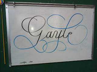
You never know what’s in the sentence below; you want to avoid descenders and ascenders clashing and creating a dark spot.
Typically, you know what’s above as you’re writing.
HOMEWORK: Practice flourishing capitals and also writing text and flourishing it. Try various flourishes even if it looks stupid.
The thick strokes of the flourish should be thinner than the primary stem stroke.
Remember: Flourishing is BIG.
Rehearse flourishing before you write it.
Flourishing text: try writing words without ascenders and descenders (see below, in black). Then come back and put on the flourishes afterward (see below, blue ink).

 |
| If a flourish doesn't work, try again. |


You never know what’s in the sentence below; you want to avoid descenders and ascenders clashing and creating a dark spot.
Typically, you know what’s above as you’re writing.
HOMEWORK: Practice flourishing capitals and also writing text and flourishing it. Try various flourishes even if it looks stupid.
February 13, 2012 - Copperplate Class #5 at Sinai Temple
Today DeAnn demonstrated alternate capitals. The handouts were different versions of more flourished Copperplate capitals.
Review:
Capitals and stroke #5 are from ascender to base
Stroke #6 goes down to the descender
Lowercase d, t, p go halfway to ascender or descender

Flourishing: better that it’s too big than too small

Start thin, then get thicker.

Come back into itself.
Alternate Capitals:
Intead of the terminal dot, consider making an oval.
Or 2 ovals with different orientations.
When flourishing, beware of crossing strokes:
Thick over thin = OK
Thin over thick = OK
NEVER thick over thick – this creates a dark spot, which is bad.
If you’re about to cross a thick on a down-stroke, artificially make it thin with no pressure.
Elements of Flourishing are: Oval, Figure 8, Circle.
Flourishing is not just happenstance. You have to think about it. DeAnn sees it in her mind’s eye before she actually starts writing.
PLAY with flourishing capitals. Circle the ones you like on your practice sheet, then make one sheet with all the ones you like. Try making a whole alphabet with your favorite flourish.
HOMEWORK: Practice writing Capitalized flower words. Then write poetry or text.
Wednesday, February 8, 2012
February 6, 2012 - Copperplate Class #4 at Sinai Temple
Today DeAnn demonstrated Copperplate basic formal capitals. The handouts were different versions of more flourished Copperplate capitals.
Review of connectors:
(photos to come)
Copperplate Capitals: the size is from the base to the ascender. For demonstrating them on the board, DeAnn didn’t write in the waist guideline. See the handout.
When writing the capitals, think OVAL for the strokes. Many of the letters can be visualized as a combination of ovals.
Primary Stem Stroke: No pressure – Pressure – No pressure – Terminal Dot. This stroke should be slightly thicker than the other lowercase downstrokes and goes with the slant line. The terminal dot is there to stop your eye from continuing to move. Think of the primary stem stroke as the spine or backbone of a letter.

Secondary Stroke: should be the same or less than the thickness of the Primary Stem Stroke. This stroke should curve into the letter so that the eye doesn’t travel away from it.
Remember: Flourishes should be BIG!

Notes on individual letters:
A: starts at the bottom at the baseline with a terminal dot.

B: the flourish should be big, it should come down to about halfway to the base.

C: think of it as 3 intersecting ovals.

D: unlike the cursive “D” that many of us learned in grade school, if you think of the Copperplate “D” as one big oval, the body of it is a small portion and most of it is the flourish.

E: like the “C”, think of it as intersection ovals. Swing the lower half out enough to have enough space for the final loop. When you’re about to start the lower half, pull back further than you think you need to.

F: imagine a straight line from the terminal dot; this is where the left edge of the top bar should be. The cross-bar ends in a small loop

G: unless you know this is the “G”, it may look incomprehensible. Think of the General Mills “G”.

H: start with a #4 stroke that ends in a diagonal upstroke. It shouldn’t curve too much where the primary stem stroke starts.

I: Think of the secondary stroke as an oval shape.
J: Primary stem stroke goes down to the descender
K: the secondary stroke should be parallel to the Primary Stem stroke
L: curve last stroke back into itself, not off into space. You want your eye to be brought back into the letter. DeAnn recommends not connecting to the next lowercase letter and also leaving off the entrance stroke to it.

M: starts at the bottom at the baseline with a terminal dot. Try to keep it pretty skinny.
N: start at the bottom at the baseline with a terminal dot. Think of the downstroke as an s-shape. The final upstroke ends in a terminal dot above the ascender line and should be parallel to the initial upstroke. Both upstrokes should be in the direction of the slant line.
O: Think of the letter as a big oval with a curvy flourish to end it

P: make the flourish big

Q: think of this as an oval plus a figure-8
R: the secondary stroke should be parallel to the Primary Stem Stroke
S: similar to the “L” but ends with a terminal dot

T: imagine a straight line from the terminal dot; this is where the left edge of the cross-bar should be. If the cross-bar of the “T” seems too thin, go over it with a little more pressure
U: the initial stroke curves back slightly, it doesn’t go straight down. Start the curve early so that you have a nice big triangle

V: like the “H”, start with a flourish similar to the #4 stroke but ending on a diagonal stroke; then downstroke. Upstroke ends with a terminal dot above the ascender line. Focus your eyes on the location where the terminal dot should go and your hand should follow. “Look where you’re going.”
W: start with a #4 stroke that ends in a diagonal upstroke. Like the “V”, but don’t put too much white space between the “V”-spaces; letter should be pretty narrow.
X: First stroke ends in a terminal dot. Second stroke should overlap at the center, not be double-wide through the center. If you find that difficult, then don’t pressurize the second side.

Y: doesn’t go down to the descender, but only to the base. Ends in a terminal dot.

Z: this is DeAnn’s modern version of a “Z”. The last touch is a “carrot” flourish: set – press – pull and release.

Observe where those ovals sit in relation to the letter.
Some Capitals are connectable, meaning they can end in the entrance stroke to the next letter, but others aren’t.

Connectable Capitals: A, F (both), H, I (both), J, K, M, R, U, X, Z

Not-connectable: B, C, D, E, F (depends on next letter), G, I (depends on next letter), L (historically connectable, but DeAnn recommends NOT to connect), N, O, P, Q, S, T, V, W, Y
HOMEWORK: Practice writing Capitalized words. Never write Copperplate words all in capitals! See DeAnn’s website for alphabetical Flower Names. Then write text.
Subscribe to:
Posts (Atom)