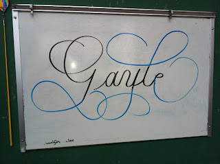
Framed Letter Project: DeAnn found pretty purse frames as well as other small frames. She pre-cut black paper in 3” x 3”, 2.5” x 3”, and other sizes to fit the frames. TIP: Keep the paper in the frame to use as a guide. Then with metallic watercolor, she wrote a flourished letter and then framed it.
Metallic watercolors that DeAnn likes:
FineTec metallic watercolors (also comes in pearlescent and interference colors) – Grade A
USArtQuest Mica Color metallic watercolors (also comes in pearlescent and interference colors) – Grade A-
Yasutomo Pearlescent watercolors (also comes in a smaller size) – Grade B
Prang Metallic watercolors – Grade B-
Writing with watercolors:
First set up your workplace. Have 2 containers of water – one is for dirty, one is for clean. When changing colors, you’ll be rinsing your brush first in the “dirty” container, then in the “clean” water to ensure no color contamination. Change the water as needed when it gets too dirty.
Add a few drops of water to the watercolor pans you’ll be using to hydrate them. Use the lids of the watercolor set as your palette. Soften the pan with a couple drops of water, then put the colors you want to use in a clean palette space and add drops of water to thin the watercolor to an ink consistency. If you use the watercolor pan itself as the palette, the ink will get thicker and thicker.
Stir constantly so the pigment doesn’t settle.
Use a small stiff bristle brush (like the Royal soft grip #3) to load your pen nib. Initially, brush color on top and bottom of nib. Then feed by just brushing the top of the nib. DeAnn likes the stiff brush because it cleans your nib even as it loads it with color. Hold the brush in your left hand with the tip pointed away so you can load your nib away from your paper and avoid splattering the paper.
Paper Matters: DeAnn brought black paper (from Kelly Paper Co.) for us to use. But if you want to write over what you’ve written (for example, to even out the amount of ink), the soggy paper can clog your nib and the color will come up. This doesn’t happen on Strathmore Artagain black paper.
 |
| Marjorie's sampler of different inks on black Canson paper. |
Add to your sampler of different nibs on different papers using different inks with examples of different metallic watercolors on black paper. Note what paper you used. Marjorie showed us her sampler of metallic inks on black astrobrite paper. She also had a sheet with letter written in bleach.
Always test ink and paper that you plan to use on a project. Not all inks work with Copperplate; many are too thin. In a recent example, DeAnn wrote with iron gall ink and when it was dry, accidentally touched it and it smudged. Trying to fix it by erasing the smudges made it worse. She added a few drops of gum Arabic to the ink and then it was fine.
Most watercolors should have enough gum Arabic so that even when thinned to ink consistency, the dried color shouldn’t smudge. But if you encounter a case where the pigment doesn’t stick, then add a drop or so of gum Arabic.
 |
| example by Rhonda |
 |
| Satomi's Frame project |
Demonstration of writing Copperplate with watercolor and blending the colors: The best nib to use on cold press watercolor paper is the Hiro 41. The Nikko G works well too. The watercolors are Prang with 16 colors. DeAnn loves their vibrant colors. The paper was from a Strathmore watercolor pad that Flavia had. DeAnn likes Arches watercolor paper.
Start with one color and add a 2nd color to the nib before the first one is completely gone so it blends. When switching colors on your brush, first rinse it in the “dirty” cup, then in the “clean” cup. Wipe off excess ink or water on rag. Be careful of colors on opposite sides of the color wheel (e.g. red & green, purple & yellow), the blend may be brown/gray. This look can be organic though.
If the color changes too abruptly, go back and touch some of the second color into the still-wet strokes for a smoother transition. As long as it’s still wet, the color will continue to migrate out.
Continue adding new colors in this way, and/or go back to the original color.
 |
| Judith's work |
 |
| Judith's work |
Next semester starts April 9, 2012.


