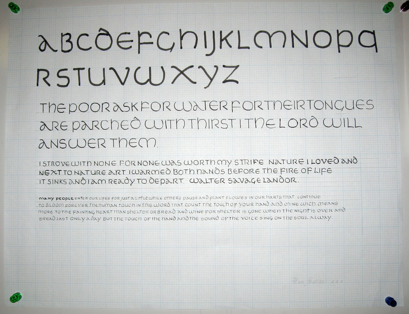
Beverly Hills Adult School Uncial Class #4: The warm-up was writing alphabet sentences with the Speedball B1 nib at an x-height of 1-inch. DeAnn reviewed some homework observations. Then she introduced writing Uncial with the chisel point nib.
 |
| Satomi's homework using watercolors |
 |
| Trini's homework: monoline Uncial at different sizes |
 |
| Judith's homework - fun and colorful! |
DeAnn reviewed common mistakes she found in the homework:
D : start the second stroke above the waistline to the left, not at the mid-point.
Z and L : Don’t exaggerate the horizontal strokes, they slant just a little.
Uncial with the chisel point nib: To start, we’ll be using the Brause 5mm nib (largest one). Use it with a round pen-holder. If you have the Brause holder that’s flat on one side, insert it toward the right side (when holding it) of the wooden nib holder. If you’re looking at the holder head-on, the nib will be toward the left edge.
Pen angle: The Brause is a chisel-point pen, able to create thicks & thins within one stroke, based on the angle of the pen. Using a protractor as the reference, a pen angle of 0-degrees equates to holding the pen so that the nib is parallel to the horizontal lines of the grid paper. A vertical stroke at this pen angle is the thickest; a horizontal stroke is the thinnest.
If the pen angle is 90-degrees, then a vertical stroke is the thinnest and a horizontal stroke is the thickest. For a 45-degree pen angle, use a box as a reference and place the pen so that you’re placing it on the diagonal of the box. At this angle, both a vertical stroke and a horizontal stroke should be the same thickness.
x-height: is the height between the waist and base. Each hand has a specific x-height measured in pen-widths. At a pen angle of 90-degrees, draw short horizontal strokes to measure by pen widths.
Uncial has a pen angle of 15-degrees (up to 30 degrees) and an x-height of 4 pen widths (equal 6 boxes on the grid paper). Since 15-degrees is one-third of 45-degrees, eye-ball the angle from the waistline. Look at the top of the chisel point Uncial exemplar.
 |
| Protractor on top of grid paper - note where 15-degree pen angle intersects grid. |
In class we practiced writing downstrokes & cross-strokes at 0 and 90 degrees, at an inch in height. Dip the pen so the reservoir is 3/4 full. Wipe the nib on the edge of the ink well to take off any excess. We need to get fully familiar with this chisel point nib. Practice making straight lines with the nib. You need even pressure on both sides of the nib. Not a lot of pressure, just even pressure. The ink will flow better to begin with if you give a little side-to-side "rub" (like an ice-skate) with the nib. Or touch the tip to some wet ink on a previous stroke. As you draw the stroke down the page, EXHALE. This helps give a more controlled stroke. Also, set your opposite hand near the work so you can give slight pressure as you start down. These tips will help you have success quicker. At this large size, ink will puddle at the end of the downstrokes; don’t worry about it now, it’s natural & expected.
To achieve the thicks and thins with the chisel point nib, you must keep it at the same angle. Don’t turn the pen-holder in your fingers as you make a curved stroke.
At this time it’s OK to wipe off your nib to clean it. DeAnn will show you how to remove the reservoir next time so don’t worry about washing it with water yet. When practicing, wipe your nib every 20 minutes or so to remove any paper residue, etc.
Preparing (lining) the grid paper: 8 boxes on the grid paper equal an inch, with the darker lines indicating the inch-marks. The x-height for Uncial with the 5mm Brause nib is 6 boxes. So after each darker line, line the sheet at 2 boxes, dividing the 8 boxes into 2 boxes and 6 boxes. We will be writing in the rows that are 6 boxes tall. The 2-box row in between will be for the ascenders (e.g. H, L) and descenders (P, Q). Write an “x” in the margin if that will help you see which lines to write on.
 |
| sample of lined grid paper - click on it to enlarge. |
Notes on individual letters:
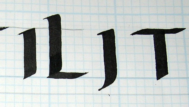
I : pierces the baseline slightly
L : almost 2 boxes above the waistline, slight serif at base
J : don’t pull it longer than 2 boxes below the baseline
T : Marcia Brady’s “T” which is on the exemplar, goes off to the right slightly.
Also alternate T:
 |
| T from Exemplar and alternate T |
O : be careful not to turn the pen when curving
G : top stroke doesn’t go farther than the bottom stroke
D : DeAnn prefers it not to be that flat; it’s OK if there’s a space between the first stroke and the second.
Q : curved stroke is above the baseline
S : need to start below the waistline
A : beginners can just go out, then back, without worrying about the hairline for now. And don’t worry about flattening the first stroke against the baseline. Intermediates – pull the stroke into a hairline. Also twist pen to flatten stroke 1 to the baseline. You need a round pen holder for this.
B : start with serif; come down, pause, then move over. Don’t make this last stroke too round. Set pen inside stem stroke and come out to make the next 2 strokes.
F : Make the horizontal strokes longer than the exemplar.
H : Don’t curve in too much; it’s more of an optical illusion.
K : beginners don’t have to put the serif on the top stroke or flatten the last stroke. Intermediates can.
M : start inside the stem stroke to make the last stroke.
N : pen angle is slightly steeper; diagonal-stroke is slightly S-shaped. When making the last stroke, aim for the inner corner to match.
P : curved stroke doesn’t touch the baseline
R : intermediates can flatten the last stroke
U : thicken the curve slightly so it’ll connect nicely
V : put a nice curve in the second stroke so it’ll balance. Don’t let it lean to the side.
W : like the “U”, first stroke is straight-ish, the last stroke is curvy.
X : you can follow the exemplar and make the cross-stroke in 3 strokes. Or pull one stroke from the bottom, putting serifs on each end.
Y : think martini-glass to create a balanced triangular shape
Z : if the diagonal stroke is too thin, then your pen angle is too steep; flatten it to thicken the stroke.
HOMEWORK: Practice the letters with the 5mm Brause nib and an x-height of 6-boxes. Write each letter only 3 times in a row before moving on. Study the exemplar closely and compare your written letter to it. Trace the exemplar if you’re having difficulty.
Once you’re comfortable with the letters, write words. Intermediates can go down to the 2 ½ mm Brause nib with an x-height of 3 boxes.